The network for creativity
Join 1.25M professional creatives like you
Connect with clients, get discovered, and run your business 100% commission-free
Creatives on Contra have earned over $150M and we are just getting started
Back to feedPost

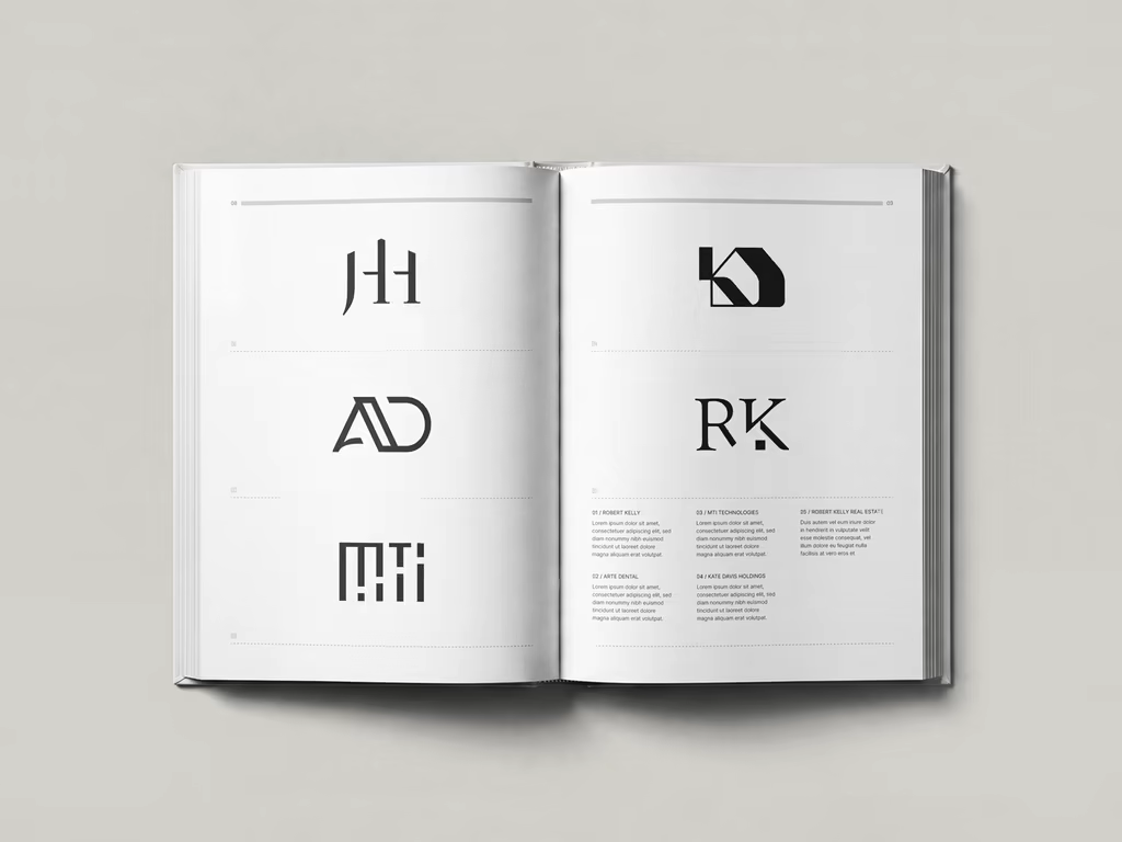
Give me two letters, and I’ll give you a hundred ways to make them speak.
Over the past 10 years, I’ve had the chance to create many logos. Each with its own story, purpose, and visual language. I recently started turning that archive into a printed collection, grouping the work into different categories.
This first chapter is dedicated to monograms, logos built from two or more letters. There’s something incredibly satisfying about taking a handful of letters and trying to find the right balance between form, rhythm, proportion, and meaning. No two monograms are ever really the same. The letters change, the industries change, the personalities behind the brands change, and so does the solution.
Monograms are also one of the oldest forms of visual symbols, historically used to represent individuals, families, communities, and groups. And despite their long history, they still feel remarkably relevant today.
Maybe that’s what I enjoy most about them: reducing a brand to a few letters, while still making it feel distinctive, intentional, and memorable. Here’s a small selection from the collection.


The network for creativity
Join 1.25M professional creatives like you
Connect with clients, get discovered, and run your business 100% commission-free
Creatives on Contra have earned over $150M and we are just getting started







Related posts

Sync rents cars in Greece. You pick the car, a local provider brings it to you.
The brief was to make them look like they belong in the same frame as the giants, without pretending to be a giant. So the polish went up and the personality stayed.
The pink was already theirs. I gave it more room. Greek typography, bold. A frame borrowed from a car's side mirror, which quietly does a lot of the work across the layouts.
Small brands don't win by looking bigger. They win by looking more specific.

That last line says it all. Small brands don't win by looking bigger, they win by looking more specific. The Greek typography and the car mirror frame detail are exactly that level of intentional. Really sharp work.

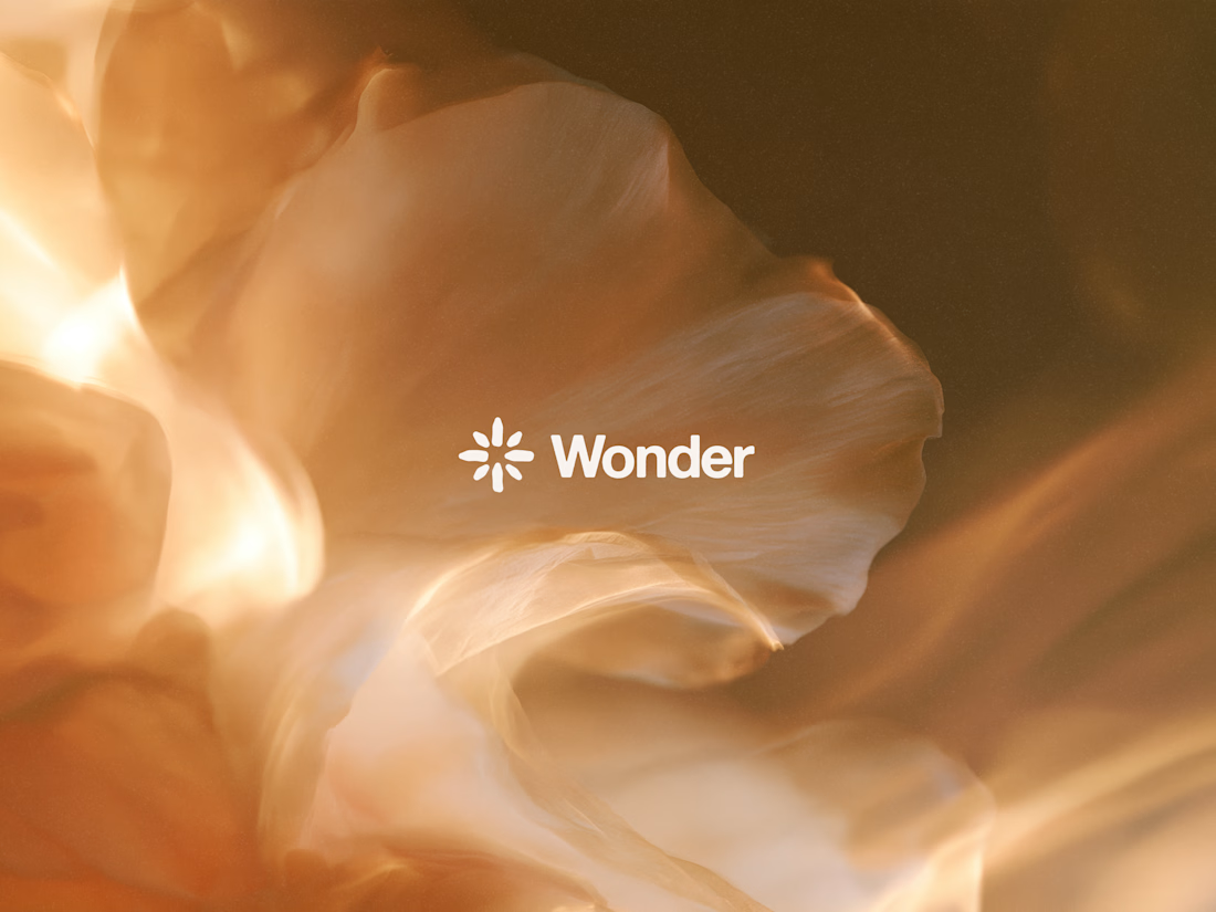
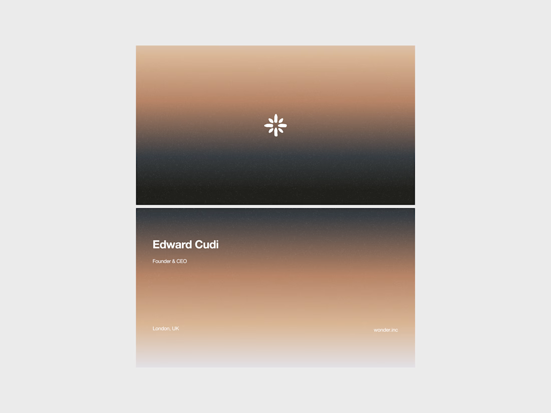
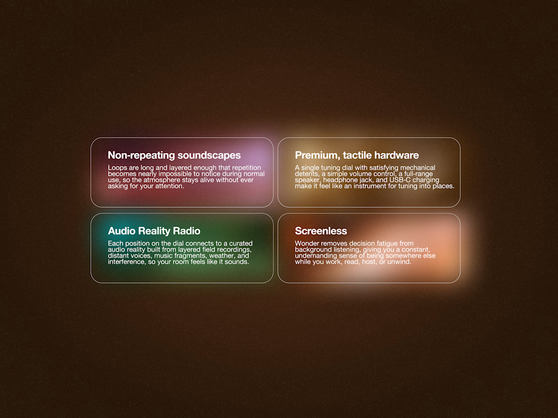
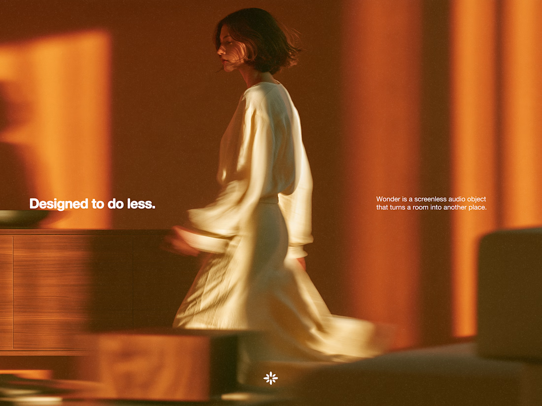
Wonder -- Brand Expressions



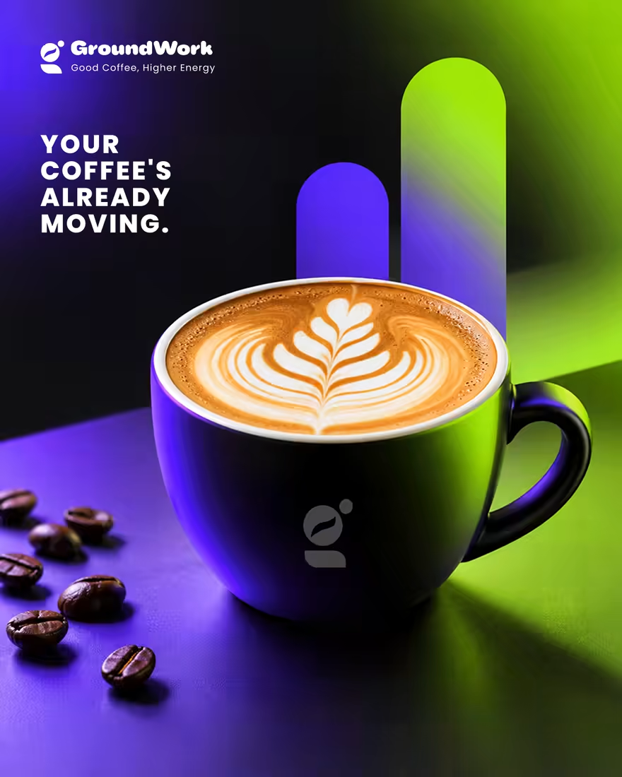
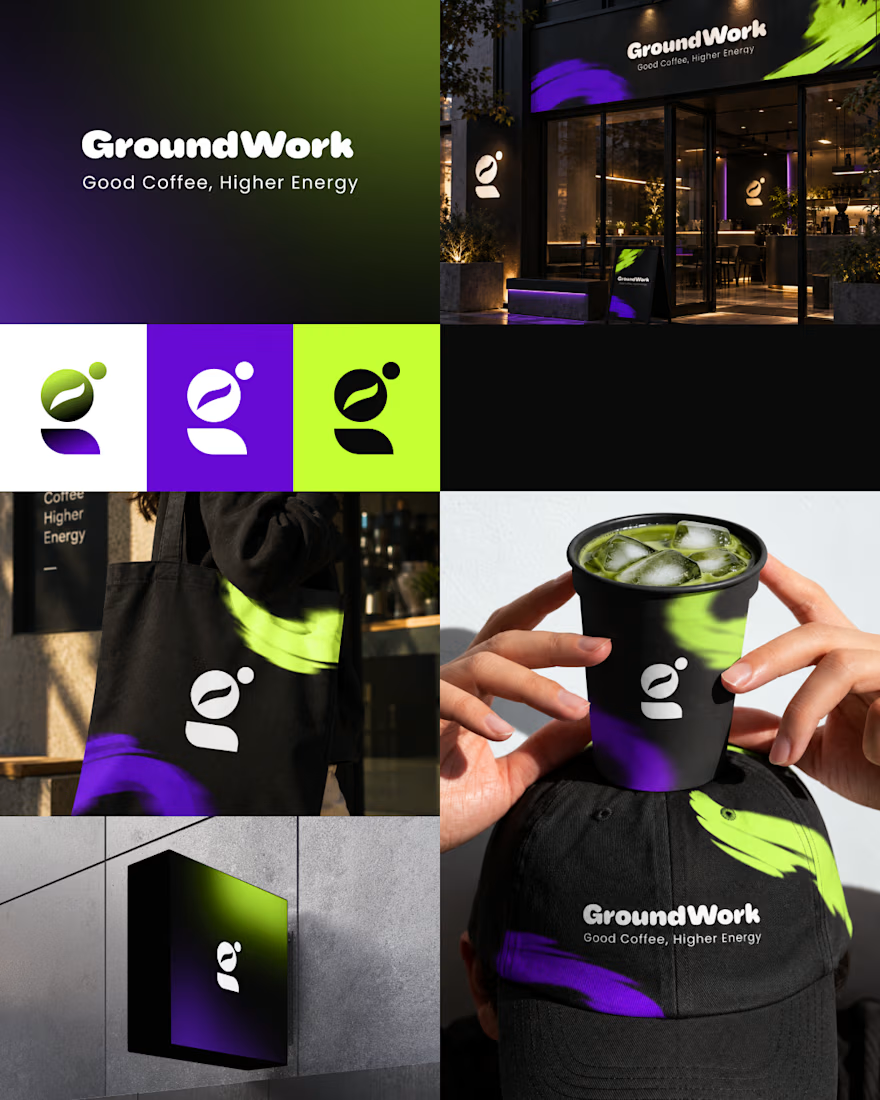
☕ GroundWork — Good Coffee, Higher Energy.
🎨 Brand Identity · 📱 UI/UX · 📦 Packaging
A modern coffee brand built around energy, creativity, and momentum. ⚡
💡 The Idea
I wanted to create a coffee brand that feels as energetic as the first cup of the day.
🎨 Visual Direction
🖤 Charcoal — premium foundation
💜 Electric Violet — creativity
💚 Neon Lime — energy & freshness
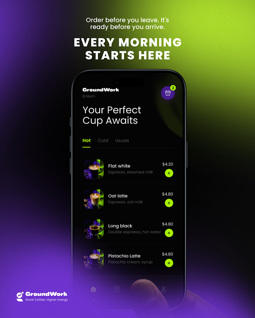
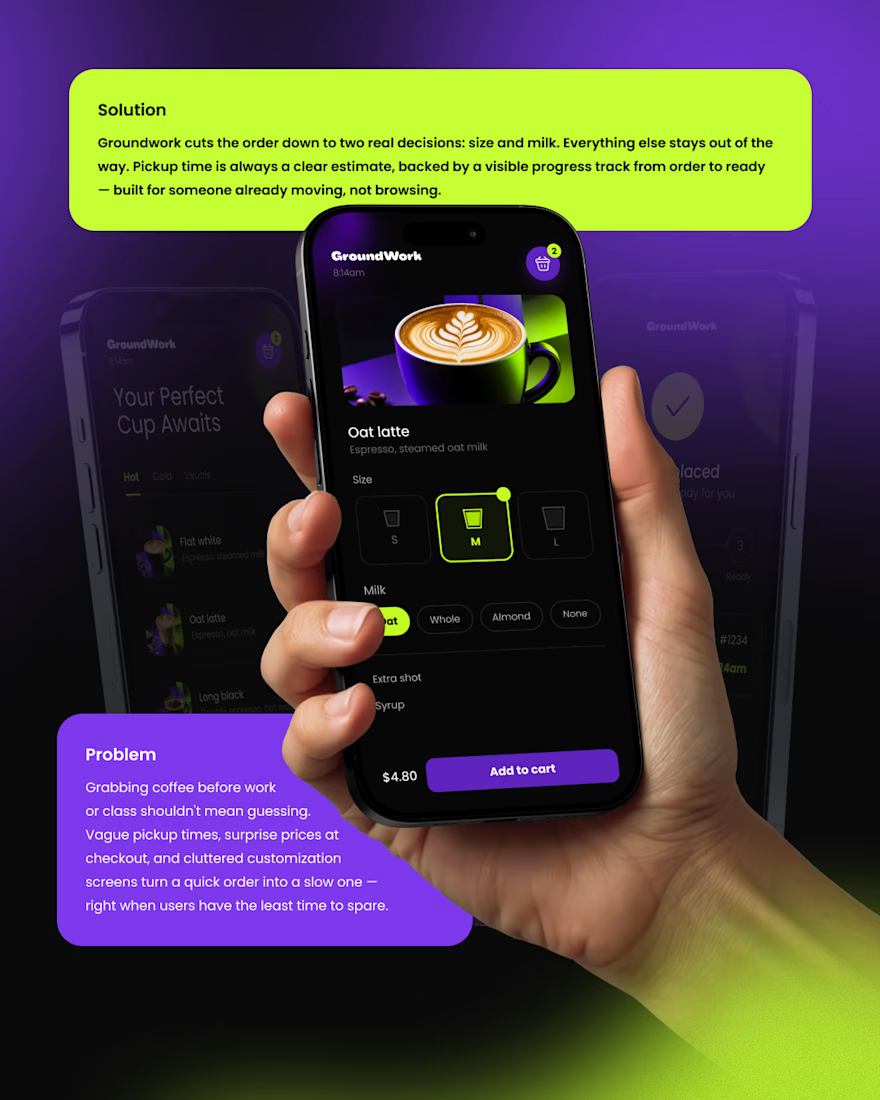
📱 Digital Experience
A clean mobile ordering experience designed to make getting coffee simple, fast, and engaging.
☕ Brand Experience
I extended the identity across cups, caps, totes, packaging, and storefronts — creating one consistent visual system.
✨ The Result
A bold coffee identity that connects digital + physical experiences under one idea:
Good Coffee, Higher Energy. ⚡
What’s your first impression of GroundWork? 👀☕

I personally don't like the colors intensity or shade