The network for creativity
Join 1.25M professional creatives like you
Connect with clients, get discovered, and run your business 100% commission-free
Creatives on Contra have earned over $150M and we are just getting started
Back to feedPost
Taste Test
Exploring two landing page directions for Serein - a skincare brand focused on calm, balanced, healthy-looking skin.
Portrait Layout - with the models as the main focal point and the copy placed alongside the image.
Wide Layout - a calmer, more editorial composition that introduces the brand’s skincare philosophy through a structured content block.
Which direction would you choose for Serein: Portrait Layout or Wide Layout?
Which one feels more memorable and trustworthy for a skincare brand?


86 voted
75%
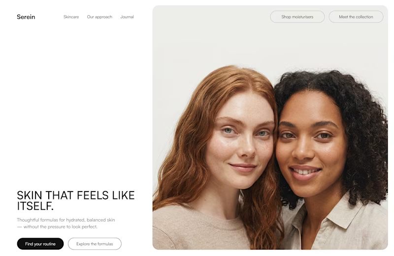
29 voted
25%
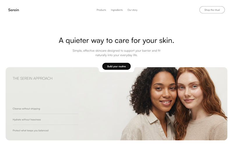
115 votes
Closed

Portrait layout for me. It feels more memorable and emotionally engaging.

Portrait Layout

Potrait

Portrait layout is better because it feels more natural to the eye and gives you more options for the content (image, video or even a GIF) that can introduce the brand very well

love the portrait layout!

The wide layout is very near the hero. The portrait has a better design proportion

Wide layout feels empty, will go with portrait layout

Portrait layout looks better

The portrait layout looks much better

Portrait Layout gets my vote Placing the models prominently above the fold creates immediate trust while keeping the CTA buttons super clear.Did you generate the model visuals with Adobe Firefly directly?

Yes, with Adobe Firefly + ChatGPT helped with detailed prompt generation.

🎉 🎉 🎉

Portrait Layout 👍

had to choose, this is so clean and perfecto

I'd say both are good, Wide one focuses on more 'Build your routine' while other one serves primary and seconday actions very well.
if building routine is the primary goal for the business & end-user I would go with first with elegant typeface.

My vote t Portrait layout. As it reads stronger to me the asymmetric split gives the copy room to breathe and lets the image carry full emotional weight, while the shorter, punchier headline ("Skin that feels like itself") lands with more clarity than the centered version's longer line.

Close your eyes and go for the portrait version.

Portrait for sure.


wide one, feels more like a brand than an ad

Voted Portrait 👍

Wide layout feels so much closer to calm, balanced than portrait does, that editorial pacing does a lot of work. Was the client on board with losing the immediate face-first hook, or did you have to make the case for it?
The 'brief' and 'client' were AI-generated, purely a practice round for me.

Totally agreed
Wide layout feels so much closer to calm, balanced than portrait does, that editorial pacing does a lot of work. Was the client on board with losing the immediate face-first hook, or did you have to make the case for it?

Something about the wide layout..
I feel the portrait layout is well detailed than the wide layout


The portrait layout for me, the way it comes together is so good

The first hero section

Portrait layout stand out more

What an eye-catching concept! Super useful and innovative design.

Wide layout for me

Portrait layout is the only correct answer for a Skincare brand.
The images matters as much as the text for a first impression, so portrait mode works perfectly
The network for creativity
Join 1.25M professional creatives like you
Connect with clients, get discovered, and run your business 100% commission-free
Creatives on Contra have earned over $150M and we are just getting started









Related posts

Designed a step tracking screen where you can see your daily progress and weekly trend in one glance.
Same screen, two shots. Which one would stop your scroll? 👀

11 voted
73%
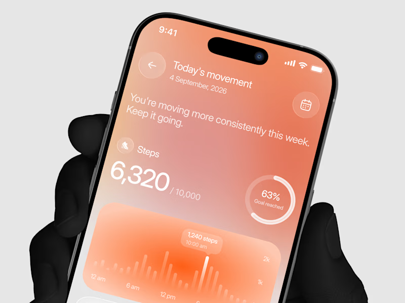
4 voted
27%
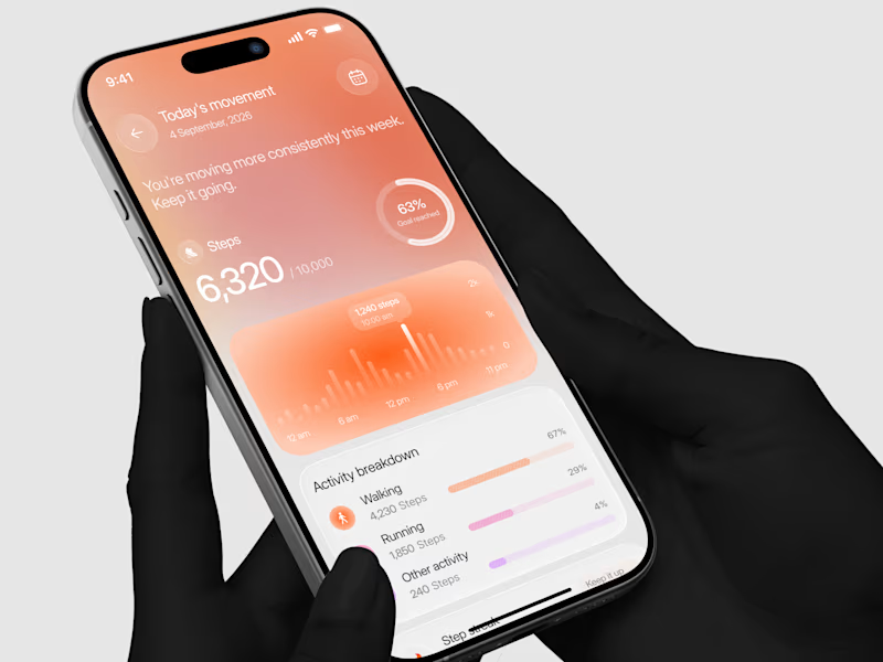
15 votes
Closed


Two page transitions, one site. Which one feels better to you?

5 voted
83%
1 voted
17%
6 votes
Closed

Kinetic Reveal feels more natural ❤️❤️
great job Dayyan🎉🎉

15 seconds of smooth UI, editorial layouts, and micro-interactions.
Kept the micro-interactions snappy, typography expressive, and transitions buttery smooth.
Rate this UI animation from 1 to 10 in the comments, or tell me what you’d improve! 😉


Solid 10/10 bro! 🔥 Micro-interactions are super snappy and transitions are buttery smooth indeed. Editorial layout game is strong. Keep it up!