The network for creativity
Join 1.25M professional creatives like you
Connect with clients, get discovered, and run your business 100% commission-free
Creatives on Contra have earned over $150M and we are just getting started
Back to feedPost

What if your family needed critical information tomorrow and couldn't reach you?
Family Vault uses AI to help families organize essential information, identify preparedness gaps, and stay ready before emergencies happen.
Built with Figma Make.


The readiness score is a smart design choice. Most people know they should organize this stuff but never do because there's no clear baseline to measure against. Giving someone a 68% with a label like 'Getting there' makes the gap feel closable rather than overwhelming.
That was exactly the goal. Most people aren't starting at 0% or 100%, but they rarely know where they stand. The readiness score helps turn a vague task into something measurable and actionable.
The network for creativity
Join 1.25M professional creatives like you
Connect with clients, get discovered, and run your business 100% commission-free
Creatives on Contra have earned over $150M and we are just getting started









Related posts


Brilliant work

Poster Club turns a simple event template into your own print. I built two working Flutter versions and recorded the same editing flow in each.
Print Room: calm, editorial, with a mounted canvas and bottom tools.
Cutout Playground: bold, playful, with loose prints and tools at the edge.
Which one would you rather use?
What made the difference?
Grab it for free:
https://contra.com/products/cUHBysMu-poster-club-free-flutter-ab-ui-kit


37 voted
60%
25 voted
40%
62 votes
Closed

Print Room looks great!!


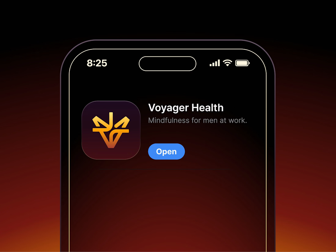

Aryna, that golden symbol pops so nicely against the plum background ✨