The network for creativity
Join 1.25M professional creatives like you
Connect with clients, get discovered, and run your business 100% commission-free
Creatives on Contra have earned over $150M and we are just getting started
Back to feedPost

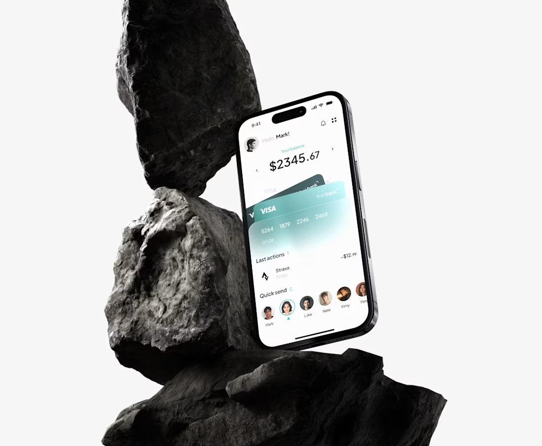
Nestbank - Onboarding Flow for a Personal Finance App
This one's a personal project. I got kind of tired of how every banking app treats onboarding like a form you have to survive before you're allowed in email, password, verify, done. Nobody tells you why you should actually trust them with your money. So I tried to fix that, at least in concept.
The problem
Onboarding in most finance apps is pure friction. It's functional, sure, but it says nothing about the product. I wanted the first few seconds to actually mean something instead of just being a gate you get through.
The idea behind it
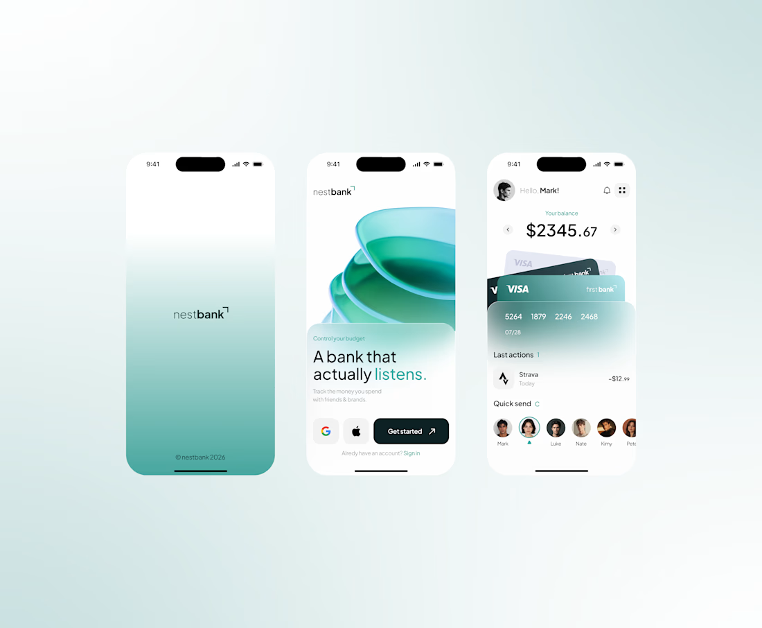
Everything came from one line: "A bank that actually listens." That basically became the whole personality of the app. Nestbank isn't trying to be the bank that just holds your money, it's the one paying attention to how you spend it. Once I had that line, the rest of the design kind of followed from it.
The splash screen is intentionally quiet, just the logo on a gradient, nothing else. I wanted a second of calm before the app says anything at all. Then the next screen brings in the actual message along with a soft, fluid visual, those layered glass-like shapes felt more human than the usual sharp corporate banking look.
Some of the smaller decisions
The "Get started" button is big and solid, while Google and Apple sign-in sit off to the side, smaller. I wanted people to actually make an account with the app, not default to a third-party login out of habit.
On the home screen the card slightly overlaps what's underneath it. Tiny detail, but it makes the whole thing feel a bit more like a real wallet instead of just numbers stacked on a page.
Quick send sits right under the balance, not lower down somewhere. Sending money is probably the most common thing people open a banking app to do, so it shouldn't take scrolling to find it.
For the overview screen I went with a bar chart instead of a line graph. People think "how much did I spend in July," not really in smooth trends, so bars just answer that question faster than a line would.
What I'd change
Honestly, I'd want to actually test "a bank that actually listens" with real people before treating it as final. Right now it's just my best guess at what would resonate, not something anyone's told me works.


Awesome work!
The network for creativity
Join 1.25M professional creatives like you
Connect with clients, get discovered, and run your business 100% commission-free
Creatives on Contra have earned over $150M and we are just getting started
Trending
retrofuturism
Share your favorite designs from the past exploring the distant future. Or your own take on the aesthetic 🚀
halftone
Dots. Texture. Grain. Let's see your designs using the halftone technique.

Midjourney
Creatives are showing off what they're making with Midjourney.
colorgrade
Video editors sound off: How do you enhance the mood of your video in color grading?





Related posts

A little preview of what I’ve been building lately 👀
This Framer project is just one piece of what’s coming.
There’s a lot happening behind the scenes, and I’ve got several case studies in the works.
More soon. Stay tuned.🚀
Motion DesignUI DesignAdobe After EffectsFigmaFramermotiondesignerframerdesignerFramer Website Design


Pretty excited for the final outcome!

I'm exploring a new concept for the Telehealth product. Which one would convert better?
31 voted
72%
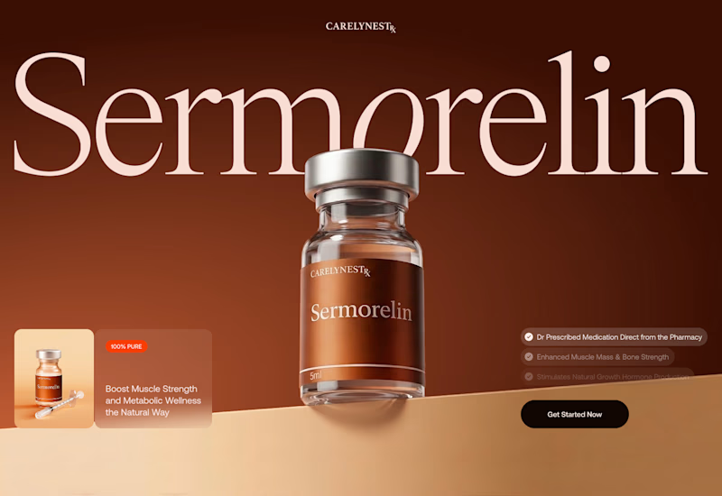
12 voted
28%
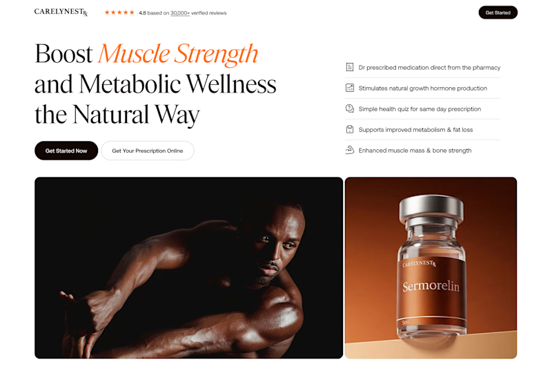
43 votes
Closed

Variant 1 looks great! 🤩

Almost two years ago, I started shaping the visual identity of my own studio.
Time flies. Couldn't be happier with what we've built so far, and what's next!
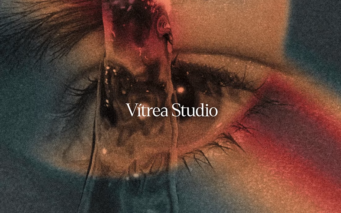
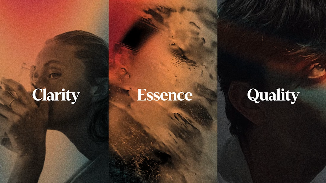
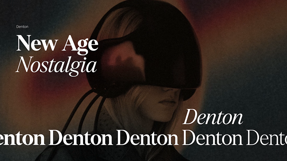

The eye motif carrying through every project instead of just the logo is what makes the studio's own identity actually recognizable, most agencies never bother applying their brand to themselves that consistently.