The network for creativity
Join 1.25M professional creatives like you
Connect with clients, get discovered, and run your business 100% commission-free
Creatives on Contra have earned over $150M and we are just getting started
Back to feedPost
Taste Test
I'm exploring a new concept for the Telehealth product. Which one would convert better?

31 voted
72%
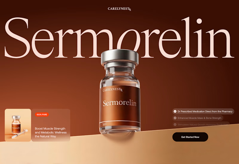
12 voted
28%
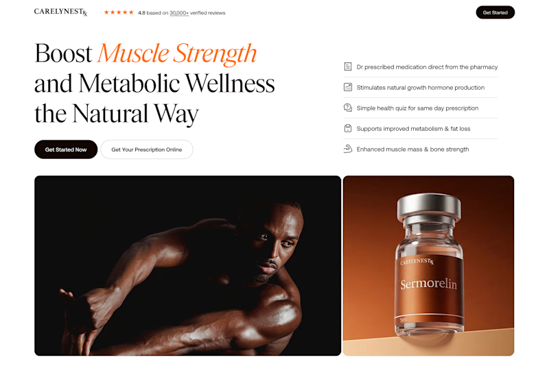
43 votes
Closed


Thank you!

i think especially for a telehealth product, 2 comes packing a greater punch & sense of promise.
I agree with you, the 2nd variant in this field would be stronger, despite that 1st is more visually appealling.

I like option 2 more, it's cleaner and less crowded! 🙌
Thank you, Tan! I agree

Variant 1's warm tone feels more premium and less clinical, which seems right for a supplement product. Is this going in front of real users to test, or is the vote here basically deciding it?
I also prefer 1st variant. But the 2nd one converted much better in front of real users. I was curious to ask designers though

Variant 2 🔥

i love option 1, product is look premium

Variant 1 looks great! 🤩
Thank you!

Option 1 more attractive and give the meaning with less content however option 2 can be added as the second layer to complete the story

Thank you, Sajid! Good point

Worth separating conversion from retention here - a telehealth product needs people to come back, so the variant that wins the first click and the one that keeps someone comfortable typing symptoms into it every time might not actually be the same design.
So which variant do you think would keep retention more, Mark?

Variant 1 got my vote

Late to the party, but happy Variant 1 got the win! The premium look and feel of that first option is just fantastic. Awesome design work!
Thank you so much, Agadon Creative!

The network for creativity
Join 1.25M professional creatives like you
Connect with clients, get discovered, and run your business 100% commission-free
Creatives on Contra have earned over $150M and we are just getting started





Related posts

Credit card landing page design for a fintech startup — an interactive 3D claw machine that turns the offer into the hero instead of another floating card at 15 degrees.
Every card brand ships the same hero: a card hovering over a gradient. Clawd sells one card, not a marketplace, and the entire pitch is "stop comparing — we already did the comparing". So the landing page had to make a single-product offer read as a win rather than a shortage of options, and pull early-access sign-ups from people who are deliberate about money: the ones who actually track spending and read the APR line.
The metaphor does the positioning work. A claw machine that never misses, plus "we already picked the best one", means the visual is the argument and the headline doesn't have to explain itself.
I built the scene in Blender as an interactive element rather than a still render — the claw follows the cursor, the card tilts in the grip, and the pile underneath reacts, so a visitor plays with the product's core idea for a few seconds instead of scrolling past it.
Hero plus full page structure, desktop and mobile designed separately, the Blender scene with web-ready exports, interaction notes, and a developer-ready Figma file.


nice work

You leaned toward Atmospheric in my last taste test, so I took it beyond the hero.
Here’s the full homepage for the same fictional lighting studio, with two different scroll experiences: Fluid and Cinematic.
Which one makes you want to keep exploring?
Continuing from this post: https://contra.com/community/KacW2yxF-homepage-design-comparison-product-photography-vs
22 voted
46%
26 voted
54%
48 votes
Closed

I can't recognizable the difference but both of them are great 🎉🎉

Winder is a bold brand identity built around a geometric W-inspired symbol, combining sharp angles and forward movement to represent progress, speed, and direction.
The identity uses a striking red and deep burgundy palette, supported by clean typography and a consistent visual system across brand guidelines, digital applications, and product mockups.
Progress in Motion.



Great logo it feels it really has an identity 🎉🎉