Sergej Šurlan - UI Designer | Contra
Work by Sergej Šurlan
Sign Up
Post a job
Sign Up
Log In
Sergej Šurlan
UI/UX Designer crafting intuitive web & mobile apps.
Message
Follow
New to Contra
Sergej is building their profile!
Banja Luka 78000, Bosnia and Herzegovina
Work
Posts
About
Banja Luka 78000, Bosnia and Herzegovina
3
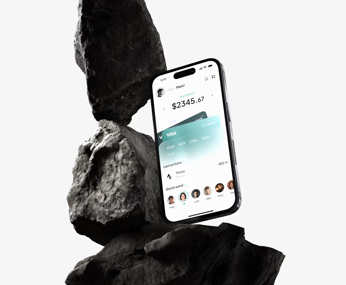
Nestbank - Onboarding Flow for a Personal Finance App This one's a personal project. I got kind of tired of how every banking app treats onboarding like a form you have to survive before you're allowed in email, password, verify, done. Nobody tells you why you should actually trust them with your money. So I tried to fix that, at least in concept. The problem Onboarding in most finance apps is pure friction. It's functional, sure, but it says nothing about the product. I wanted the first few seconds to actually mean something instead of just being a gate you get through. The idea behind it Everything came from one line: "A bank that actually listens." That basically became the whole personality of the app. Nestbank isn't trying to be the bank that just holds your money, it's the one paying attention to how you spend it. Once I had that line, the rest of the design kind of followed from it. The splash screen is intentionally quiet, just the logo on a gradient, nothing else. I wanted a second of calm before the app says anything at all. Then the next screen brings in the actual message along with a soft, fluid visual, those layered glass-like shapes felt more human than the usual sharp corporate banking look. Some of the smaller decisions The "Get started" button is big and solid, while Google and Apple sign-in sit off to the side, smaller. I wanted people to actually make an account with the app, not default to a third-party login out of habit. On the home screen the card slightly overlaps what's underneath it. Tiny detail, but it makes the whole thing feel a bit more like a real wallet instead of just numbers stacked on a page. Quick send sits right under the balance, not lower down somewhere. Sending money is probably the most common thing people open a banking app to do, so it shouldn't take scrolling to find it. For the overview screen I went with a bar chart instead of a line graph. People think "how much did I spend in July," not really in smooth trends, so bars just answer that question faster than a line would. What I'd change Honestly, I'd want to actually test "a bank that actually listens" with real people before treating it as final. Right now it's just my best guess at what would resonate, not something anyone's told me works.
1
3
26