The network for creativity
Join 1.25M professional creatives like you
Connect with clients, get discovered, and run your business 100% commission-free
Creatives on Contra have earned over $150M and we are just getting started
Back to feedPost

Sharing a recent conceptual project:
Arketype, Interior design studio
p2. The identity
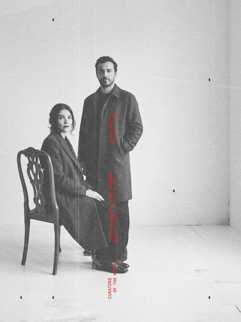
In shaping this project, I asked myself how a studio can stand apart in a field where everything starts to look the same. So Arketype isn’t a simple design practice, it works with a curatorial logic that separates it from the thousands of “minimal” studios out there. It doesn’t treat a home as something to be styled, it treats it as a composition built around one meaningful object. It speaks to people who care about material, origin, and structure more than aesthetic trends. That approach needs a visual language that fits. Object becomes letter. Letter becomes mark. The identity grows from the same way of thinking. Its letters are drawn from the objects the studio studies and measures, which is why the type carries a slight human irregularity (not as decoration, but because the geometry reflects the character of the originals). The monochrome palette comes from the same place: it keeps the atmosphere of the objects themselves without adding anything that distracts from them. Photos: TheMet, Pexels. Typeface: Oaxaca Sem more: https://www.instagram.com/zinea.dsg/


The network for creativity
Join 1.25M professional creatives like you
Connect with clients, get discovered, and run your business 100% commission-free
Creatives on Contra have earned over $150M and we are just getting started



Related posts


ESE GIN — Between the Dunes | Visual Identity & Packaging
ESE GIN draws its curves from the dunes. The signature S catches the light in sculpted olive glass and leaves its imprint in wax.
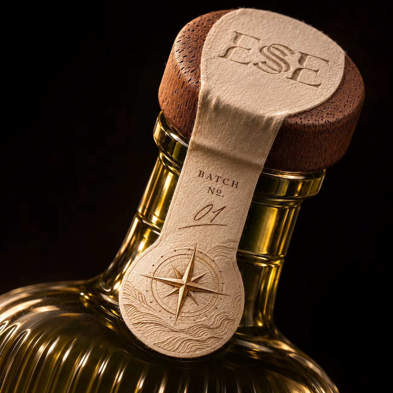
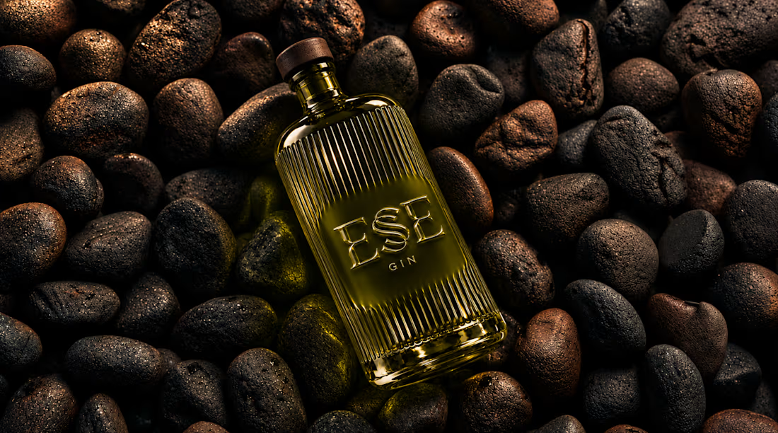
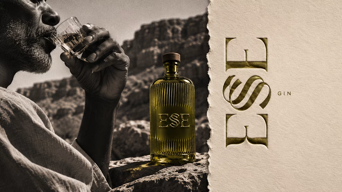
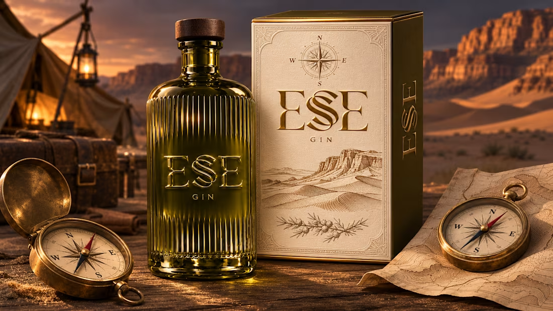

This is gorgeous, Maya — the sculpted olive glass with that S catching the light is such a clever way to carry the dunes into the bottle itself. And the wax seal imprint is a beautiful finishing touch, it gives the whole thing a crafted, almost apothecary feel. Really cohesive...

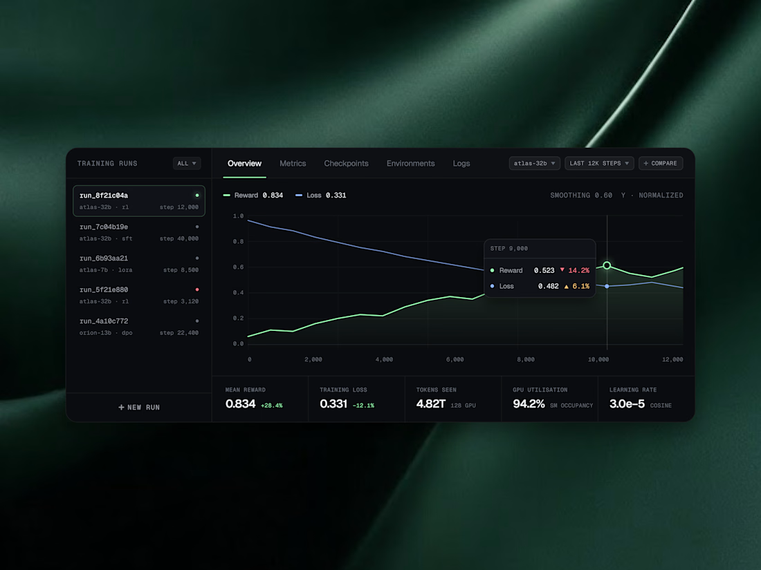
AI Telemetry & Evaluation Widgets 🟢
What if AI infrastructure data felt calm instead of overwhelming? 🌿
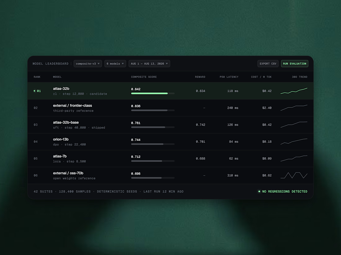
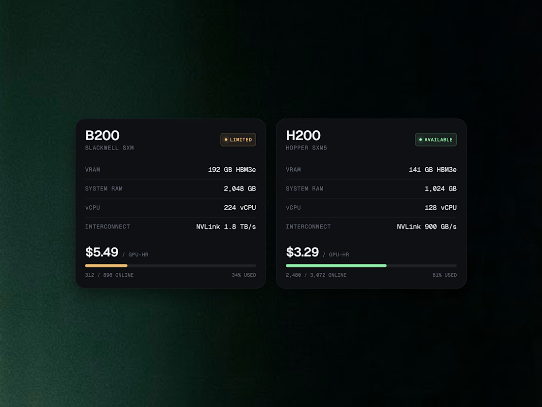
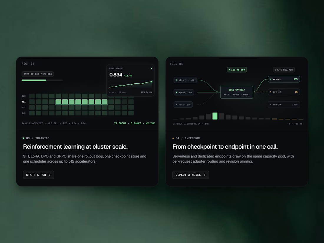
We designed a set of widgets for tracking models, GPUs, and training runs, where every score, price, and metric is easy to scan. Sleek dark cards with soft green highlights float over a rich emerald silk backdrop, turning dense telemetry into something you actually want to look at.
Swipe through the 4 frames to see the model leaderboard, GPU pricing cards, training and inference flows, and live training run charts. 👀
Which widget would you want on your dashboard first? Tell us in the comments! 💬👇
#UIDesign #UXDesign #DashboardDesign #DataVisualization #AIDesign #SaaSDesign #DarkModeUI #DeveloperTools


Nice work

How do you make a construction brand feel consistent from a business card to a building site?
Brixon’s identity brings angular lettering, an assembled geometric symbol, and a lime, black, and white palette together.
I carried those elements into stationery, brand guidelines, team identification, social graphics, and site signage, then brought the system into motion with Adobe After Effects.
The connecting decision: keep the geometry and layout structure consistent while the logo details, messages, and application previews change within the animated panels.
My contribution covered brand design, graphic design, and motion design.
What draws your attention first: the wordmark, the lime palette, or the rotating symbol?
See the full Brixon case study. If you’re shaping a construction or development brand, I’m available for brand identity and motion projects.

Incomparable work!