Izabella Dudan
graphic design • editorial design
- 1x
- Hired
- 5.0
- Rating
- 8
- Followers


Sharing a recent conceptual project:
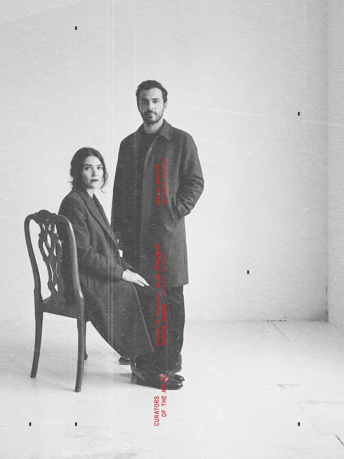
Arketype, Interior design studio
p2. The identity
In shaping this project, I asked myself how a studio can stand apart in a field where everything starts to look the same. So Arketype isn’t a simple design practice, it works with a curatorial logic that separates it from the thousands of “minimal” studios out there. It doesn’t treat a home as something to be styled, it treats it as a composition built around one meaningful object. It speaks to people who care about material, origin, and structure more than aesthetic trends. That approach needs a visual language that fits. Object becomes letter. Letter becomes mark. The identity grows from the same way of thinking. Its letters are drawn from the objects the studio studies and measures, which is why the type carries a slight human irregularity (not as decoration, but because the geometry reflects the character of the originals). The monochrome palette comes from the same place: it keeps the atmosphere of the objects themselves without adding anything that distracts from them. Photos: TheMet, Pexels. Typeface: Oaxaca Sem more: https://www.instagram.com/zinea.dsg/
3
117
Arketype
Interior design studio
p1. The catalogue
In shaping this project, I asked myself how a studio can stand apart in a field where everything starts to look the same.
So Arketype isn’t a simple design practice, it works with a curatorial logic that separates it from the thousands of “minimal” studios out there. It doesn’t treat a home as something to be styled, it treats it as a composition built around one meaningful object. It speaks to people who care about material, origin, and structure more than aesthetic trends. That approach needs a visual language that fits.
Object becomes letter. Letter becomes mark.
The identity grows from the same way of thinking. Its letters are drawn from the objects the studio studies and measures, which is why the type carries a slight human irregularity (not as decoration, but because the geometry reflects the character of the originals). The monochrome palette comes from the same place: it keeps the atmosphere of the objects themselves without adding anything that distracts from them.
Photos: TheMet, Pexels.
Typeface: Oaxaca
Sem more: https://www.instagram.com/zinea.dsg/
2
109
INTERSECT. Where Structure Meets Life
This project was created for a creative brief challenge, where the task was to design the visual identity for a fictional exhibition called INTERSECT. The event brings together creatives, studios, and thinkers to showcase how lines, forms, and structures shape the way people experience cities and spaces.
The challenge: build a coherent identity system from scratch.
My solution: a poster, signage, motion logo, and a small exhibition catalogue exploring how structure and life meet in everyday urban space.
A project about how cities remember us, not through iconic buildings, but through the small traces life leaves behind.
A dedicated catalogue was also created to present the visual and conceptual structure of the project.
https://www.instagram.com/p/DVYneIDjIls/?img_index=1
4
4
252
Concept identity created for a brief challenge.
Elevra is a spatial‑driven studio built around clarity, structure, and material honesty.
This project explores how a brand can feel architectural without becoming cold, using proportion, rhythm, and quiet tension as core principles.
Photos are sourced from Pexels.
https://www.instagram.com/p/DSuNHc0DewP/?utm_source=ig_web_copy_link&igsh=MzRlODBiNWFlZA==
4
2
197