The network for creativity
Join 1.25M professional creatives like you
Connect with clients, get discovered, and run your business 100% commission-free
Creatives on Contra have earned over $150M and we are just getting started
Back to feedPost
What's the one thing you'd change about this — and why?


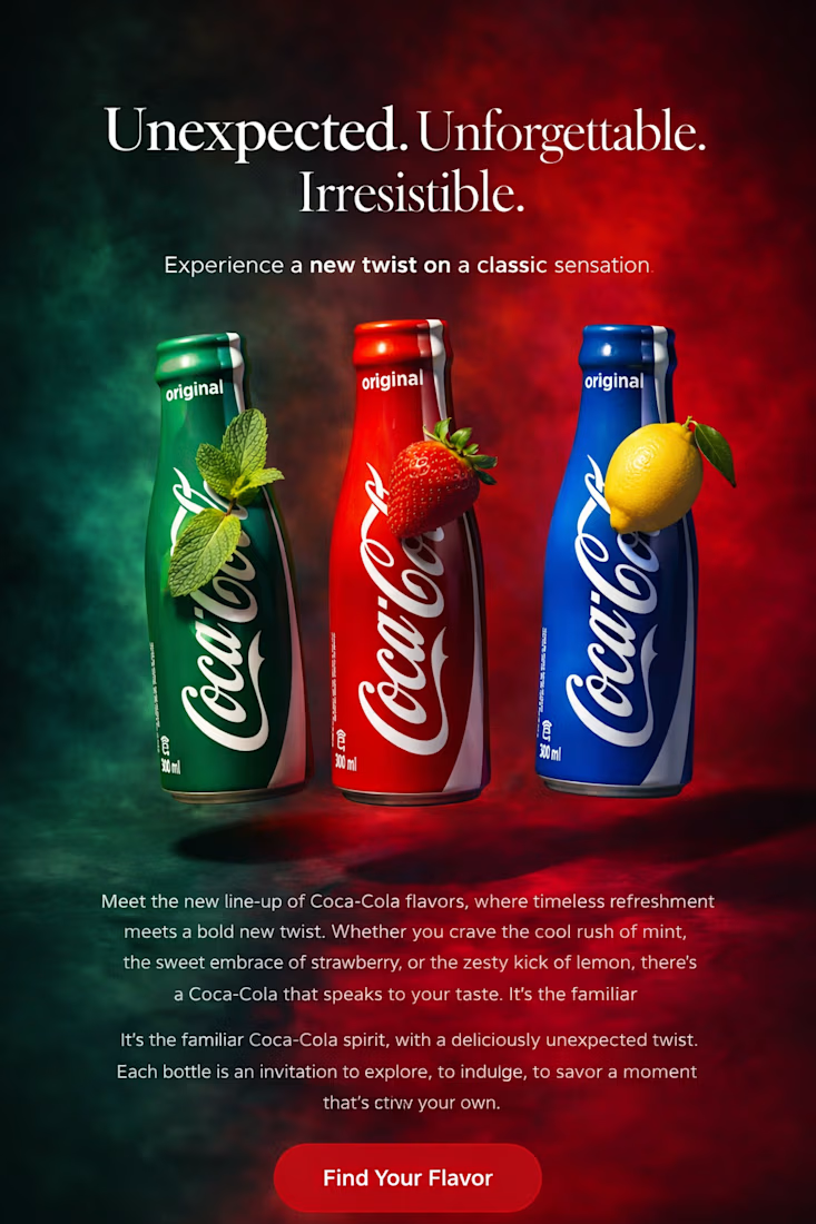

To be brutally honest, this looks to be made with AI, as there is just no harmony in the whole poster... Why is the Blue Solo, Why is the First text Bigger than the Rest?
Its great work but needs a Real designers hand to make it Make sense..Design Wise

Thanks for the honest take!
The blue solo cup is the main product so I let it stand out on purpose. Bigger first text is just to grab attention quick. Not AI btw — shot & designed it myself. Design can be subjective though! What would you change specifically?

Why you added lemon on a blue bottle? You can something like blueberry
Yeah, the lemon was intentional — it pops against the blue bottle. Blueberry would just blend right in. Tried both, lemon looked way better.
The network for creativity
Join 1.25M professional creatives like you
Connect with clients, get discovered, and run your business 100% commission-free
Creatives on Contra have earned over $150M and we are just getting started











Related posts

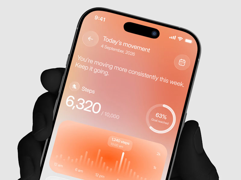
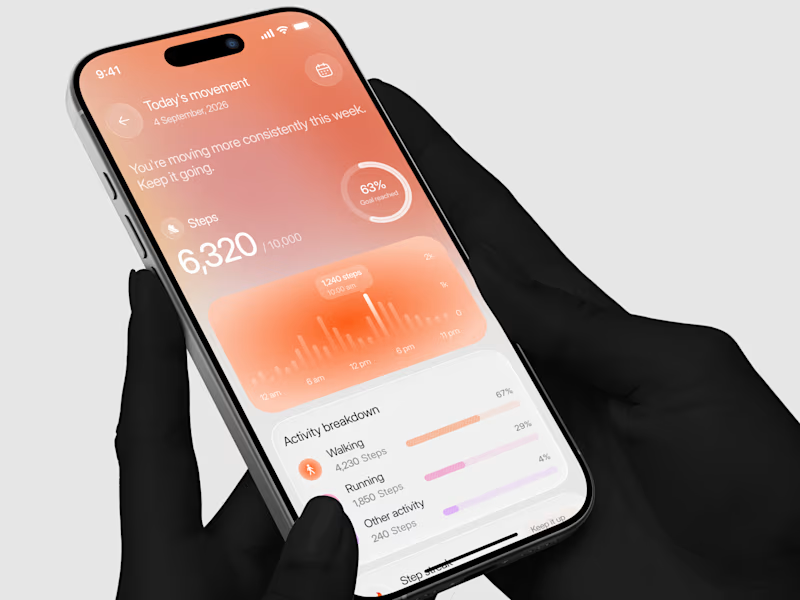
Designed a step tracking screen where you can see your daily progress and weekly trend in one glance.
Same screen, two shots. Which one would stop your scroll? 👀

11 voted
73%
4 voted
27%
15 votes
Closed


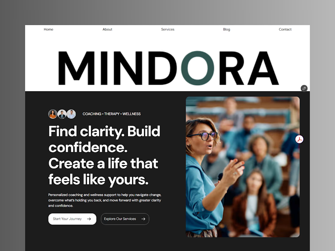
Introducing Mindora — a Life Coaching & Wellness Framer Template.
I designed Mindora for life coaches, wellness professionals, and personal growth brands looking for a calm, modern, and welcoming online presence.
Inspired by clarity, confidence, and meaningful growth, Mindora features a thoughtful layout, dedicated service sections, a blog for sharing valuable insights, and a clean visual style designed to help brands connect with their audience.
Built with Framer, it's a customizable starting point for creating a professional coaching or wellness website.
Explore Mindora and bring your next website idea to life.
Kindly check it out the template: https://www.framer.com/marketplace/templates/mindora-life-coach/


Great work

Same design. Which palette? 👀
You picked your favorite preview last time. This time, I’m putting the colors to the vote.
One body-care packaging concept, with the same typography and composition:
A · Rose Cream, Strawberry Sorbet + Plum Jelly
B · Lime Mousse, Coconut Cream + Plum Jelly
Which would you choose and what does it make you feel about the brand?
Both palettes use colors and matching ingredient textures from DCS 654, my library of 654 dessert-inspired colors.
Take a closer look: dcs.mariya.design
7 voted
44%
9 voted
56%
16 votes
Closed

B is absolutely stunning 🎉🎉🎉🎉
Great job Mariya❤️