The network for creativity
Join 1.25M professional creatives like you
Connect with clients, get discovered, and run your business 100% commission-free
Creatives on Contra have earned over $150M and we are just getting started
Back to feedPost
I am struggling to choose between these 2 design approaches for my own logo: one is sharper and feels more unique, the other one is curved and looks like it brings the concept together better.
The concept: design an amulet-like symbol with the letter S forming an eye. More details here! Thank you friends 🙏🏼
The network for creativity
Join 1.25M professional creatives like you
Connect with clients, get discovered, and run your business 100% commission-free
Creatives on Contra have earned over $150M and we are just getting started
Related posts
Clean!
Without knowing what it's for, here's a very uniformed critique:
I really like how it looks as a whole, the lowercase vibe makes it feel modern and approachable, I'm assuming is for some sort of tech brand, like a digital app or something. Something feels off on the...
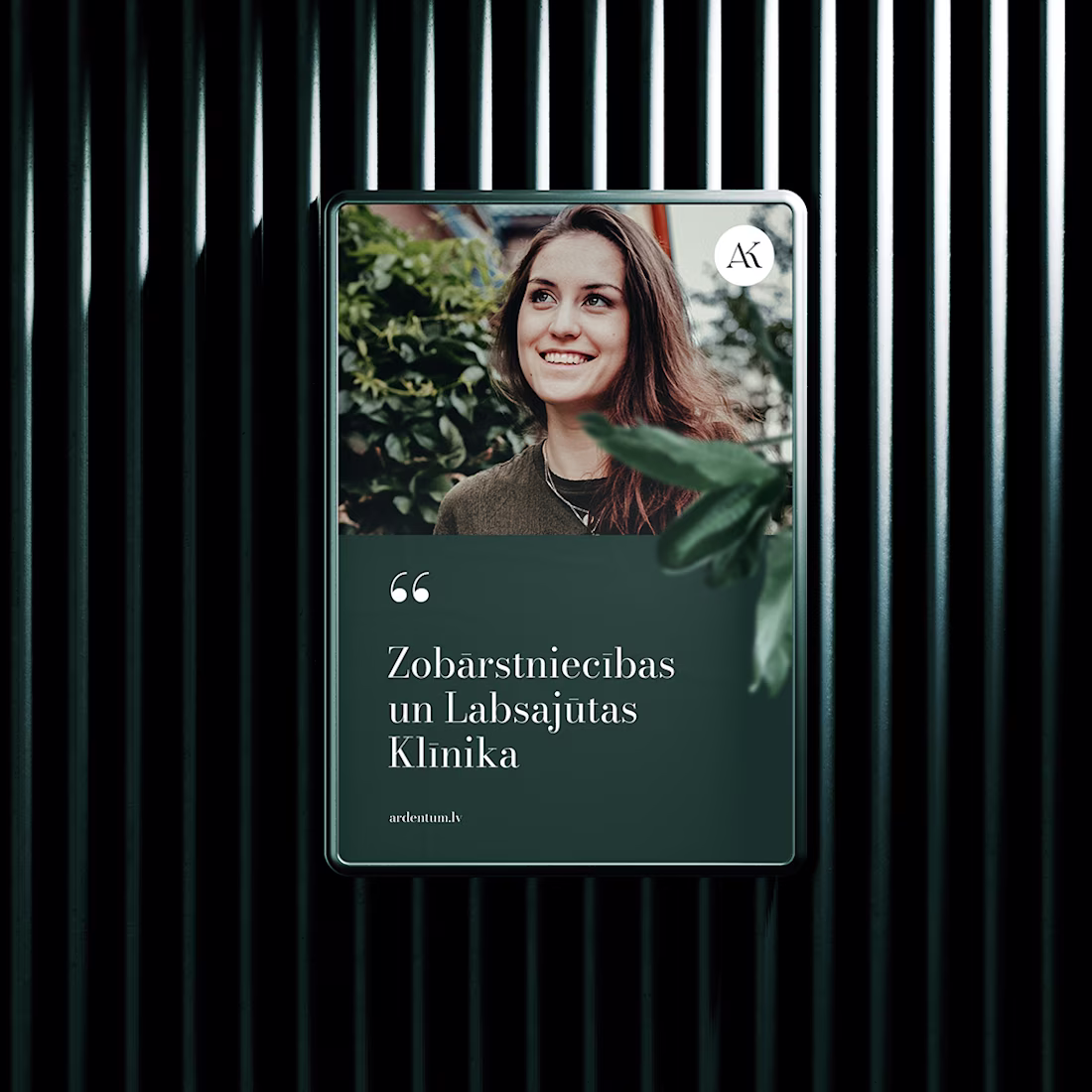
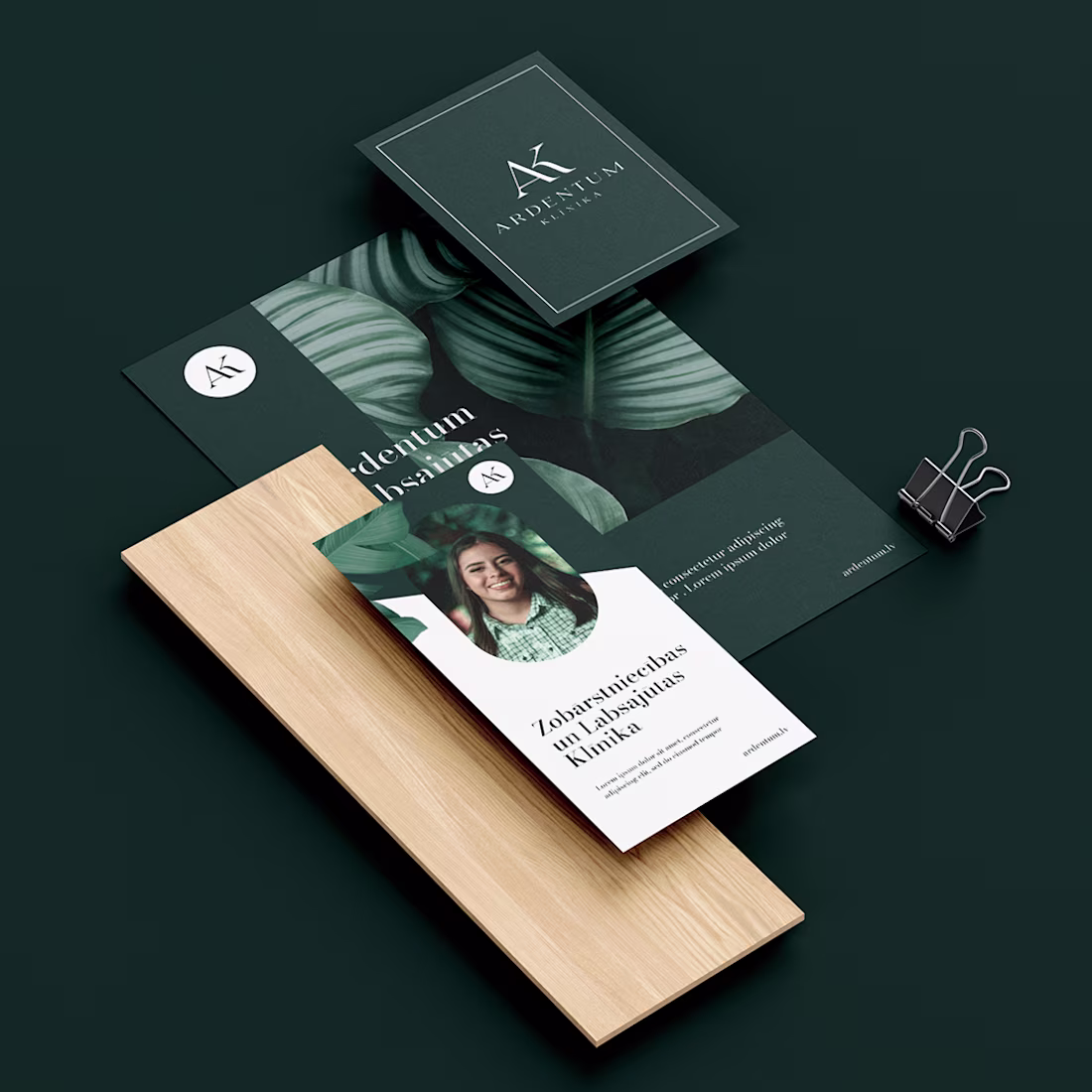
Brand identity created for a Riga based dental clinic. The goal was to develop a clean, contemporary visual identity that reflects professionalism, precision, and patient trust. The project included logo design, full brand system, and supporting visual assets, creating a distinctive identity with a consistent presence across both digital and print applications.
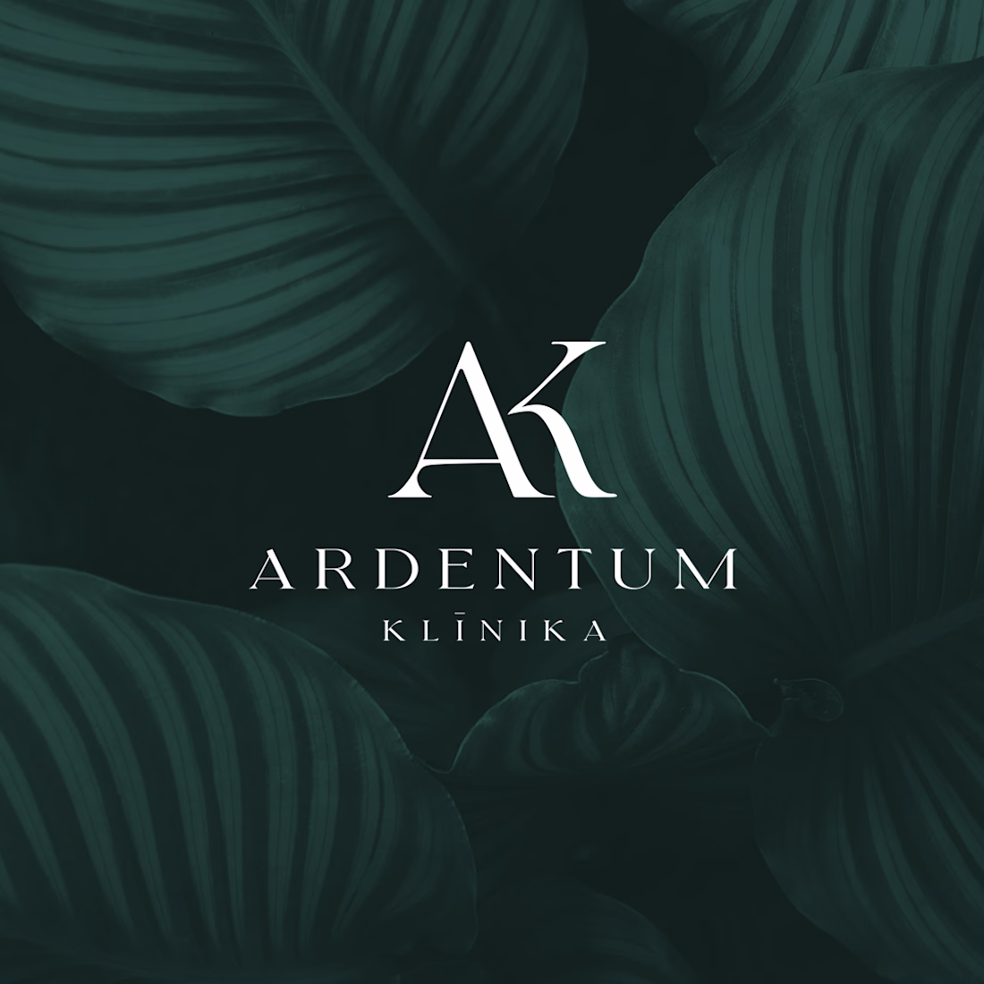
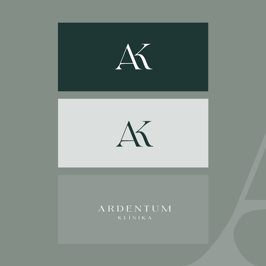
That deep green and the AK monogram feel premium without tipping into cold or clinical, hard balance to strike for healthcare branding. Did the clinic have existing brand equity you had to work around, or was this a clean slate?
For the #envatochallenge, I created AMARÉLLA using Envato Elements as my master toolkit. Here is how my human choices elevated the AI:
- The Logo: I used Envato Fonts for inspiration, then customized the letters with organic, leaf-like curves over a raw circular stamp to give it a human touch.
- The Packaging: The first flat box dieline had messy, clashing text. I redesigned it by adding clean panel lines, turning the product name sideways, and adding pretty plant drawings at the base for perfect balance.
- The Bottles: I rejected plastic and designed a heavy, custom stone-and-clay flask.
- The Videos: I used our Envato model photo as a reference and directed the AI to generate raw, slow-motion, black-and-white clips. Keeping the bottle quietly in the background allowed us to capture real, honest human emotion without issues.
- The Sound: I tied it all together with a warm, minimalist acoustic track from Envato Music.
- Toolkit: @envato Elements (Fonts, Stock Images, Music, Image Gen, Image Edit, and VideoGen)
Secondary Tools: Canva
My workflow
Trending
Claude
Claude has entered the design space. How are you using Claude Design?
Contra University
Learn from expert creatives how to earn more using next-gen AI tools.
creativeaiflow
Creative AI workflows are evolving. What tools do you use, and what are their strengths and weaknesses?
freelancerlife
Freelancer life is wins, pivots, and everything in between. What’s yours right now?