The network for creativity
Join 1.25M professional creatives like you
Connect with clients, get discovered, and run your business 100% commission-free
Creatives on Contra have earned over $150M and we are just getting started
Back to feedPost

Radacini – Long charmat
Packaging | Label Design | Visual Identity
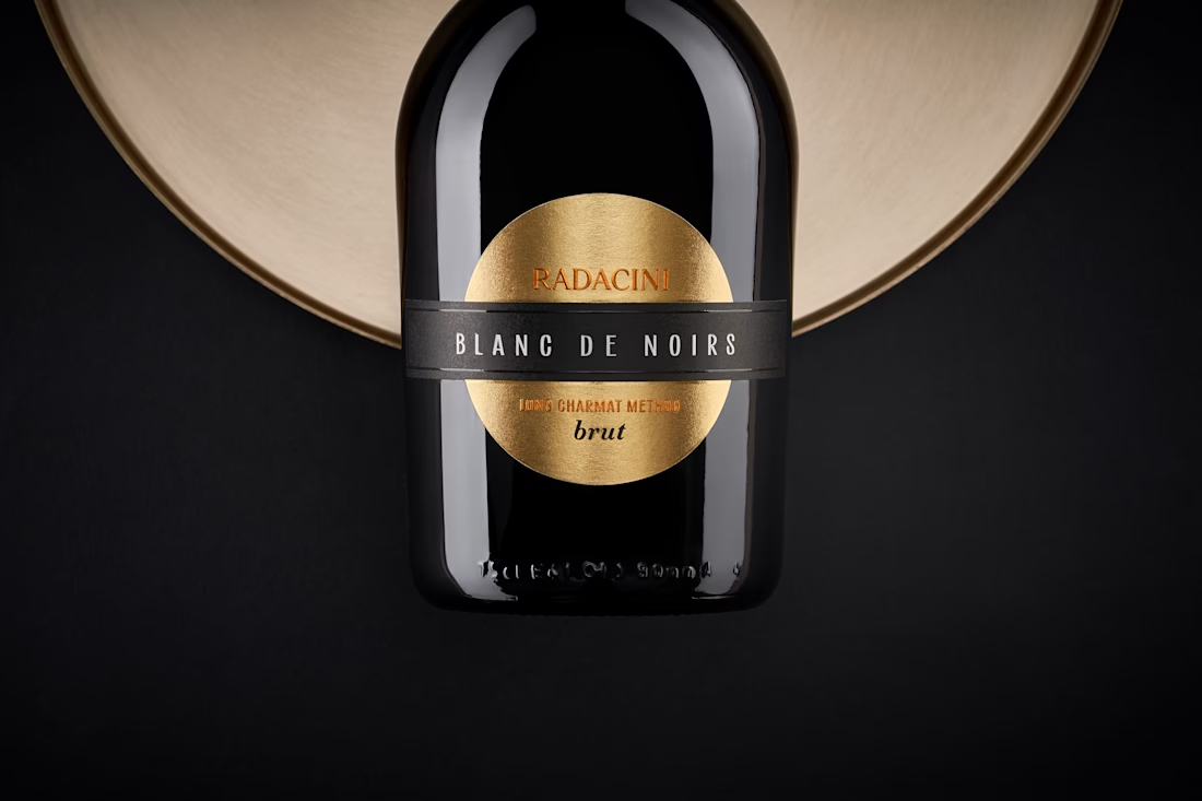
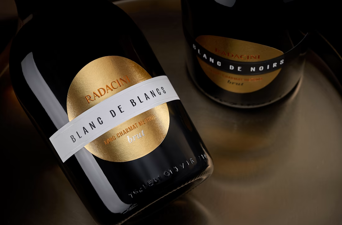
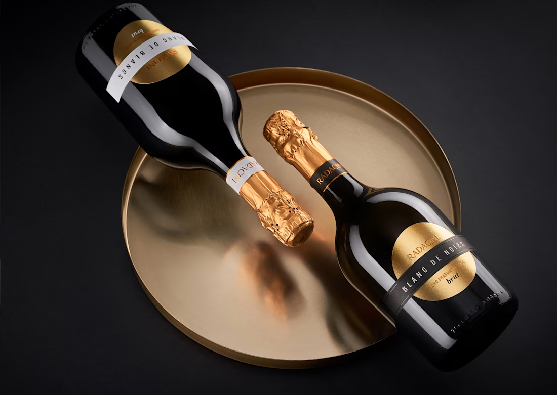
The design builds around the bottle’s shape — rounded, grounded, with a low center of gravity. It sets the tone for a visual language that’s minimal, structured, and quietly confident. Nothing here distracts from the form — instead, the elements work with it, highlighting proportions and keeping the overall composition clean and balanced.
The key visual accent is the gold foil — used both on the neck and echoed in the circular label. Set against a dark background, the metallic finish brings a sense of warmth and understated luxury without overwhelming the design.



Beautifully done!
The network for creativity
Join 1.25M professional creatives like you
Connect with clients, get discovered, and run your business 100% commission-free
Creatives on Contra have earned over $150M and we are just getting started




Related posts



Simple, clear, and brand-ready.

Which style wins for you? 🤔
We’re testing out two theme directions for Avenra’s dashboard component cards; featuring real-time spending breakdowns, project progress metrics, and time-off tracking.
Curious to hear your thoughts! 💬
8 voted
42%
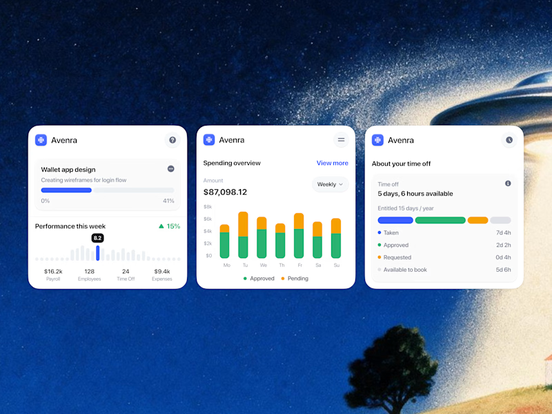
11 voted
58%
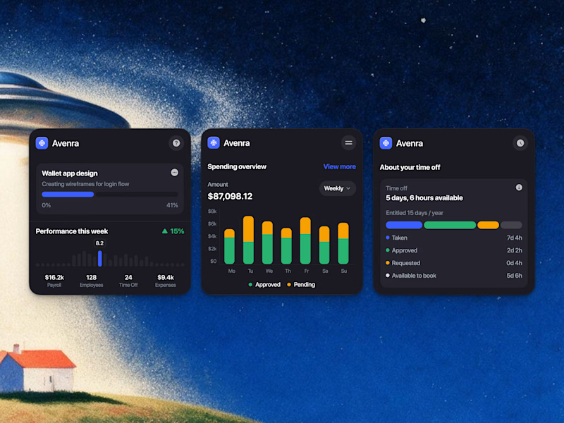
19 votes
Closed

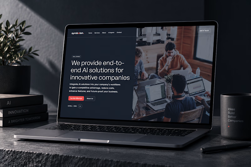
Which mockup would you choose?

6 voted
25%
18 voted
75%
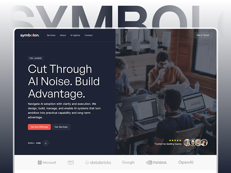
24 votes
Closed

Custom Figma showcases design better for sure! 👍