The network for creativity
Join 1.25M professional creatives like you
Connect with clients, get discovered, and run your business 100% commission-free
Creatives on Contra have earned over $150M and we are just getting started
Back to feedPost
Taste Test


The “mobile-first” approach is no longer an option.
A beautiful design for desktop computers does not automatically guarantee an excellent mobile experience. Good responsive design isn’t just about resizing elements to fit the screen; it’s about ensuring they function effectively.
In this comparison, both versions are based on an identical desktop layout. The only difference lies in how the content is adapted for smaller screens.
In one version, everything is simply scaled down.
In the other, the hierarchy, spacing, and composition have been reimagined to meet the needs of mobile users.
Now it’s your turn. 👇
Which mobile version would you choose – 01 or 02? Tell us why in the comments.


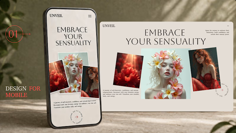
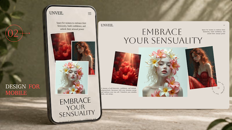
105 votes
Ends in 4h

Responsiveness is very important in design
It fits well on desktop doesn’t mean it’ll fit well on mobile

Both looks amazing but my vote for option 2

Serge I really like this style 🫠

Option 1

1 🙌

I went with 01. It reimagines the hierarchy for the small screen instead of shrinking the desktop, leading with the headline and giving one clear CTA, so a thumb-first user gets the message and the next step without pinching or hunting. Scaling down keeps the layout but loses the priority mobile actually needs.

option 1

This is so true, the prevalence of mobile internet has made the necessity of mobile first design unquestionable. Especially for websites with 3d elements, they must not only look good, but also they must load fast.

The first one wins this cos...the users matter most not the sizing as you pointed out earlier

How can i make this

I also change the order of actions on mobile, especially for local service sites. I move the booking or call action higher because many visitors arrive from Maps with one task in mind.

I choose option 1.


02

Option one seems correct because anyone can easily move forward by clicking on the (Arrow) @Serge Herasymchuk

option 2
option 2

For me option 2 is better but with the heading at the top instead.

Option 1 gets my vote! It actually feels like it was built for the user's thumb, rather than just squeezed into a smaller frame. Spot on about true responsive design.


Option 1

Option 1 looks good with hierarchy and structure

I choose on Option 2

1 is amazing
The network for creativity
Join 1.25M professional creatives like you
Connect with clients, get discovered, and run your business 100% commission-free
Creatives on Contra have earned over $150M and we are just getting started
Trending

Claude
Claude has entered the design space. How are you using Claude Design?

Contra University
Learn from expert creatives how to earn more using next-gen AI tools.
creativeaiflow
Creative AI workflows are evolving. What tools do you use, and what are their strengths and weaknesses?
freelancerlife
Freelancer life is wins, pivots, and everything in between. What’s yours right now?












Related posts

Bit hard to choose which look more appealing? 🤔

24 voted
50%

24 voted
50%

48 votes
Closed

Hero 1 for me

🌿 Which OPTIMA design grabs your attention?
Vote for your favorite and tell me why! 👇
🟢 01 – Botanical Calm 🌼
🟢 02 – Creamy Soy 🥛
Your feedback helps shape better designs. 💚
25 voted
31%
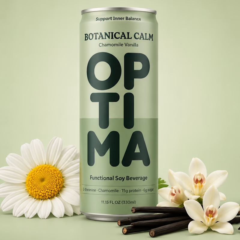
56 voted
69%
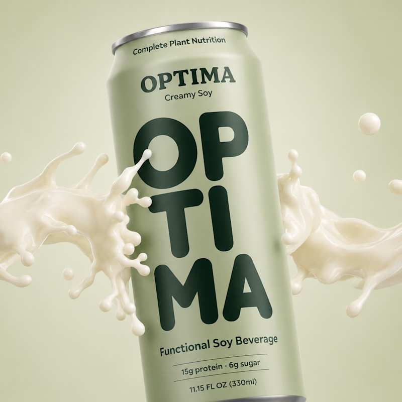
81 votes
Closed
Gopi I love this style 😍

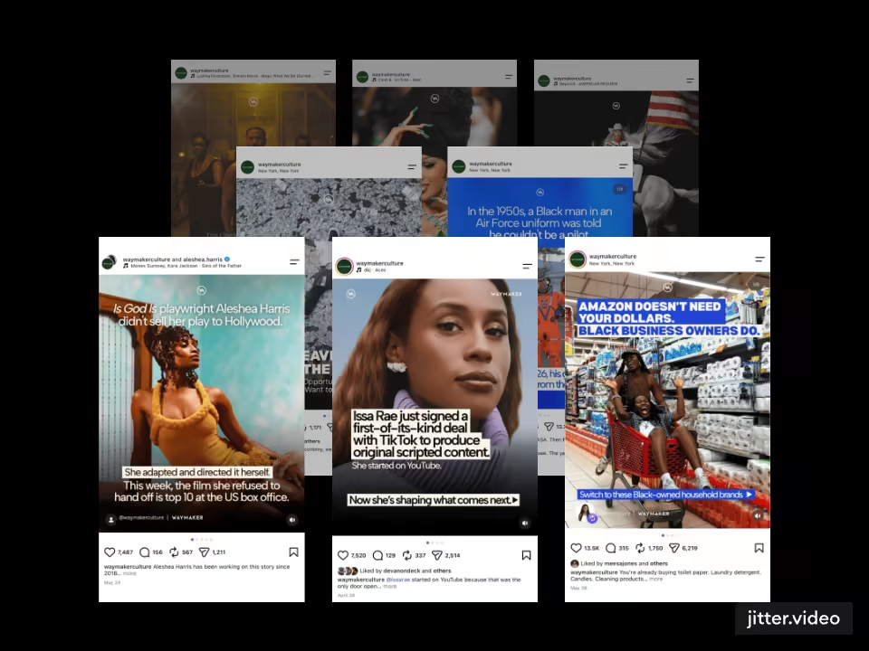
can you tell the difference in quality between this jitter.video portfolio cover i created for an upcoming case study?
if so, choose which 👀 i'm curious to hear! i don't think i can see a difference.
48 voted
79%
13 voted
21%
61 votes
Closed

Will go for mp4 because the quality of gif is not that good as i can see from here