The network for creativity
Join 1.25M professional creatives like you
Connect with clients, get discovered, and run your business 100% commission-free
Creatives on Contra have earned over $150M and we are just getting started
Back to feedPost
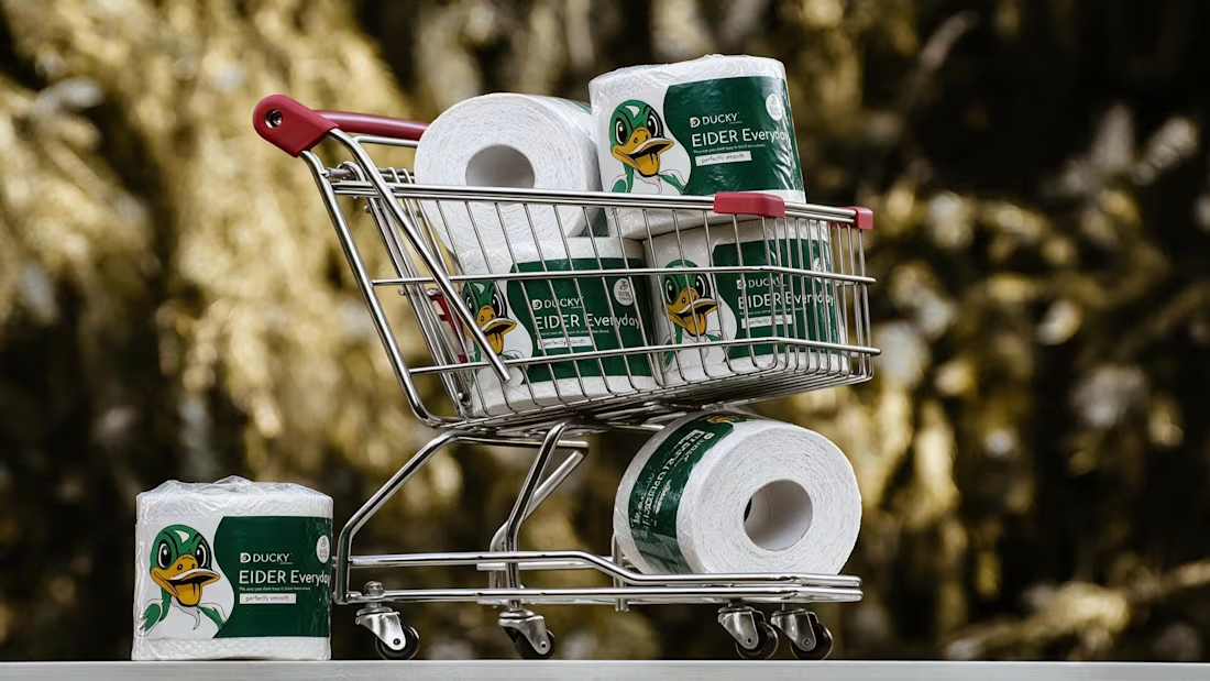
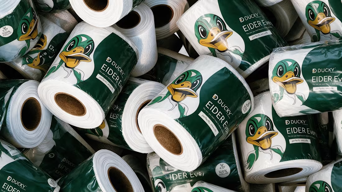
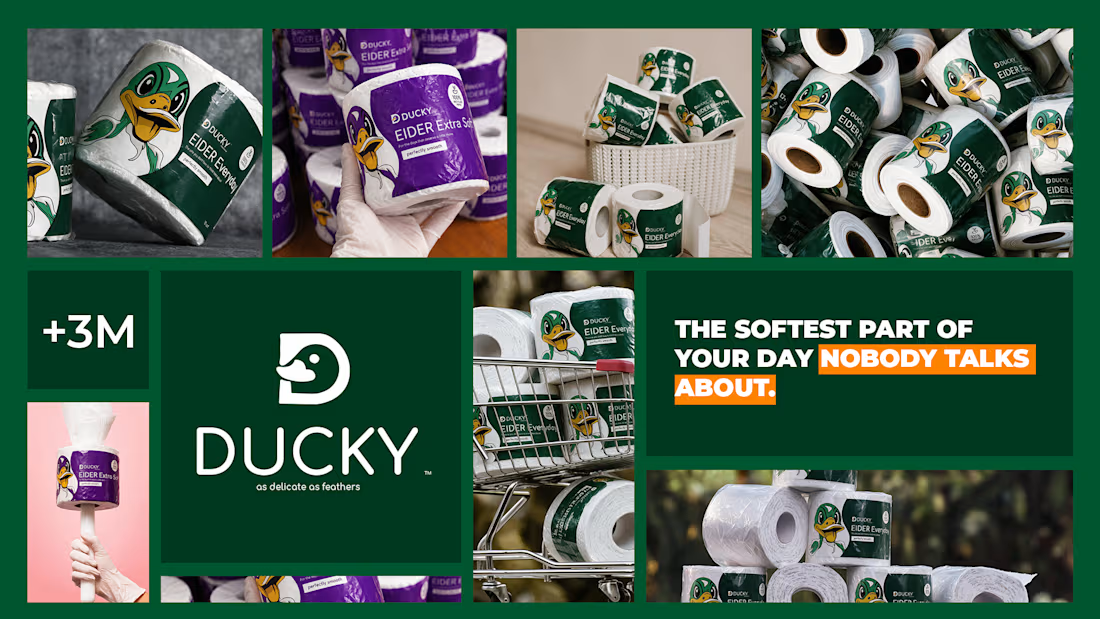
The softest part of your day nobody talks about 🦆
Spent the past week designing EIDER — a toilet paper brand built on a simple bet: even the most overlooked product in the house deserves real design attention.
No cartoon mascots. No literal bathroom jokes. Just calm pastel tones, restrained typography, and a quiet geometric duck mark — named after the eider duck, source of the softest down there is — that rewards a second look instead of shouting for one. 🪶
Sometimes the funniest thing a brand can do is take itself seriously.



So cool!!

Thanks!

obsessed with the duck packaging! love how you avoided bathroom clichés and went for calm pastel, feels so premium for toilet paper. the cart shot is genius
That was the plan, I wanted to do something different than usual. And since I had never seen a duck on a package like that, I thought why not :D

Amazing work
Thank you!

I never see a toilet paper brand like this thats incredible 🎉🎉🎉
That's what I meant :D

Love the branding, it’s clean, balanced, and easy to follow.
Thank you!
The network for creativity
Join 1.25M professional creatives like you
Connect with clients, get discovered, and run your business 100% commission-free
Creatives on Contra have earned over $150M and we are just getting started





Related posts




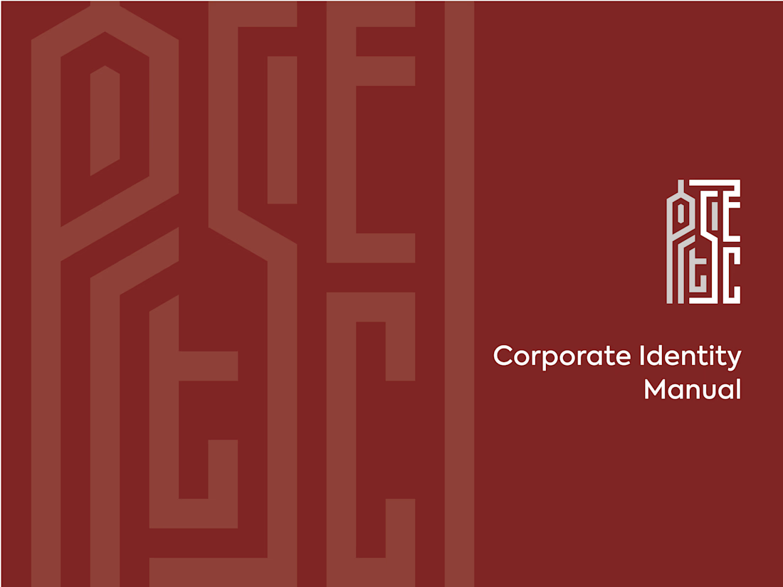
ARTSEC is an art investment platform focused on making African contemporary and indigenous art more accessible to collectors and investors.
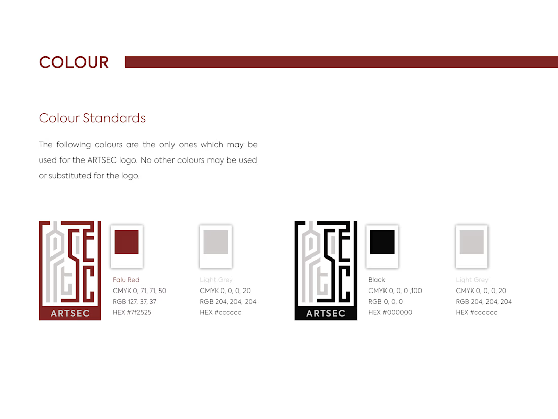
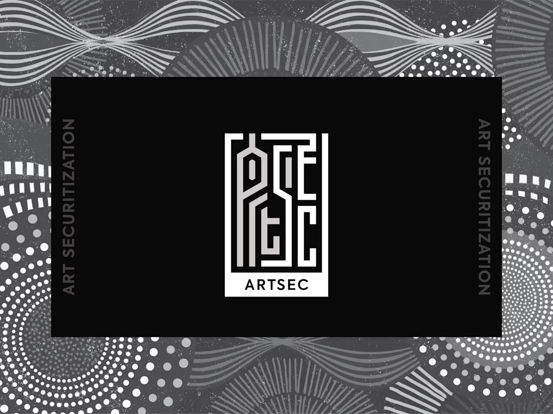
I developed a complete visual identity system for the brand, including the logo, colour palette, typography and usage guidelines.
The identity was designed to give ARTSEC a distinctive, consistent visual presence while reflecting its connection to African art and culture across print and digital applications.

Can't stop looking at this! 😍


New case study: motion product film for a mobile streaming app. Some shots filmed on camera, some AI generated, the rest built in After Effects
Check it out


This is only high end