The network for creativity
Join 1.25M professional creatives like you
Connect with clients, get discovered, and run your business 100% commission-free
Creatives on Contra have earned over $150M and we are just getting started
Back to feedPost
Shared Ground | Brand Identity Concept
Brand concept by Less Mundane
Shared Ground is a walking community 🚶🏽built around openness, inclusion, and belonging. A simple idea: shared movement creates shared connection.
The identity was designed to feel rooted, engaging, and welcoming, using emotive, connection-led colour and open typography to reflect community and shared space.
A brand system intended to live naturally across social, signage, apparel, and digital touchpoints.
Role: Brand Identity, Art Direction
Focus: Community branding, visual systems
Graphic DesignSocial Content DesignbrandingbrandbrandingstudioBrand DesignArt DirectionCreative DirectionAdobe After EffectsAdobe IllustratorAdobe Photoshop


weldone

Thank you!
The network for creativity
Join 1.25M professional creatives like you
Connect with clients, get discovered, and run your business 100% commission-free
Creatives on Contra have earned over $150M and we are just getting started



Related posts

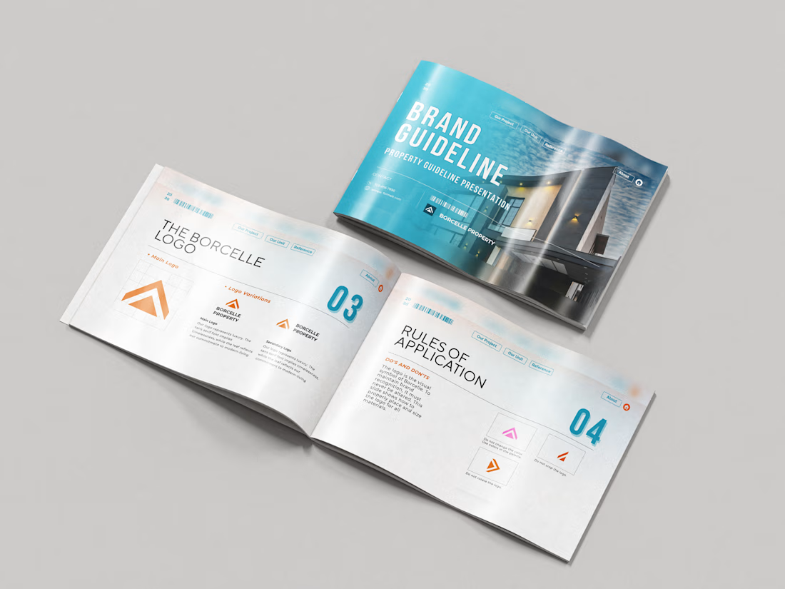
Just wrapped a brand identity concept for Haven Ridge Properties, a real estate developer selling to first-time buyers and investors.
The challenge: feel premium without feeling cold.
The answer was two ideas shelter and growth.
The mark is a roofline that doubles as an upward arrow: home and long term value in one symbol.
What's inside the guidelines:
• Primary and secondary logo lockups
• Logo usage rules
• Typography system
• Colour palette with clear roles
• Imagery direction
• Digital and print applications
Which detail stands out most to you?
#branding #brandidentity #logodesign #brandguidelines #realestate

Absolutely goated


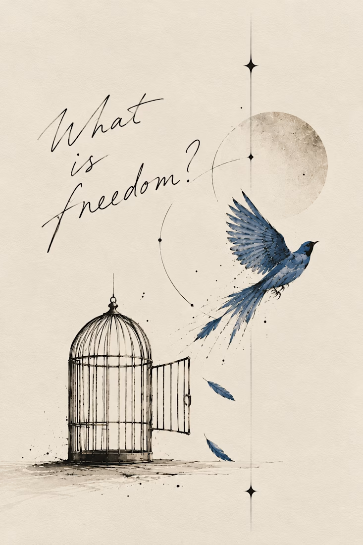
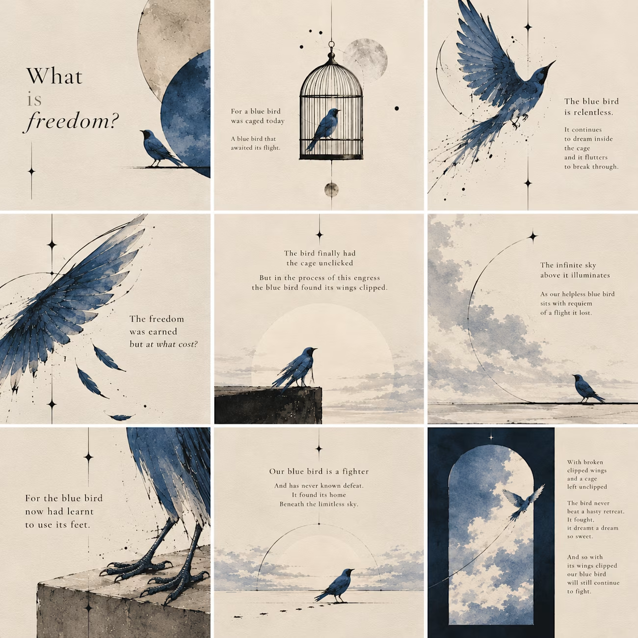
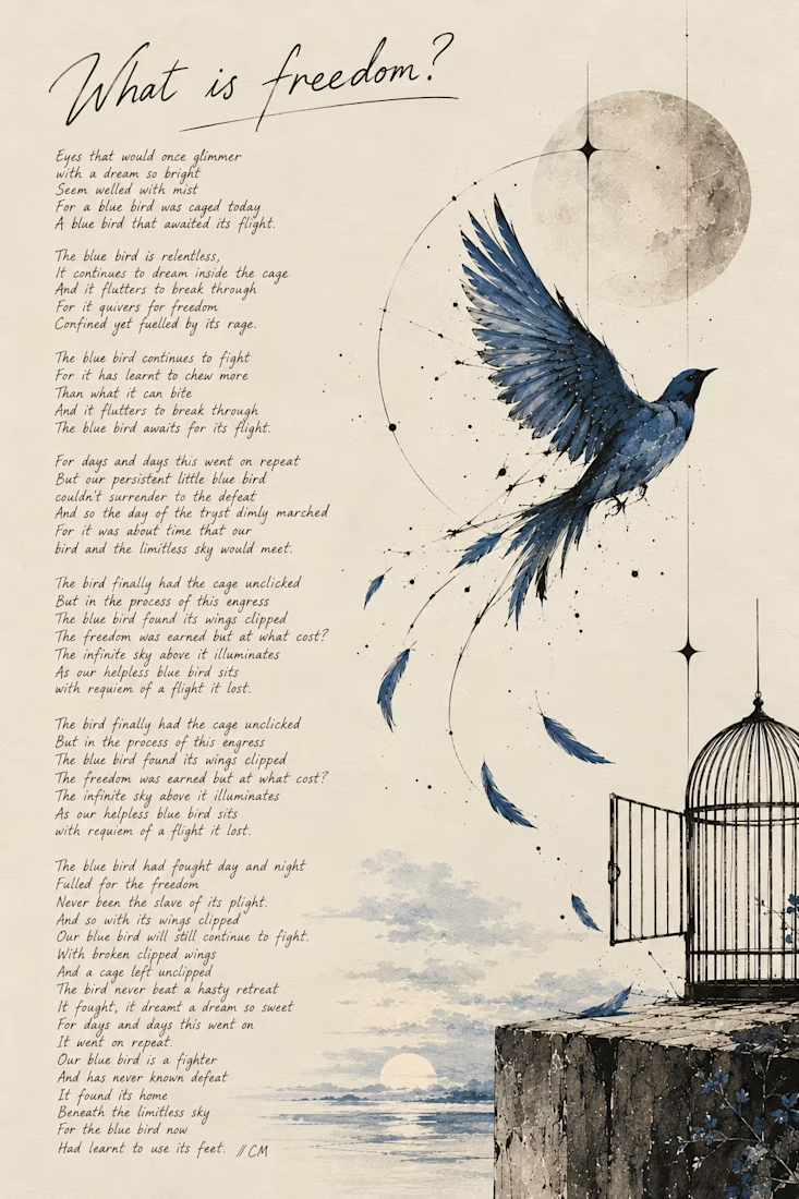
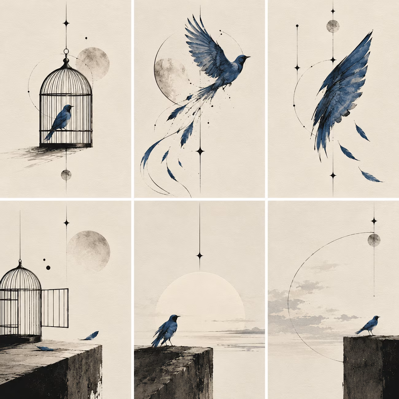
What happens when a poet picks up a pen and remembers she likes to sketch too:)
I write poetry over at @words.bycm on IG and since Inktober is here, I thought it was time to let that side of me out of its little corner of Instagram.
This is 'What Is Freedom?', a poem I wrote...

Kudos to you, you've really done a great work.

The era of custom brand systems is here.
I’ve been building systems that make it easy to tweak, adapt, and evolve brand assets without starting from scratch every time.
Here’s a little preview of one I’m working on 👀

Nice work ,i like it 💖