The network for creativity
Join 1.25M professional creatives like you
Connect with clients, get discovered, and run your business 100% commission-free
Creatives on Contra have earned over $150M and we are just getting started
Back to feedPost
Taste Test



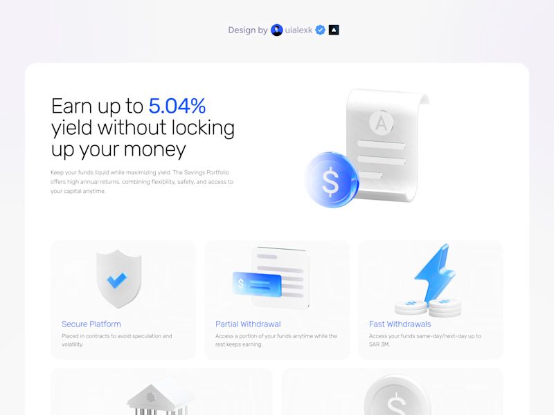
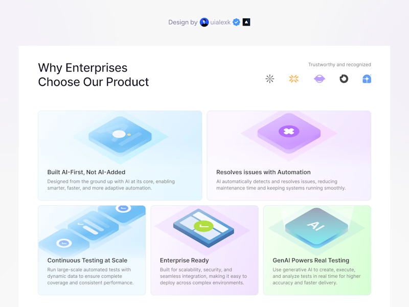

3D version


Personally, wouldn't say one is better than the other as far as it's on brand, they both look good. However, I prefer the card typography on the 3D version, much cleaner setting.

3d ig

Both are equally good but I do like the illustrations in 2D and the typography in the 3D

I think this is two entirely different directions. First says more fintech and gives a serious+trustworthy vibe. The second gives a playful vibe. Second option also makes me think it's for a community-centered brand, like Polkadot. Probably not close to each other visually, but my mind went there.

Really smart interactive pacing built into this structural bento layout comparison poll.


3D bento grid


The right one feels richer and more appealing thanks to its color palette 🙌

2d one is looking good to me due to background colour of card, you may try similar approach for the 3d option also.

going with 3D bento grid

3d


I would say the 3D version is better, but the borders aren't really visible. Right now we(I) can't really see that it's a grid, but if you put a faint stroke around each element on the 3D version, it'll be much better than the other one. My take😊

Wow theoretically you wouldn't believe that you're going to like a 2D design over a 3D one (which actually makes the answer "it depends" more accurate :))) but for this one, I liked 2D more, even though both are good! 😊👍


3D bento grid

Both look good

2D bento grid, because illustrations and typography are clearer and more visible in it. It seems everything is well balanced. Good job!

3D Bento looks simple, great, easy to fathom, organized and certainly not overwhelming at all in comparison. The one on the right is quite template-ish and from my POV I just subconsciously skipped focusing the subtexts. Also the subtle blue accent is just as elegant as it can...

I feel 3D cos, based on what I have seen in the fintech industry it is premium looking it has 3-4 colours in its palette.
Awesome work btw🙌 💯


2D for me!

Love the 2D bento grid better
The network for creativity
Join 1.25M professional creatives like you
Connect with clients, get discovered, and run your business 100% commission-free
Creatives on Contra have earned over $150M and we are just getting started








Trending

Claude
Claude has entered the design space. How are you using Claude Design?

Contra University
Learn from expert creatives how to earn more using next-gen AI tools.
creativeaiflow
Creative AI workflows are evolving. What tools do you use, and what are their strengths and weaknesses?
freelancerlife
Freelancer life is wins, pivots, and everything in between. What’s yours right now?
Related posts

Bit hard to choose which look more appealing? 🤔

24 voted
50%

24 voted
50%

48 votes
Closed

Hero 1 for me

Giving a fresh feel to my client's website with @Envato at the forefront of my workflow. 👩🎨🍋
Combining my client's brand design and creative assets from Envato, I animated the product using Envato's AI toolkit.
AI is still falling short on delivering a stand alone hero-section-ready output, this is where the human creativity comes in.
AI video was good but flat so I layered in depth, image and texture I got from Envato, giving it fresh, creative, brand-aligned look the raw AI output could not deliver.
Is "technically good", "actually good"?
I think it's a distinction AI can't tell. What do you think?
See the full workflow and the part AI can't deliver in the video. 🎬

Agree with the distinction. Technically good usually means the output is coherent and error free, actually good means it fits the brand and makes the client's product feel like theirs. That second part is still very much a taste call, not something a model can judge for itself yet.


really clean