The network for creativity
Join 1.25M professional creatives like you
Connect with clients, get discovered, and run your business 100% commission-free
Creatives on Contra have earned over $150M and we are just getting started
Back to feedPost
Taste Test


Which color palette feels more masculine to you?
16 voted
15%
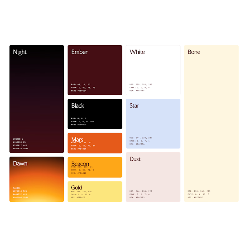
94 voted
85%
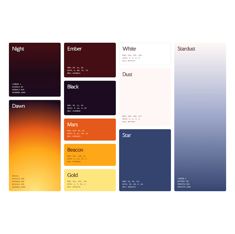
110 votes
Closed


If we're talking about masculinity, then I'd say #2, but visually, #1 speaks to me more. Arina, I'm also holding a poll right now—I'd appreciate your vote: https://on.contra.com/LPRLm9

2 is more powerful 🔥🔥


Aryna, #2 reads more masculine to me — not because of a cliché dark navy, but because the slate and grey swap out the cream and pastels and the whole system loses its sweetness. Masculinity in a palette usually comes from restraint and value range rather than a blue swatch, and...

don't know why but the 1st one doesn't suits with that light tint, the 2nd one looks really good

Slide A.


#2 for me. That deep navy at the end changes the whole set and makes it feel more grounded and heavier.

I choice is 1

2


2 feels more premium


#2 100%


Hey Aryna! A big fan of your design works, following you in X for a while! Saw there a new color pallete and I love it!
Mulțumesc! La fel :)

Well #2 looks perfect 👍

#2 for me, and the Stardust column is what decides it. In #2 the deep navy gives the warm Ember, Dawn and Mars oranges a place to sit, so they read as accents instead of the whole story. In #1 the Bone column is lovely, but it softens the set and makes it feel more editorial...
The network for creativity
Join 1.25M professional creatives like you
Connect with clients, get discovered, and run your business 100% commission-free
Creatives on Contra have earned over $150M and we are just getting started






Related posts

two brands, one tiny taste test.
would you rather look through an Oriel or answer a Calling?
winner gets the full brand. reply with your pick.
35 voted
85%
6 voted
15%
41 votes
Closed

The biggest misconception about branding is thinking it's just a logo. What actually saves founders time and money later is a compact system a focused 2–3 color palette and clear sub-brand rules so every new deck, social post, or product launch looks cohesive without starting from scratch.

Lime Cream or Peach Fuzz? 🍋🟩🍑
Two animated isometric sets — same system, different mood. Cast your vote 👇
68 voted
78%
19 voted
22%
87 votes
Closed

Lime Cream. The dark linework pops more on it.

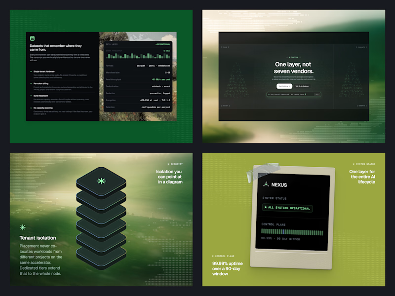
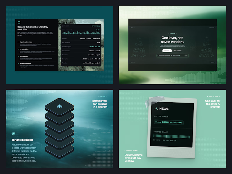
Same Nexus layout, two color moods. 🎨
A: Forest Green 🌿 feels fresh, natural, and calm.
B: Ocean Teal 🌊 feels cool, deep, and techy.
Which one are you picking? Drop A or B below! 👇
#ColorExploration #UIDesign #BrandColor #DesignPoll
0 voted
0%
2 voted
100%
2 votes
Closed
B, Ocean Teal. It sits more calmly against the dark panels, the green gets a bit loud.