The network for creativity
Join 1.25M professional creatives like you
Connect with clients, get discovered, and run your business 100% commission-free
Creatives on Contra have earned over $150M and we are just getting started
Back to feedPost
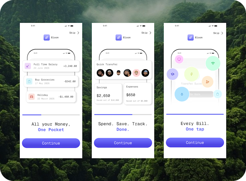
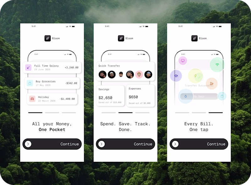
Taste Test
Bloom — Finance App Onboarding UI
A 3-screen mobile onboarding concept for Bloom, a personal finance app designed to help users track income, send money and manage bills — all in one place.
What I focused on:
— Reducing cognitive load across the onboarding flow
— Building a consistent visual language with a single brand accent color
— Writing punchy, benefit-driven microcopy that respects the user's attention
— Designing for trust — finance apps live or die by how safe and clear they feel on first impression
Deliverables: 3 onboarding screens, component system, typography hierarchy, color system
Tools: Figma
Available for fintech, Web3 and AI product design projects.
Let’s work together →....By the way which do you prefer?
8 voted
36%
14 voted
64%
22 votes
Closed
People are seeing minimalistic screens enough I'd say, since the colorful one still accessible, looks corporate & pro, and does the job in a better way, I'd say colorful one is better 👍
I'll choose colorful
The minimalist design has a calm, clean look, and the onboarding information doesn’t compete for attention. Everything feels well-balanced and easy to follow
Super work
The network for creativity
Join 1.25M professional creatives like you
Connect with clients, get discovered, and run your business 100% commission-free
Creatives on Contra have earned over $150M and we are just getting started
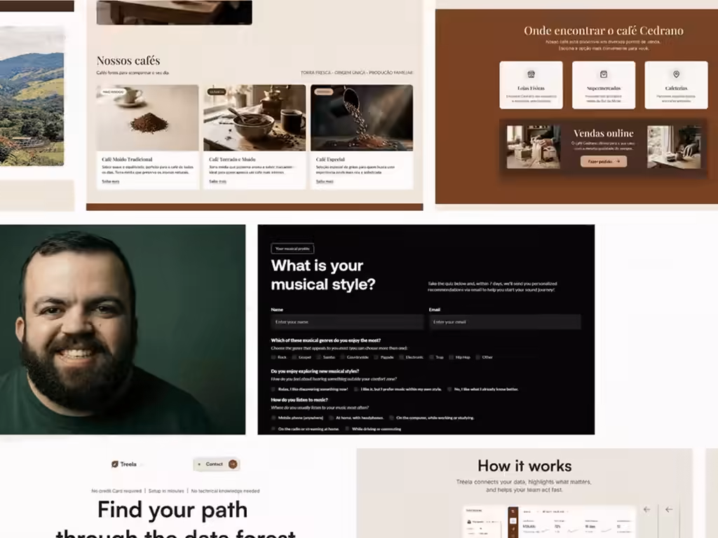
Related posts
Here's your contra post content for the SideQuest Social Feed:
What if your social feed wasn't just content to scroll but challenges worth actually doing?
We designed the SideQuest activity feed and messaging system, a gamified social experience that turns friend activity into motivation, nearby events into missions, and conversations into the starting point for real-world plans.
The design problem we solved: most social apps separate discovery, activity, and messaging into three completely different experiences. The result is an app people open out of habit, not intention.
What the design does instead, three screens, fully connected:
Activity feed that shows what your friends are actually doing: Alex completed a 3.8 km morning run and earned +120 XP. Sarah joined the Sunset Rooftop Meetup at 6:30PM with 8 people. Every card has a direct action, Try Challenge or Join Event, not just a like button.
Activity detail screen that turns a 5K morning run into a complete mission brief: distance, time, XP reward, coin drop, host profile, rival challenge system, and a single Start Run CTA that removes every reason not to go.
Messages screen that connects the social layer, Meet-up 2026, Party Night, and Ronald Richards confirming tomorrow at 9PM, all organized by All, Unread, and Groups with real conversation context visible without opening a thread.
My design decision: Map, Social, and Chats in the bottom nav aren't three separate apps. They're three layers of the same gamified world and the design makes that feel true from the first tap.
What feature would you add to make a social fitness app actually stick? 👇
Love the vibe of this one.
When someone has an audience as strong as Nina Talks, every digital touchpoint shapes perception.
Nina is a Brazilian creator with more than 100k followers, but I felt her link page didn’t reflect the level of authority and personality she already communicates through her content.
So I created a redesign concept exploring a stronger digital presence.
After seeing the project, she reached out to thank me for the attention and care behind the redesign.
She didn’t end up using my concept, but it helped her realize how much her old link page was limiting her positioning, which later led her to make a significant improvement to the experience.
The first image is her old link page.
The second is the redesign concept I created.
Which one is better?
1 voted
13%
7 voted
87%
8 votes
Closed
Nice!
Hey, I’m Rafael.
I’ve always been obsessed with how perception works on the internet.
Why some brands instantly feel premium.
Why some websites create trust in seconds.
And why small design decisions can completely change how people see a business.
Excited to share more work here. 👋
Trending
Claude
Claude has entered the design space. How are you using Claude Design?
Contra University
Learn from expert creatives how to earn more using next-gen AI tools.
creativeaiflow
Creative AI workflows are evolving. What tools do you use, and what are their strengths and weaknesses?
portfolioreview
The best portfolios tell a story, not just show a grid. Share yours for feedback.
freelancerlife
Freelancer life is wins, pivots, and everything in between. What’s yours right now?