The network for creativity
Join 1.25M professional creatives like you
Connect with clients, get discovered, and run your business 100% commission-free
Creatives on Contra have earned over $150M and we are just getting started
Back to feedPost

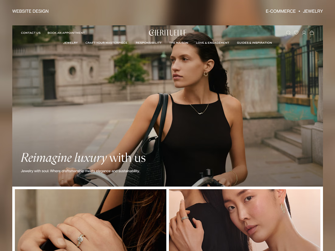
💍 One of my favorite e-commerce projects I’ve worked on.
Projects like this remind me how much good layout matters. Sometimes the best design decision isn’t adding another section—it’s knowing when to simplify, let the visuals lead, and create space for the brand to speak for itself.
The full case study is on my profile ✨


so gorgeous!

great job!
The network for creativity
Join 1.25M professional creatives like you
Connect with clients, get discovered, and run your business 100% commission-free
Creatives on Contra have earned over $150M and we are just getting started









Related posts

From the cover to what’s inside 👀
Thank you to everyone who voted in my cover test. This time, I’m trying two short previews of DCS 654: my library of 654 dessert-inspired colors and matching textures, with ready-made palettes for your own design work.
Which video makes you more curious to explore the library: A or B?
And what made you choose that one?
You can take a closer look here: https://dcs.mariya.design/
36 voted
61%
23 voted
39%
59 votes
Closed


I’d pick B. It makes the colors and textures feel more engaging and makes me want to explore the full library.


Hourfield is a 16-second 16:9 launch film for products that organise people's time: calendars, schedulers, booking and reservation apps, planners. Retype a few short lines, drop in your logo and rename the calendar's days and tiles (meetings, table bookings, classes, shifts): the week re-plans itself on screen and the film lands on your logo lockup. Our second version, Maréva, a fictional table-booking app, turns the working week into an evening of reservations on the same animation and timing.
Built end-to-end through the SVGator MCP server. The calendar that re-plans its own week, the orbit that swirls into a single dot and the lines centred by their real letter shapes (fonts measured, not eyeballed) were computed in Python and written straight into a live SVGator project as 780 editable keyframes; I directed every note and finished it in the canvas. Maréva was made the same way, on the same timeline. Everything stays a real layer: 50 live text layers, named elements (headline, logo, product-name, tagline) and one logo image animated in two moments.
Yes, there is a lot to edit: every line of the story, a whole week of calendar tiles, a palette in nine roles. A full rebrand takes longer than five minutes, and that is the honest trade: it shows how much a single SVGator file can carry, and how MCP makes a detailed, story-driven film practical to re-make, not just to watch.
Links:
▶ Template (SVGator)
▶ Demo video, A → B


Love the smooth flow and the text animation! Good luck!

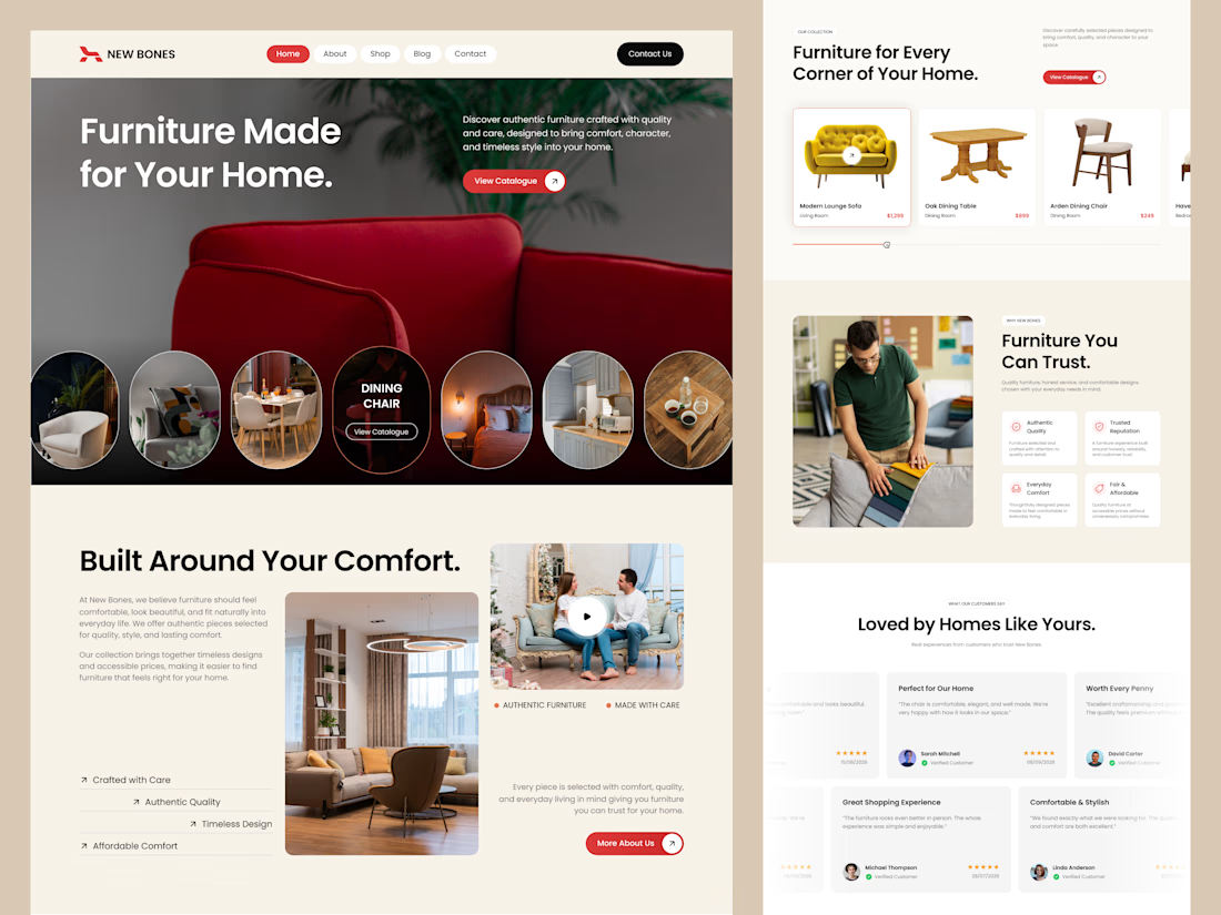
Excited to share my latest design project: New Bones 🛋️
New Bones is a furniture e-commerce landing page designed to make discovering home items and exploring decor trends completely seamless. The main focus was to break down complex online shopping layouts into a clean, minimal, and frictionless user journey.
From smooth product slider discovery to a transparent trust badge flow, every section is crafted with close attention to clear visual hierarchy and layout consistency.
Check out the full UI/UX case study here! 👇

Nice focus on simplifying furniture discovery!