The network for creativity
Join 1.25M professional creatives like you
Connect with clients, get discovered, and run your business 100% commission-free
Creatives on Contra have earned over $150M and we are just getting started
Back to feedPost

A few weeks ago, I shared a little preview of this project here and it received so much love from the community. I really appreciate all the support 🤎
The full case study is now live. You can see the process behind this homeware brand identity and the development of a timeless visual world for a lifestyle brand.
Hope you enjoy exploring it!
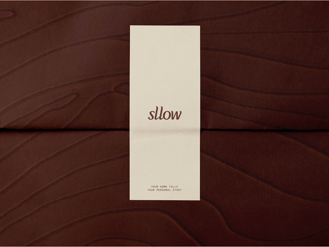

calming, classy & tasteful.
Thanks!


been waiting for this one
Worth the wait? 👀😊 Thank you!

The paper texture on that card almost reads tactile through the screen, that's not easy to pull off in a flat mockup. For a homeware brand built around timeless, how do you keep the identity from just looking dated in five years instead?
For me, making a brand timeless is about focusing on the brand expression rather than a specific trend or style that's popular right now. For the logo specifically, I try to avoid excess and keep the rest of the brand elements adaptable and meaningful enough to evolve without losing identity.

Great work
Thanks!

Looks premium.
Thank you!
The network for creativity
Join 1.25M professional creatives like you
Connect with clients, get discovered, and run your business 100% commission-free
Creatives on Contra have earned over $150M and we are just getting started







Related posts

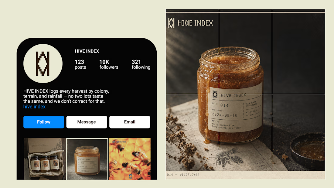
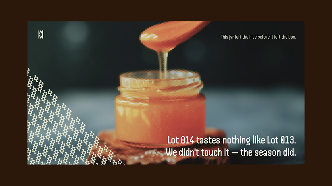
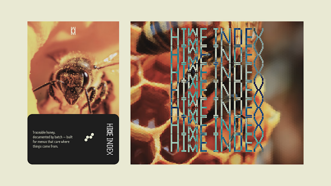
Most honey brands hide how much a jar changes harvest to harvest. I built HIVE INDEX to document it instead: specimen numbers, harvest dates, tasting notes logged like lab evidence, not marketing copy.
Case study's up.


PrettyClever designed the Maximize website and hired me to build it 1:1 in Framer. Check it out below.


the maximize site in framer looks so good. how long was the 1:1?


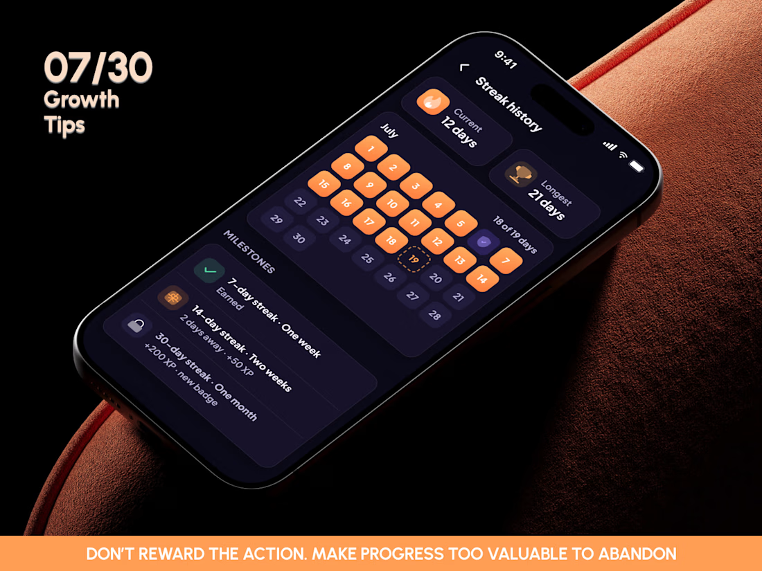
🎓 GROWTH TIP 07/30: DON’T JUST REWARD ACTIONS. MAKE PROGRESS TOO VALUABLE TO ABANDON.
Most learning apps treat gamification as a reward layer.
Complete a lesson → get XP.
Come back tomorrow → extend a streak.
Hit a milestone → unlock a badge.
Useful mechanics. But none of them creates retention on its own.
The stronger growth loop starts when every action makes the user feel like they’ve built something worth coming back to.
In this EdTech concept, a completed lesson doesn’t disappear.
It becomes part of a visible history.
History builds a streak.
The streak moves toward a milestone.
The milestone creates a reward.
And the next locked achievement creates anticipation.
Action → accumulation → anticipation → return.
That’s the difference between adding gamification and designing a progression system.
The goal isn’t to make learning feel like a game.
It’s to make accumulated progress feel valuable enough that leaving means walking away from something the user has already invested in.
The better question isn’t:
“How do we reward this action?”
It’s:
“How does this action increase the value of coming back?”
🔥 Streaks make consistency visible.
🏆 Milestones turn repetition into progress.
⭐ XP gives every session continuity.
🔒 Locked achievements give progress somewhere to go next.
One reward can create a moment.A connected progression system creates a reason to return.
#MobileDesign #GrowthUX #Gamification #EdTech #RetentionUX #ProductDesign #MobileApp #LearningUX #EngagementDesign #HabitDesign
👉 BOOK A MOBILE APP SESSION
https://calendly.com/asol_design/book-diagnostic-call-linkedin-clone


Excellent balance and structure. Keep up the great work!