The network for creativity
Join 1.25M professional creatives like you
Connect with clients, get discovered, and run your business 100% commission-free
Creatives on Contra have earned over $150M and we are just getting started
Back to feedPost
Taste Test

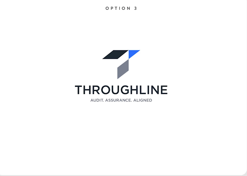
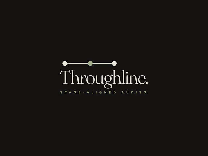
✨ Two directions. One brand. Which Throughline identity would you choose?
I explored two different approaches for Throughline, one bold, geometric & progressive, the other minimal, refined & sophisticated.
🔷 Option 1 — Geometric & Progressive
🌿 Option 2 — Minimal & Refined
Which one feels stronger to you? 👀
Vote below! 🗳️👇
7 voted
27%
19 voted
73%
26 votes
Closed


Love it option 1 is my choise


I’d go with Option 2. It feels more refined and timeless to me, especially for a brand like Throughline.

Second design is great and first color is nice

🌿 🌿

Option 2 looks great!

Option 2 feels more premium to me, that thin logotype has range across different applications. What's driving Throughline toward wanting two such different directions in the first place?


Love option 2 for it's simplicity

Both are looking really good, but my first choice is option 2.
The network for creativity
Join 1.25M professional creatives like you
Connect with clients, get discovered, and run your business 100% commission-free
Creatives on Contra have earned over $150M and we are just getting started







Related posts

AEROVA - Brand Direction
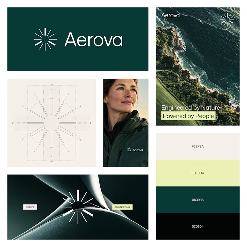
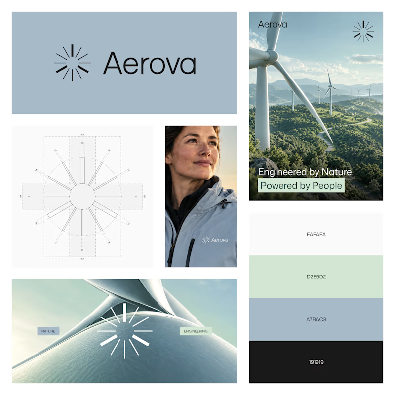
Exploring two visual directions for AEROVA, a wind-energy brand built around the idea of “Invisible force. Visible progress.”
Both directions use the same identity system, but create a different feeling:
Option A - Deep Green
Option B - Soft Blue
Which direction feels stronger for AEROVA?
27 voted
77%
8 voted
23%
35 votes
Closed

The soft blue palette feels more airy and closer to wind energy! Deep green is so overused in the energy industry so definitely option B.

A little design exploration for practice ✨
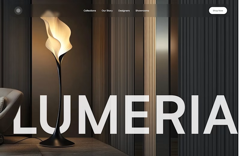
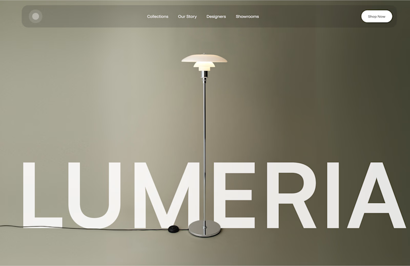
This time, I’m working on a concept for a lighting brand.
Which direction do you prefer?

74 voted
70%
31 voted
30%
105 votes
Closed
Atmospheric, for a lighting brand it feels almost unfair not to show the product actually doing its job in a real room. The minimal version reads more like a furniture catalog to me. Is Lumeria leaning toward a specific price point or market that would push this one way or the other?

Two directions. One product. Which one would you choose? 👀
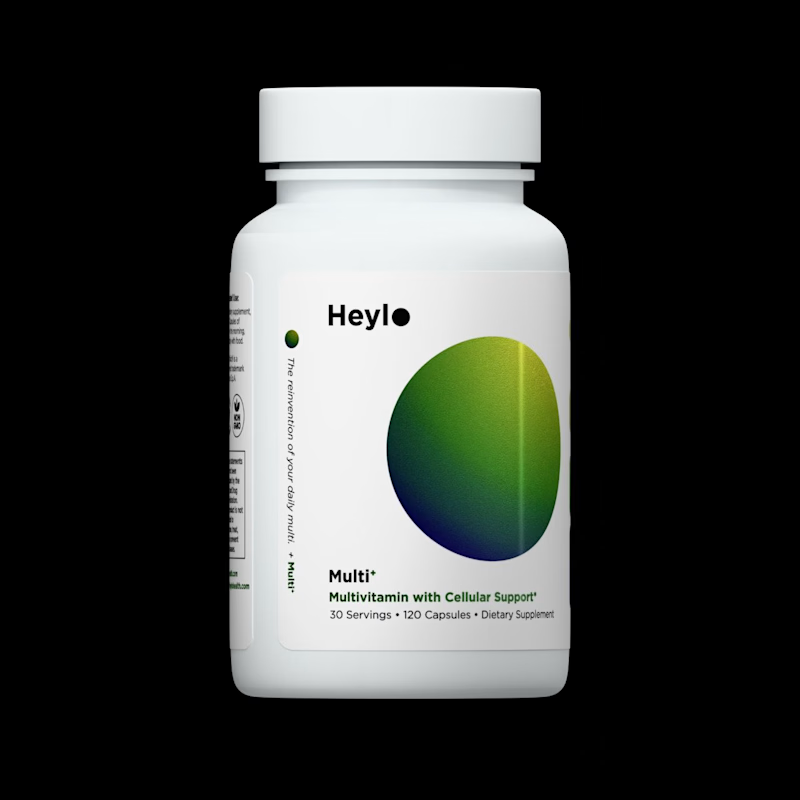
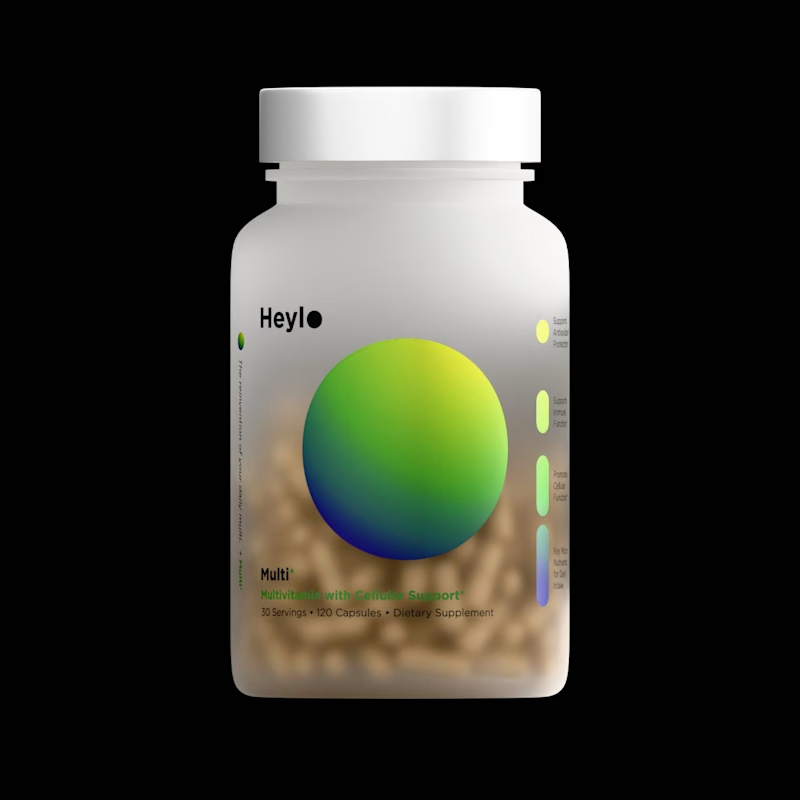
I created these 3D model for a Heylo supplement product, while exploring two different ways to present the same product.
For Image A,
Minimal background, controlled lighting, strong focus on the packaging.
For Image B, I
Added depth, atmosphere and visual context to make the product feel more like a campaign shot.
The buyer ended up going with A.
But I'm curious...
Which direction would you choose for a supplement brand?
A or B? 👇
7 voted
64%
4 voted
36%
11 votes
Closed
