The network for creativity
Join 1.25M professional creatives like you
Connect with clients, get discovered, and run your business 100% commission-free
Creatives on Contra have earned over $150M and we are just getting started
Back to feedPost
Taste Test
A little design exploration for practice ✨
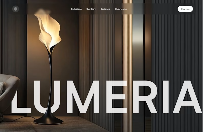
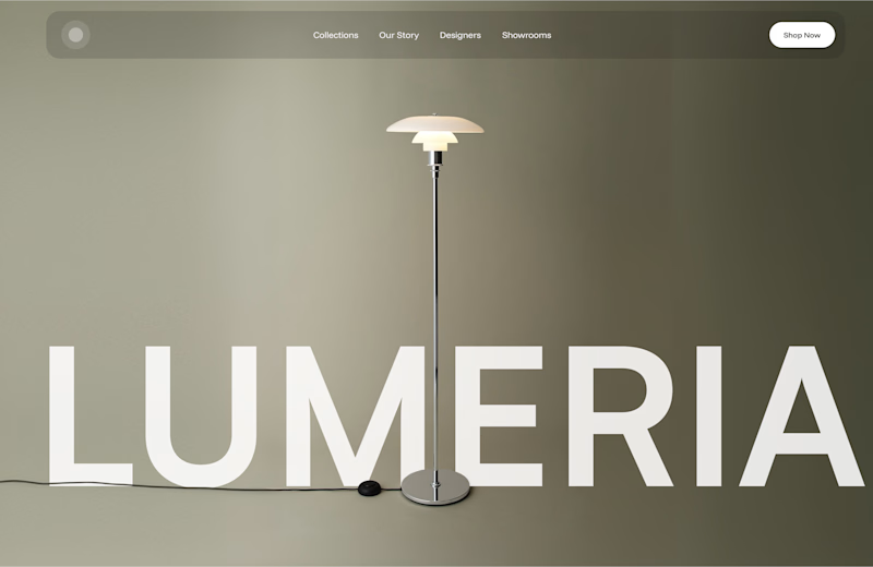
This time, I’m working on a concept for a lighting brand.
Which direction do you prefer?

74 voted
70%
31 voted
30%
105 votes
Closed

Atmospheric, for a lighting brand it feels almost unfair not to show the product actually doing its job in a real room. The minimal version reads more like a furniture catalog to me. Is Lumeria leaning toward a specific price point or market that would push this one way or the other?

It's a fictional brand I created for design practice. In my mind, Lumeria is premium, but still accessible - not super luxurious or overpriced.

Minimal, clearer and easier to understand without any distraction 😊

Atmospheric. better depth of field, more immersive and easy on the eyes


Hard to select. Both are stunning


I prefer the atmospheric one overall. But I think the minimal version could look even better if the lamp were a bit darker, closer to black. It would create more contrast and make the product stand out

Minimal

Atmospheric, a lamp brand has to show the light actually doing its job or you are just selling a metal object. Minimal is prettier but it hides the one thing people are paying for.

I voted atmospheric. The warm setting makes the light feel like part of the room, while the lamp still stands out. It suits the accessible premium feel you described.

Both have their own charm, but the atmospheric version feels more immersive.

first one is great

If I'm to purchase the product i'll pick atmospheric because it clearly shows how it'll look in my room.

The minimal direction gets my vote! The clean background makes the whole concept feel really modern and fresh.

Atmospheric one stands out better, dark theme wins

The minimal is good, but it's just feels a bit too neutral I guess.


the lamp is so nice. which one is your pick?

just a fan of minimal
nice the both

Atmospheric

atmospheric

The image background for atmospheric looks better.

The second one is way warmer🤎


The second one is a better choice 🔥

I prefer the deep depth of the atmospheric version

If you don't mind, I may add a third option for you: minimal/editorial?
Zoom in on pendant, or shades forming patterns on wall surface?
It would communicate combination of atmospheric and minimal style, but it might even give it a high-end touch for a lighting brand :)
PS I love both options!

I love atmospheric. It shows me how the light will work on filled spaces 😊

I like the Atmospheric one, the composition looks more finished. The Minimal one reminds of a Pixar intro, lol

Minimal looks better to me.

Went with atmospheric too. For a lighting brand, showing how the light actually feels in a space sells it so much better. The minimal one is still really clean though
The network for creativity
Join 1.25M professional creatives like you
Connect with clients, get discovered, and run your business 100% commission-free
Creatives on Contra have earned over $150M and we are just getting started
Related posts


Left aligned for me. With that much body copy next to the headline it reads cleaner.

AI can generate a dashboard. But can it give a product its own identity?
The first design was created by my client using AI a familiar dashboard style you've probably seen across countless AI-generated products.
I redesigned it to feel less generic and more intentional, with a distinctive visual identity, clearer hierarchy, and an experience built around meaningful celebrations.
The goal wasn't just to make it look better. It was to make it feel like its own product.
What do you think is missing from most AI-generated interfaces?
#ProductDesign #UIDesign #AI
5 voted
23%
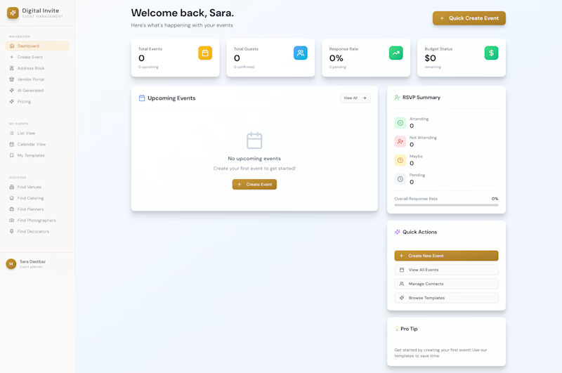
17 voted
77%
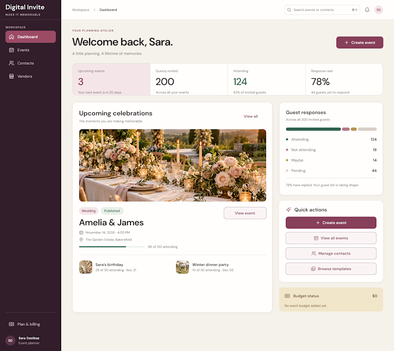
22 votes
Closed

I think personality is what makes a product stand out. A clean design is good, but it should also feel unique and memorable. 👏

Same product, three different visual directions.
Exploring alternative concepts for a single product over the weekend.
I started with a simple product shot on a plain background and used Krea 3 to reimagine it in three different settings: playful floating spheres, sculptural glass structures, and a miniature garden.
Which one is your favorite?
