The network for creativity
Join 1.25M professional creatives like you
Connect with clients, get discovered, and run your business 100% commission-free
Creatives on Contra have earned over $150M and we are just getting started
Back to feedPost

Case Study: Corporate Culture & Transformation Pitch Deck
Use this for Behance, your Upwork portfolio description, your website or the Medium article.
Overview
Project: Presentation design for an internal learning academy session on culture, transformation and growth
Type: Corporate pitch deck (20+ slides)
Role: Presentation Designer
Deliverable: Fully designed slide deck and a portfolio mockup
Tools: Figma, PowerPoint, Canva,Photoshop.
The Challenge
The content was important but heavy. It covered company culture, why it matters, the digital roadmap, people investment and the future vision, and the first draft was text-dense and inconsistent.
Too much information per slide
No clear visual hierarchy
No consistent look across sections
Abstract topics (culture, change) that are hard to picture
The Goal
Turn complex, abstract content into a clear, branded presentation that is easy to present and easy to remember.
The Approach
Content first. I gave every slide a single job: define, explain, show the plan or set expectations. Slides that did two jobs were split.
Simplify the copy. Paragraphs became short phrases and one-line statements, so the slide supports the speaker rather than replacing them.
Visualise the abstract. Concepts like "culture" and "one team" became icons, timelines and process flows, so ideas can be seen rather than only read.
Design as a system. I built the rules first (colour, type, layouts) and then applied them to every slide.
The Design System
Colour
Deep purple-to-teal gradient as the base
White for headlines and body text
Teal and white cards for emphasis and contrast
Typography
Large, light headlines for impact
Bold sub-headings and short body text for scanning
One clean sans-serif family throughout
Layout patterns
Icon cards for values and benefits
Staircase and numbered layouts for steps
Vertical timelines for roadmaps
Rounded cards for commitments and expectations
Iconography
Simple line and solid icons in white or teal, used as visual anchors
Brand elements
Logo placed consistently on every content slide, with generous white space
The Solution
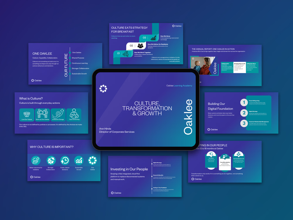
A consistent deck where each slide can be understood in about five seconds. Layouts change with the content type, so the deck stays varied without losing its identity.
The Presentation
To showcase the work, I placed the final slides in a flat-lay mockup, with the title slide on a tablet in the centre and the other slides around it. The background uses the deck's own purple and teal, so the thumbnail looks like part of the brand.
The Result
- A clean, professional deck that is easy to present
- A consistent visual identity across every section
- A reusable system for future presentations
Key Takeaway
When structure, colour and hierarchy work together, even complex ideas become simple to follow.


The network for creativity
Join 1.25M professional creatives like you
Connect with clients, get discovered, and run your business 100% commission-free
Creatives on Contra have earned over $150M and we are just getting started





Related posts

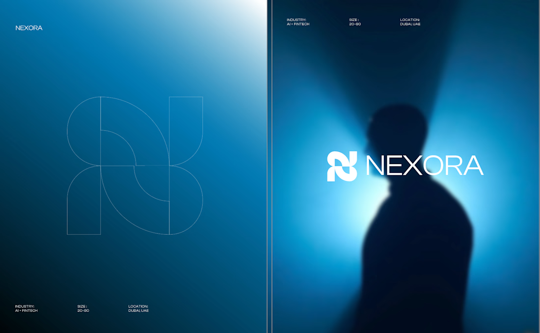
Currently building a new identity for an AI + fintech company in Dubai.
Still early, but this is one of the directions we’ve been exploring for the brand.
The idea was to avoid the usual “AI company” visual language and build something that feels more established, precise, and quietly futuristic.
We’ve been playing with geometry, light, and a much more restrained visual system around the mark.
Still developing this one, so I’m curious:
Would you push this direction further, or keep it this restrained?

Honestly the logo presentation is impressive

I designed some fashion-inspired editorial layout explorations for the new fashion brand ASCIS
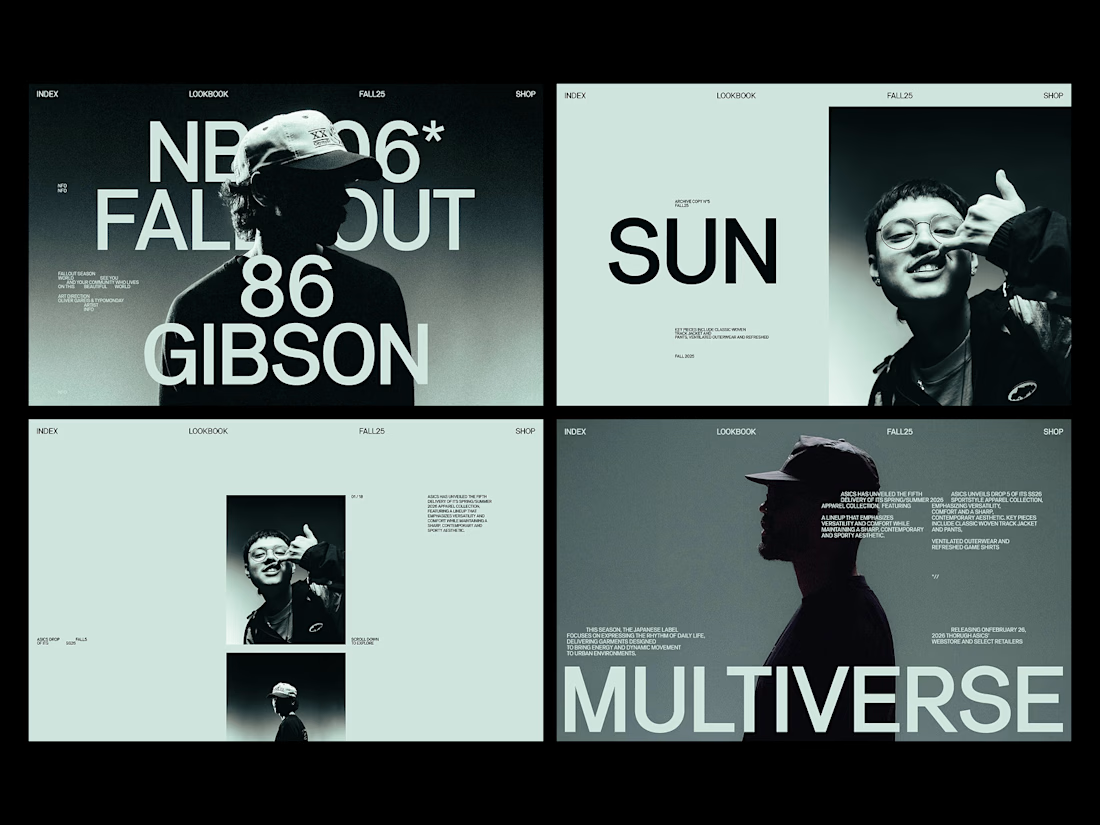


the layout system feels sharp.


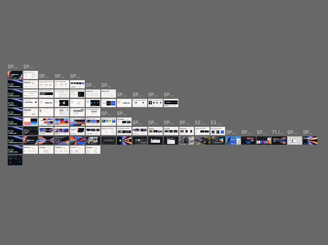
Brand guidelines fail when someone tries to use them. The PDF is complete. But when a developer needs something the system didn't anticipate, there's no logic to extend from. A style guide documents what exists. A system tells you what to do next.

Mind blowing job