The network for creativity
Join 1.25M professional creatives like you
Connect with clients, get discovered, and run your business 100% commission-free
Creatives on Contra have earned over $150M and we are just getting started
Back to feedPost

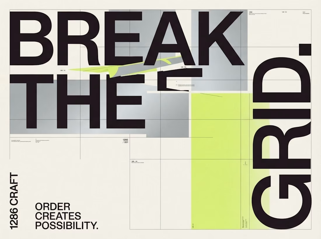
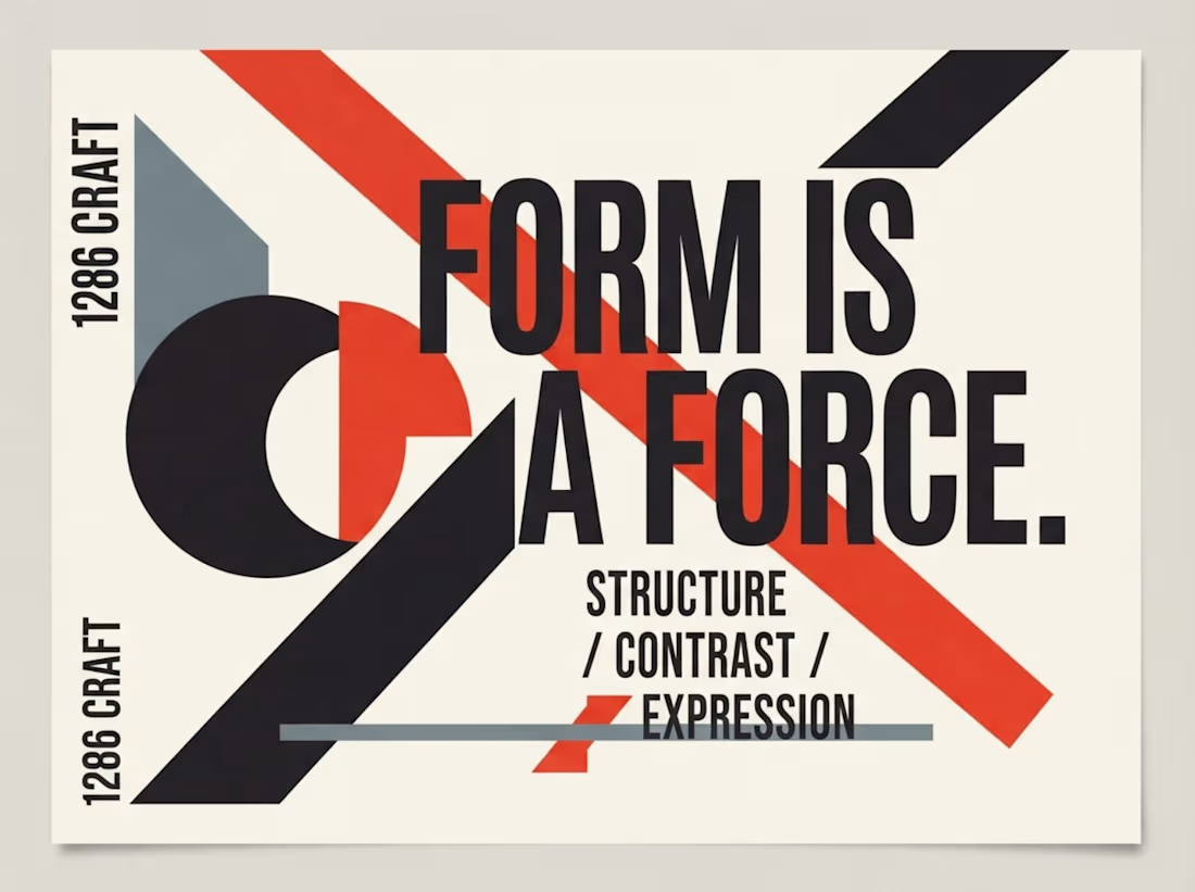
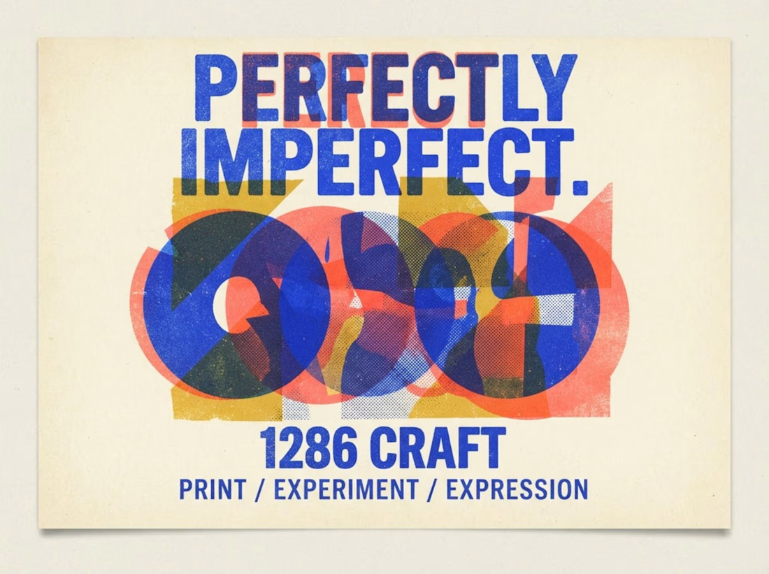
1286 CRAFT | Exploring Form, Nature & Experimental Design
Three distinct visual explorations, each with its own creative language.
From bold geometric typography and expressive color layering to intricate botanical compositions, this collection explores how structure, contrast, texture, and imagination shape powerful visual identities.
Every composition is an experiment in balancing artistic expression with thoughtful design.
Different styles. One creative vision.
#1286CRAFT #GraphicDesign #VisualDesign #ExperimentalDesign #Typography #CreativeDirection


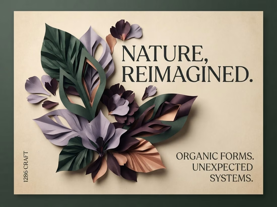

The botanical composition part caught my eye - layering those leaf textures against the type creates a surprisingly tactile contrast.
Thank you so much, Johnson! I really appreciate your thoughtful feedback. Exploring the contrast between organic textures and structured typography was one of the key ideas behind this composition. Glad it caught your eye!
The network for creativity
Join 1.25M professional creatives like you
Connect with clients, get discovered, and run your business 100% commission-free
Creatives on Contra have earned over $150M and we are just getting started





Related posts

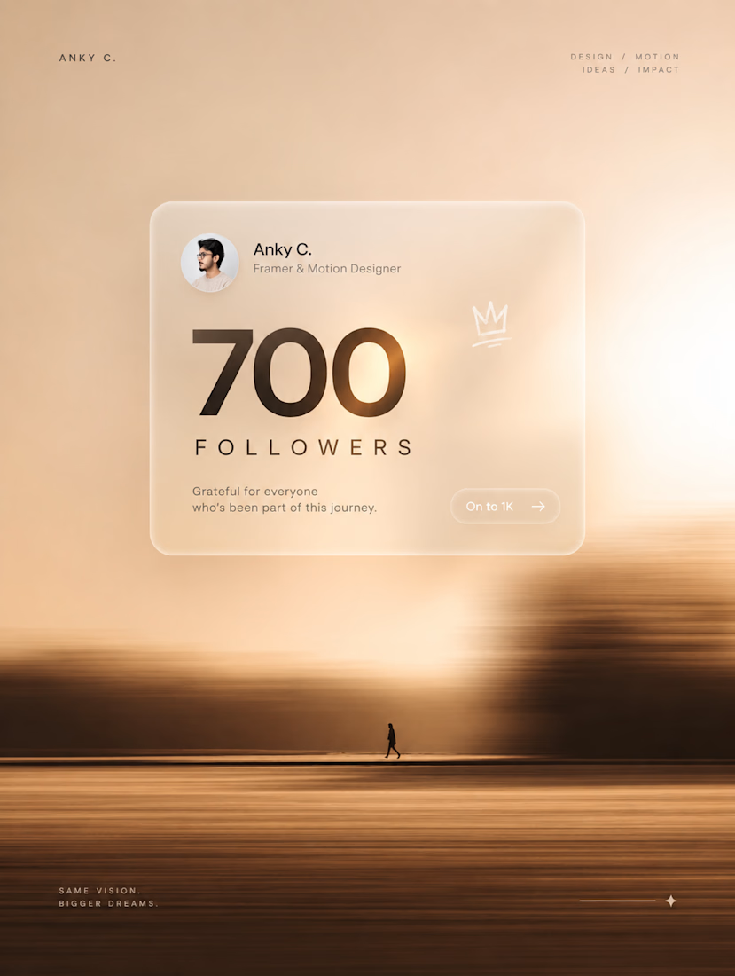
700 followers on Contra. 🫶
A small number, but a big milestone for me.
700 → 1K. Let’s keep going. ⚡
PS: Yes, the post is AI-generated.
At this point, I’m just supervising. 😂

The Rebranding Challenge - Season Investments
One of the key challenges was deciding what to change and what was worth preserving.
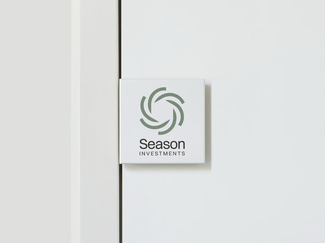
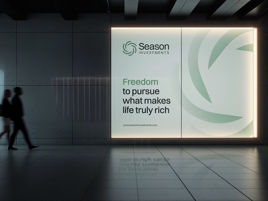
Rather than starting from scratch, the new identity retains a visual connection to Season Investments’ heritage, but reframes it for a more contemporary and flexible brand system.
A major improvement was creating a symbol that can work independently from the wordmark. This gives the brand a stronger presence across investment platforms, digital interfaces, profile images, and other compact applications where the previous identity was difficult to use.
The result is a more adaptable system that moves the brand forward without losing its familiarity.


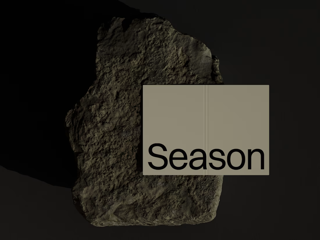

Love how adaptable this feels across compact digital spaces. Really well done. Any plans to post the original before version for comparison?

Archive Friday 💿
Such a shame this concept never made it into production—still one of my favorite explorations.
Industry: health/sleep tracking


nice designs