The network for creativity
Join 1.25M professional creatives like you
Connect with clients, get discovered, and run your business 100% commission-free
Creatives on Contra have earned over $150M and we are just getting started
Back to feedPost
Taste Test

Creating this footer section in two versions using Halftone Engine
⚪️ A: Blue version
🔵 B: White version
Which one would you pick?
👇🏻 A or B?
24 voted
77%
7 voted
23%
31 votes
Closed

Good call 🤝

Wow
Thanks bro!😃

Blue version

The two versions make the halftone texture feel like a real design system rather than a one-off effect—I’d pick the blue for the extra depth.
Thanks brother! 🤝 Glad the blue stood out to you :)

Yeah that's a good call🤝

Blue version😍
Good choice :)

The blue version is working best here, want to know about the whole project.
Good call bro!🤝
and it’s not a project, I’m just experimenting with my own components to explore how far I can push them and create something unique & interesting.
Yep got you buddy, this already seems both unique and interesting. Are you satisfied with this result?
Liked your take! I love both as well but I’m still experimenting with them. will share one of the versions with you soon :)

blue version..
Absolutely a great pick! 😃


Version A (Blue) brings that retro futuristic halftoning to life with much stronger depth and contrast, making the footer feel deliberate rather than just an end of page container. Option B is clean, but A has way more personality. Great experimentation!
Definitely a solid pick bro🤝, I was aiming for exactly that, giving the footer a bit more unique personality :)

I'll go with blue. White version looks like a brand with slim audience where as blue works for all.
Solid choice brother also liked your insights! 🤝

white version is 🔥
Nice choice bro! 😃

I'll go with the Minimal/Abstract version. Obsessed with grayscale design.
Great pick brother! 🤝


Blue Version
It's a good pick, Chidera! 😃

I liked Blue version


Lovely design !
The network for creativity
Join 1.25M professional creatives like you
Connect with clients, get discovered, and run your business 100% commission-free
Creatives on Contra have earned over $150M and we are just getting started

Challenges
View all


Related posts

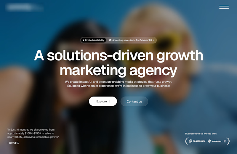
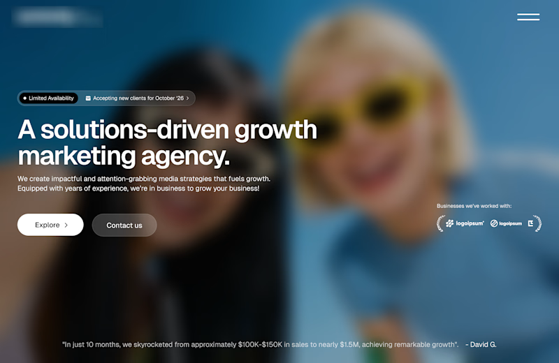
Working on a redesign for a marketing agency and I’m currently exploring layout options.
Assuming the background image is approved, which layout do you think will work best?
A or B?

11 voted
73%
4 voted
27%
15 votes
Closed
Option A works well

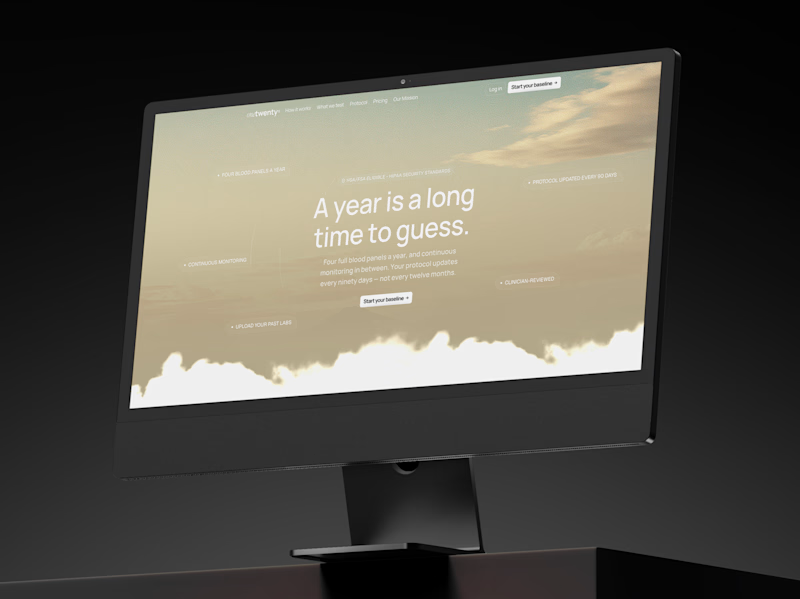
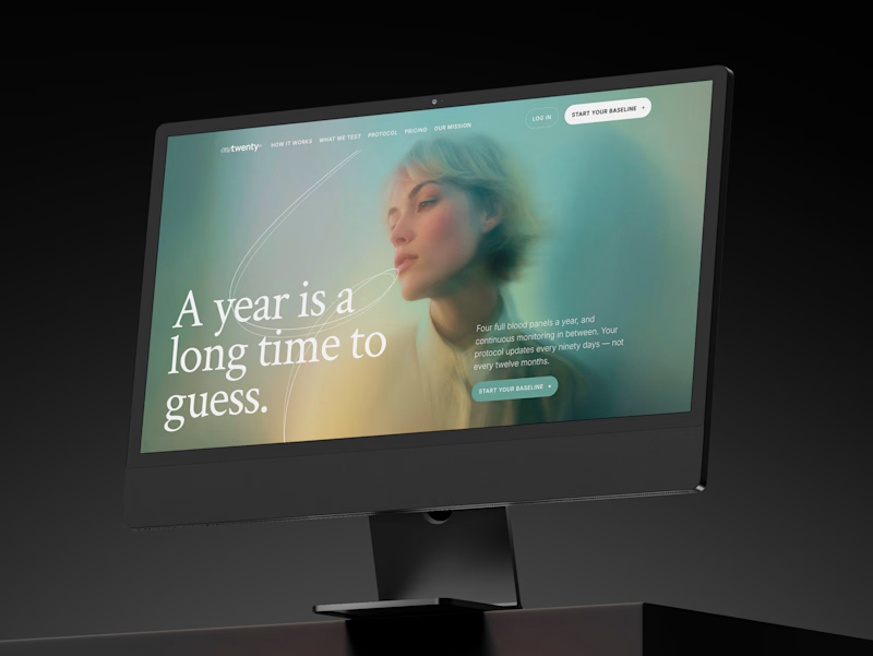
a longevity health membership asked me for the first ten seconds of their site. two opinionated directions, not four safe ones.
A · the instrument: https://onetwenty-direction-a.framer.website/
opens with how it works, shown through real product interface. the clearest version of what the category already does.
risk: one more health dashboard.
B · the publication: https://onetwenty-direction-b.framer.website/
opens with the reader's doubt, then explains. a big serif headline, one photo, a section that plays the idea out as you scroll.
risk: drifting into wellness.
the copy is nearly identical in both, on purpose. so the question isn't which one looks better:
which one would make you trust a health company with your blood and your data?
vote, and tell me why below.
10 voted
17%
49 voted
83%
59 votes
Closed

B look similar to this https://templatoria.com/templates/clearpath
templatoria.com
ClearPath — Framer Template for Therapists and Coaches
ClearPath is a warm Framer template for therapists, coaches, and personal growth professionals. Built for services, client stories, journals, and booking-focused websites.


New cover, new visual taste test.
As a visual director, the hardest choice is choosing between your own creations.
Two covers. Two directions. One choice.
Which one gets your vote?


34 voted
79%
9 voted
21%
43 votes
Closed


the blue background makes the orange shapes pop