The network for creativity
Join 1.25M professional creatives like you
Connect with clients, get discovered, and run your business 100% commission-free
Creatives on Contra have earned over $150M and we are just getting started
Back to feedPost
Taste Test
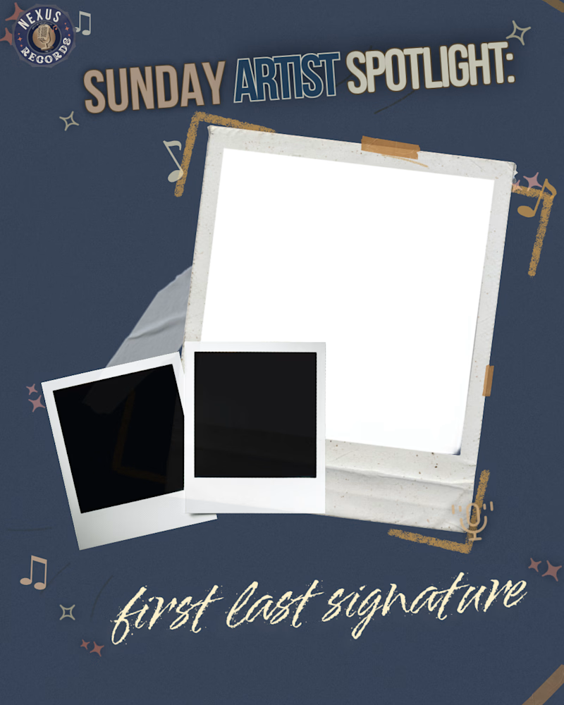
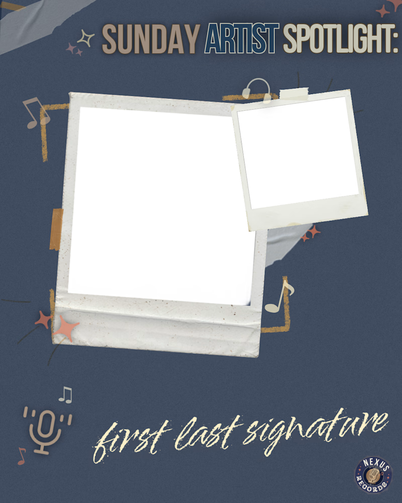
just for fun as i work some templates up, which of these do you like best? they're meant to be introductory slides to carousels on socials for a record label looking to boost attention for their signed artists.
naturally, 'first last signature' would be replaced with each weekly artist's signature (as would the spaces inside the polaroid frames, i've just assigned placeholders for the time being for clearer spacing as i toy around with adobe express.
let me know your thoughts!


0 voted
0%
6 voted
100%
6 votes
Closed


Since the cards are already tilted the header must be in a strict position in my opinion, so i will go with O2. Both great tho!

O2 for me, the polaroid stack feels more collectible and fits a record label better than the single frame. Since these get swapped weekly per artist, how long does one actually take you to update once the template's locked?

i'll be finalizing these in .psd format, so editing each shouldn't take more than 30 minutes, 45 maximum! each frame's contents would either fully be a clipping mask or allow for layering that gave a 3D effect outside of the frames, then the signature placeholder would be...
30-45 minutes per swap for a weekly recurring asset is a great turnaround, that's the kind of system that actually survives contact with a real deadline. Are you setting up the layering so a non-designer on their team could eventually swap frames themselves, or is this staying a task you'll own each week?

O1 for me, the mix of a light and dark polaroid feels more like an actual scrapbook someone would flip through. Have you run these by the label yet, or is this still your own gut check before options go out?
The network for creativity
Join 1.25M professional creatives like you
Connect with clients, get discovered, and run your business 100% commission-free
Creatives on Contra have earned over $150M and we are just getting started

Challenges
View all


Related posts


Where should the photo live - behind the words or beside them?
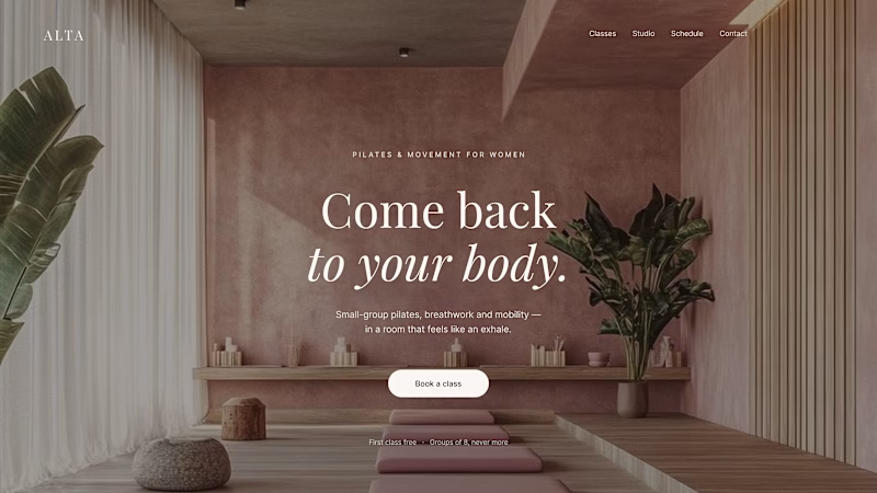
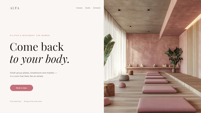
Same pilates studio, same headline.
01 - Photo as the background. Full-bleed atmosphere: the room wraps around the words. Immersive and cinematic, but the text only survives thanks to a darkening overlay laid over the image.
02 - Photo beside the text. A clean split: words on calm ground, the room in its own column. Everything readable at a glance, the trade is a little less drama.
One sells the feeling. The other sells the clarity. Which hero would make you book the class?

80 voted
75%
27 voted
25%
107 votes
Closed

1 nails it

Creating this footer section in two versions using Halftone Engine
⚪️ A: Blue version
🔵 B: White version
Which one would you pick?
👇🏻 A or B?
24 voted
77%
7 voted
23%
31 votes
Closed

Wow

Two case studies, two totally opposite registers.
One is carved in stone and says nothing.
One drips off a spoon and won't shut up about which field it came from.
Which one do you want first?
vectis — zero-knowledge privacy, dithered like a forgotten statue
HIVE INDEX — raw honey with a paper trail. No two lots taste the same, and we don't correct for that.
45 voted
51%
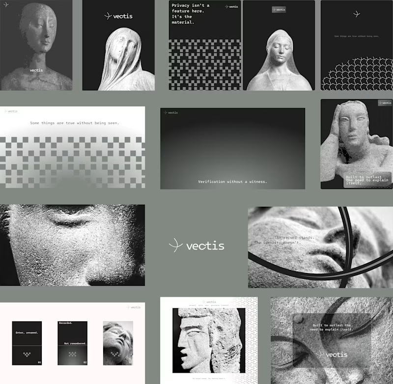
43 voted
49%
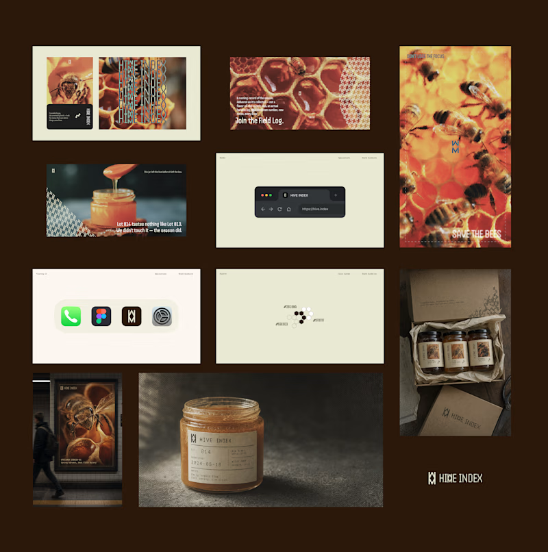
88 votes
Closed

Vectis