The network for creativity
Join 1.25M professional creatives like you
Connect with clients, get discovered, and run your business 100% commission-free
Creatives on Contra have earned over $150M and we are just getting started
Back to feedPost

A two-week brand sprint for Charles & Charlotte & Consulting, or C&C&C for short.
This one was really fun. The challenge was figuring out how the brand could evolve from Charles & Charlotte’s already unique design language into something new for their venture into consulting.
We created something intentionally unconventional, with a lot of different pieces working together across typography, graphic design, 3D assets, motion, and digital.
The process was also a nice balance of new and old tools. Around 90% human, 10% AI. Using AI where it actually added something, while keeping the ideas, experimentation, and design decisions human.
Really happy with where this one landed.
https://charlesandcharlotte.consulting/


Thanks Kai!


two weeks for all that? fast
Worklife balance starts in 2027 🤣

Impressive work
Thanks Olabisi!

90/10 human to AI is a healthier ratio than most people admit to right now. Where did the 10% actually end up living, was it more in the 3D/motion pieces or somewhere earlier like exploration and moodboarding?
Charles & Charlotte didn’t want their evolution into brand strategy to make them look like another consultancy chasing tech and AI clients. The focus was always culture, subcultures, and human output.
We used a 90% human, 10% AI principle as a creative constraint for the...
Keeping AI as a tool rather than the aesthetic is a distinction a lot of studios miss right now. Handwritten typography and real objects photographed as reference feels like the opposite instinct of where most brand work is heading. Did the client need convincing on that direction or were they already leaning that way?

Thank you Komu!


Good work🔥👏👏
Thank you Picto!

really like your work and that kind of style! wow!
Thank you! It is maybe refreshing with so many fancy Ai brands today haha

Appreciate you sharing the AI to human split on this one. 90/10 feels like the right ratio, using it as a tool for speed rather than letting it make the creative calls.

Great work🔥
Thank you!

Love the simplicity here, it gives the brand such a nice feel

props

The 90/10 split on AI tool integration is such a healthy benchmark using machine learning for tedious iteration while keeping the core visual direction and 3D concepting completely human. Navigating an identity transition for an established brand is always tricky, but leaning...

Love how you evolved Charles & Charlotte's brand for their consulting venture! The flatlay with the blue, orange pop and Brand OS elements is so playful yet professional. That clock and scissors detail is a nice touch - really shows thoughtful brand strategy!
The network for creativity
Join 1.25M professional creatives like you
Connect with clients, get discovered, and run your business 100% commission-free
Creatives on Contra have earned over $150M and we are just getting started





Related posts





🔥 🔥


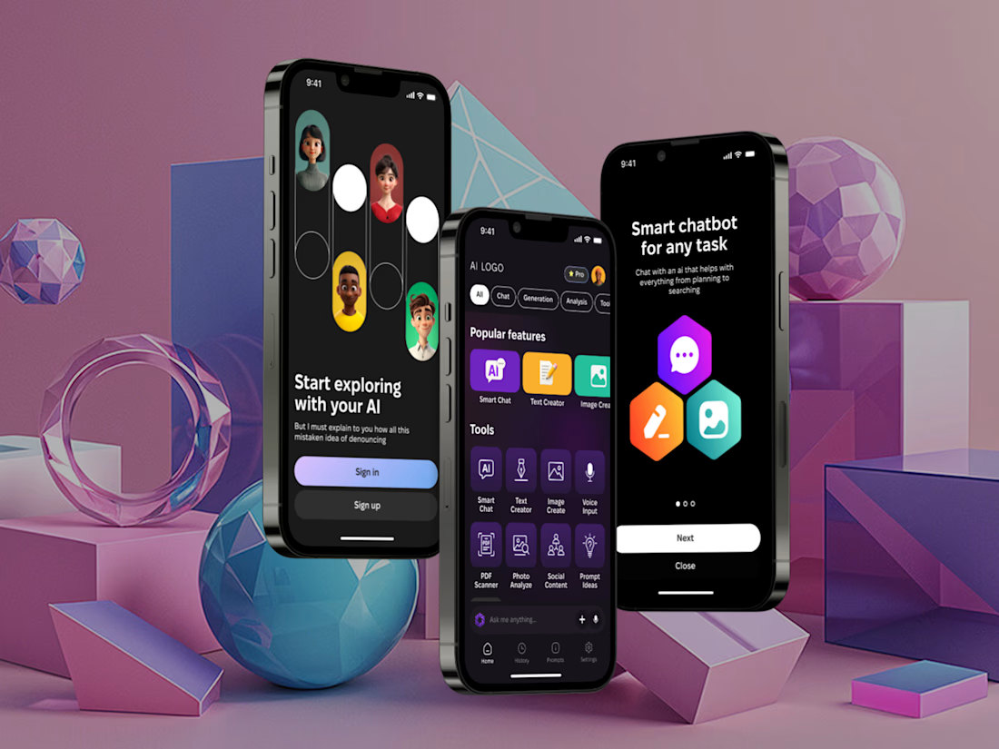
I've built a new mobile AI assistant that brings chat, text and image generation, voice input and document analysis into one app.
It have Smart Chat, Text Creator, Image Create, Voice Input, plus PDF Scanner, Photo Analyze, Social Content and Prompt Ideas, filtered by category.
Almost everything AI can do, just in one place.


Such an amazing tool! Keep going!