Brand Sprint & Corporate Identity for Boutique Consulting Agency

Dane Kowachek


C&C&C Case Study
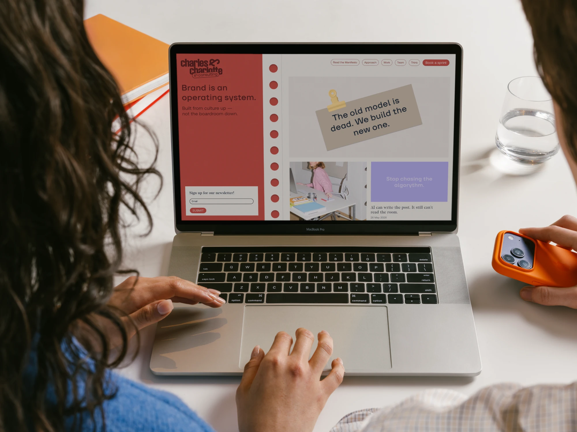
Charles & Charlotte & Consulting (C&C&C) is the strategic extension of charles & charlotte, one of Germany’s leading social media agencies. Built to expand the agency into brand strategy and consulting, I designed the MVP brand system in a three-week sprint, creating the visual identity, Brand OS framework, and launch content.
Duration: May,2026 - June,2026
Role: May,2026 - June,2026
Tools: Figma, illustrator, photoshop
Team: Dane, ana, pascal, ben, paulina
The Challenge
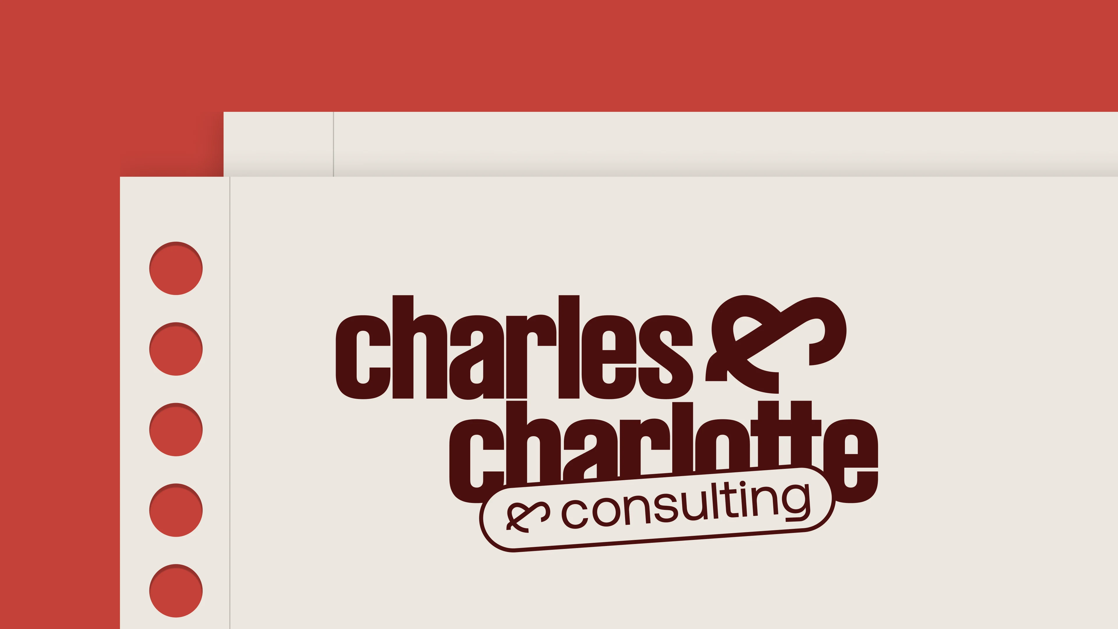
Most brand consultancies look the same — either overly corporate or trying too hard to feel disruptive. The challenge was to create an identity that felt connected to the existing C&C brand while giving the consultancy its own, more strategic and mature voice.
The Approach
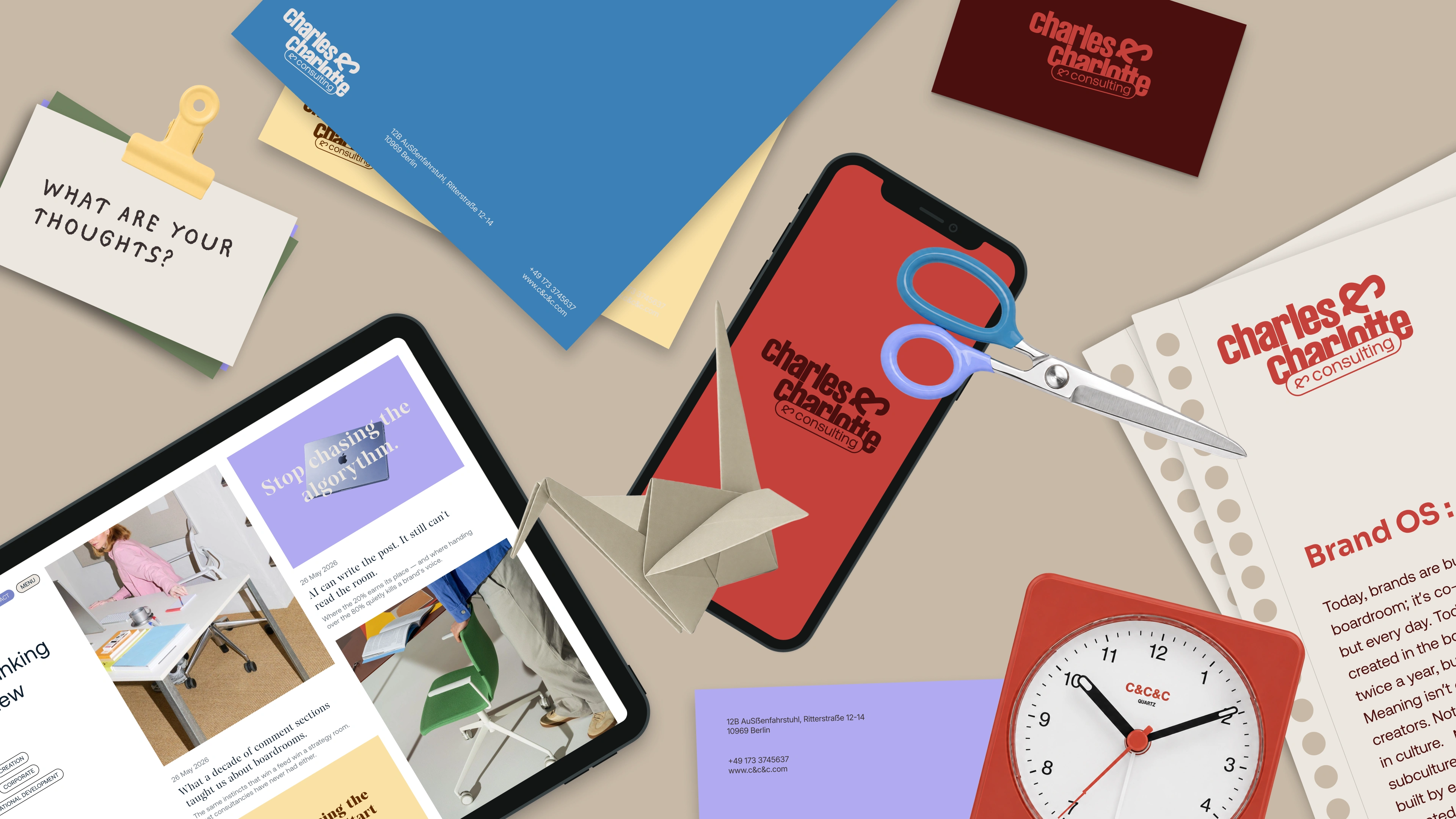
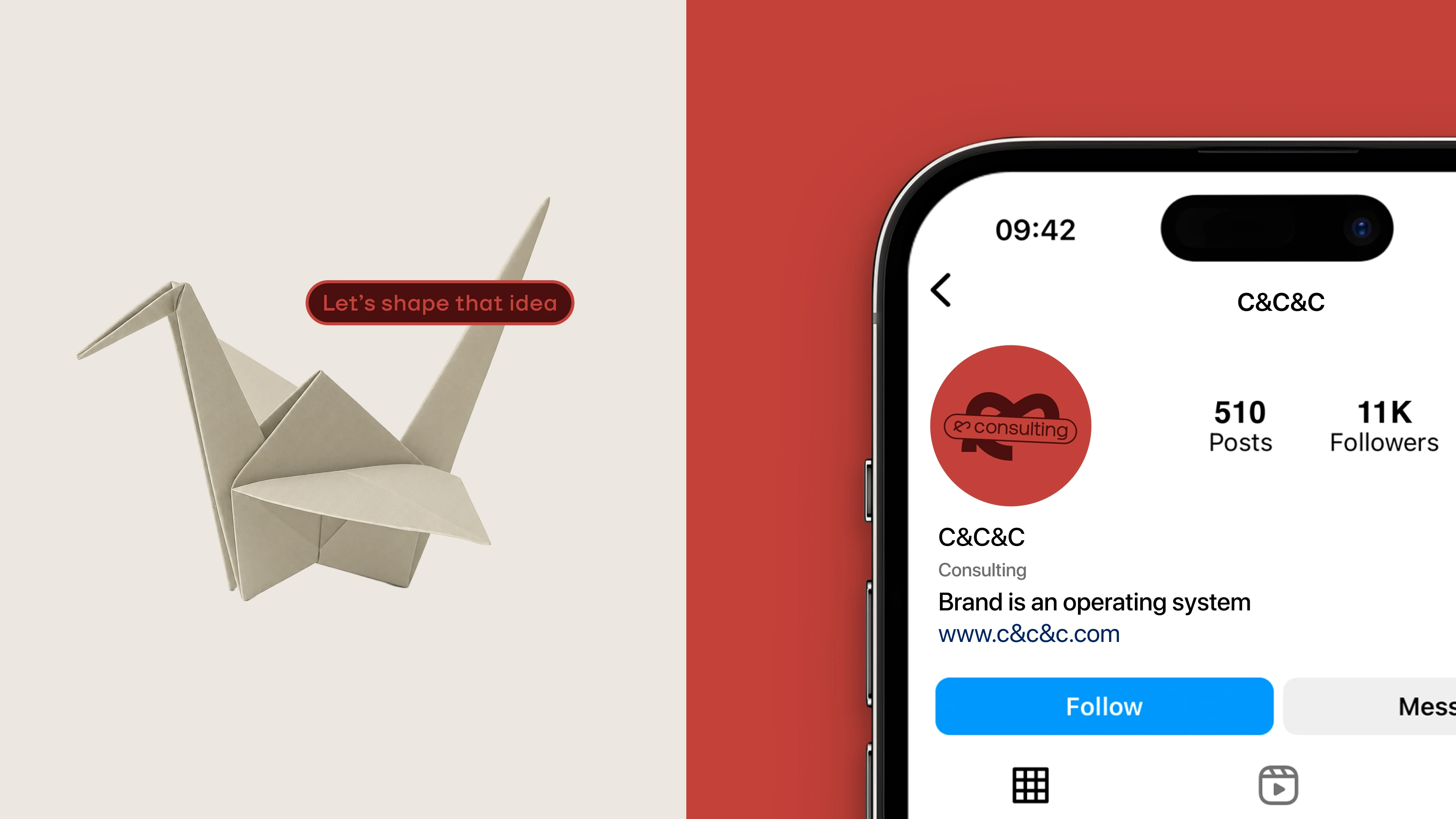
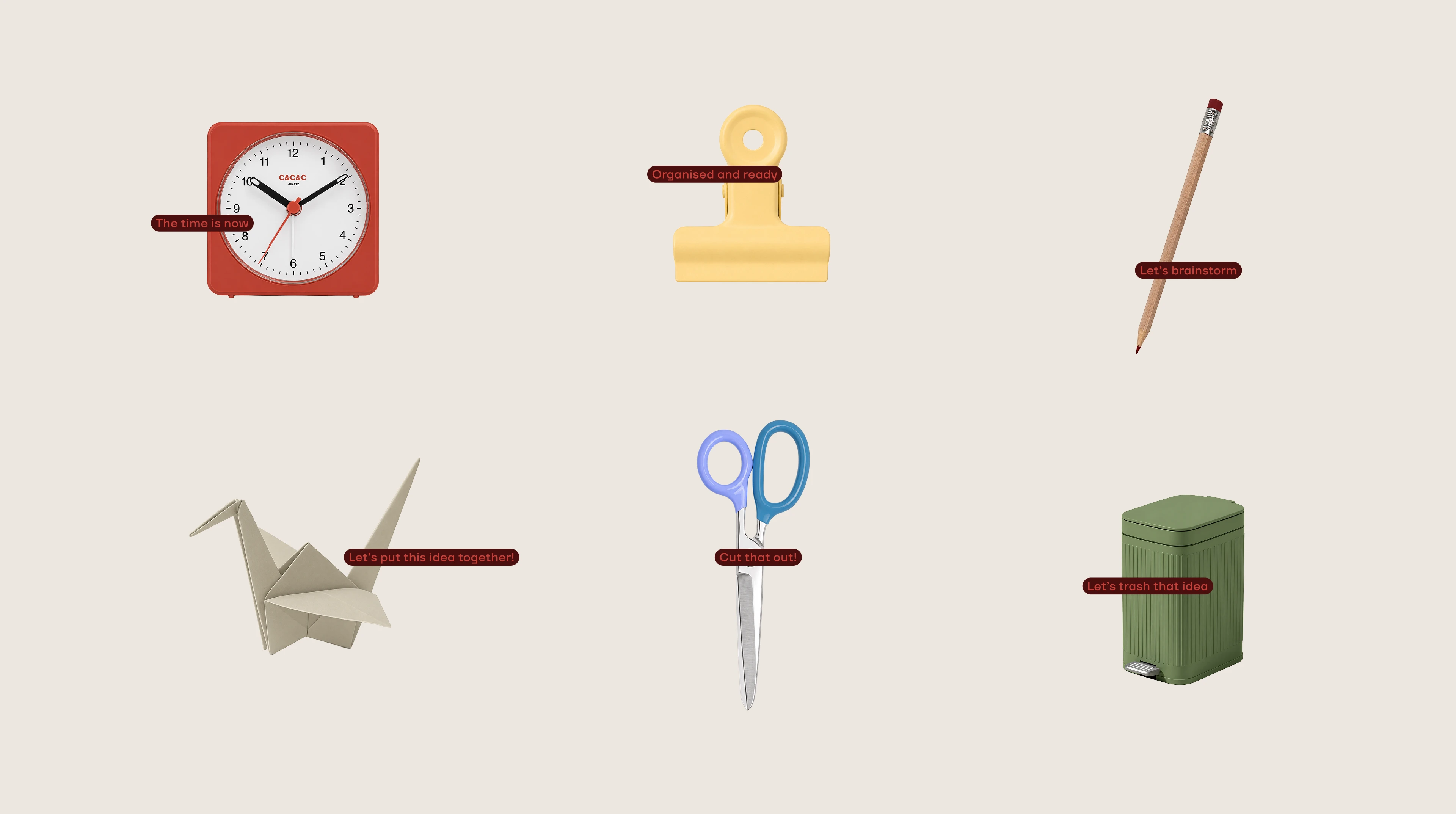
Rather than reinventing the brand, I built on what already existed. The logo, colours, and typography evolved from the original C&C identity, creating something that felt familiar but more refined. I also translated the Brand OS framework into a simple visual system that made a complex idea easier to understand and communicate across presentations, social content, and launch materials.
The Result
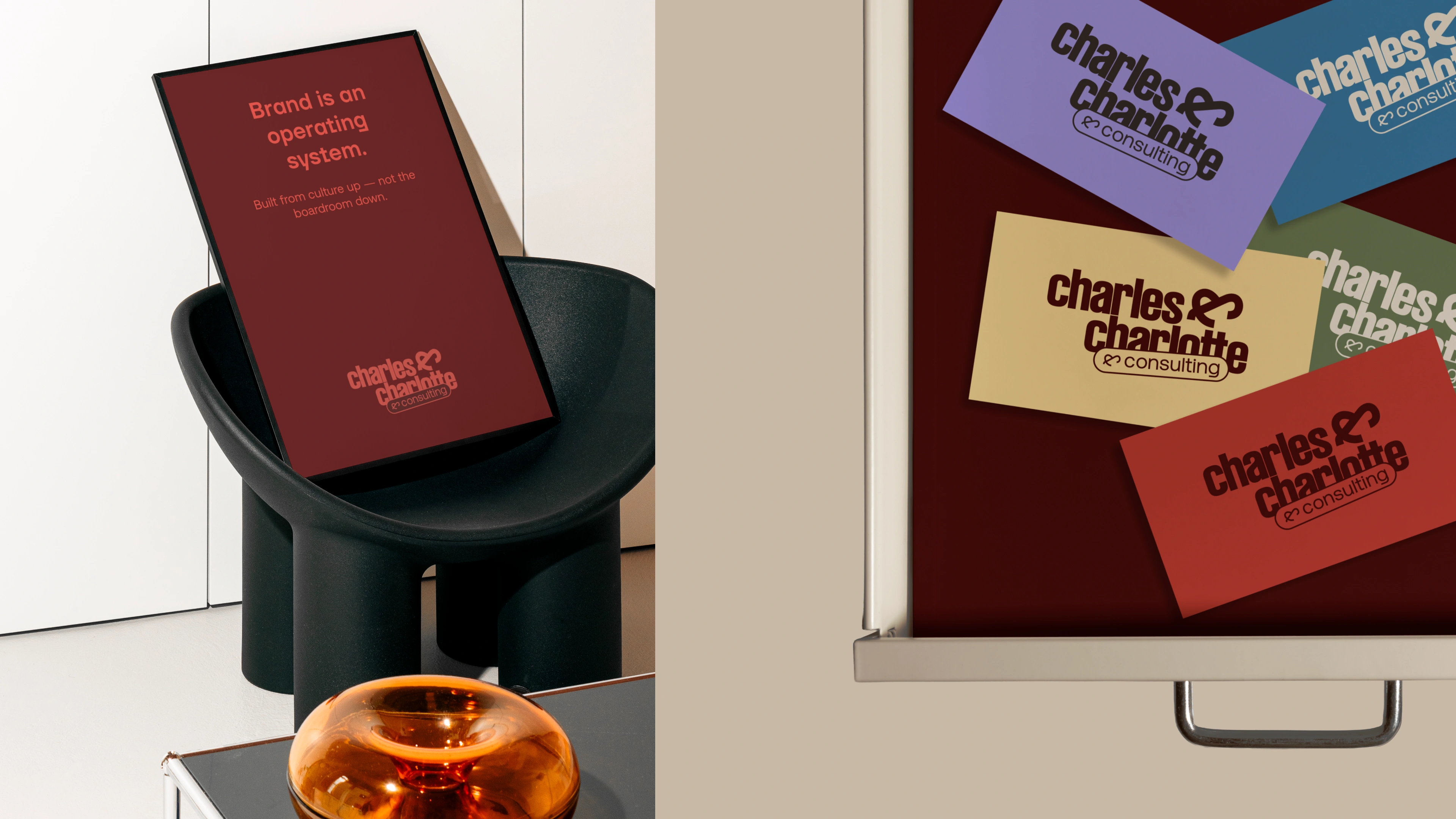
Successfully launched the consulting brand in a two-week brand sprint.
Delivered a complete visual identity, brand guidelines, and a reusable brand kit.
Created strategy visuals and presentation assets for the Brand Operating System framework.
Established a scalable design system for presentations, social content, and future marketing materials.
Like this project
Posted Jul 6, 2026
Extended Charles & Charlotte into a new consulting venture, creating the brand identity, Brand OS, launch assets, and digital art direction.