The network for creativity
Join 1.25M professional creatives like you
Connect with clients, get discovered, and run your business 100% commission-free
Creatives on Contra have earned over $150M and we are just getting started
Back to feedPost
Taste Test

Two logo concepts for the same brief.
Both built around the same idea which is unlocking hidden value for New York co-op and condo boards who are owed tax savings they've never claimed.
One leaned architectural and place-specific, a NYC skyline with a keyhole as negative space in the primary building. One went cleaner and more minimal, exploring the lock and key metaphor directly.
The client chose the skyline. I agreed. When your entire audience lives in New York City buildings, the skyline earns its place.
Which would you have chosen? A or B?


2 votes
Ends in 1d

Thank you!

I'd have gone with the skyline too, tying the mark straight to the audience it's speaking to is hard to beat. Was the keyhole negative space something you nailed early, or did it take a few passes to read clearly at a small size?
Thanks!
The smaller building needed to be identified - it did take a few rounds of revision!
The network for creativity
Join 1.25M professional creatives like you
Connect with clients, get discovered, and run your business 100% commission-free
Creatives on Contra have earned over $150M and we are just getting started

Challenges
View all


Related posts


Help me decide which game icon is good..!
Web game link: https://playgama.com/game/starweave-make-constellations?clid=p_11001f19-1b7d-4d6f-bf33-8e495b474e06
4 voted
19%

17 voted
81%

21 votes
Closed

Star with obstacle

More visuals from the rejected brand direction I shared earlier.
Really good to see this direction resonating with so many of you. It was one of our favourite explorations to build, from the narrative behind it to the visual world that brought it to life.
Great work doesn’t always make the final cut, and sometimes the reason has little to do with the quality of the direction.
Curious why this one was rejected? I’ve shared the story in the first comment✨


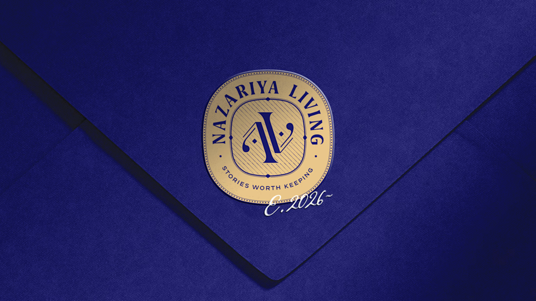
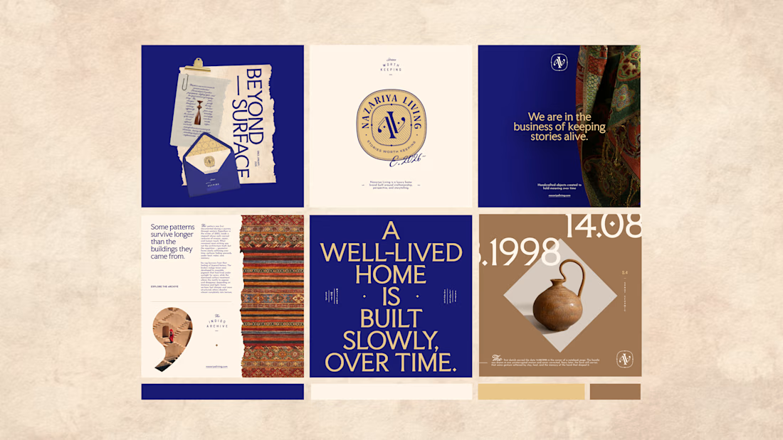
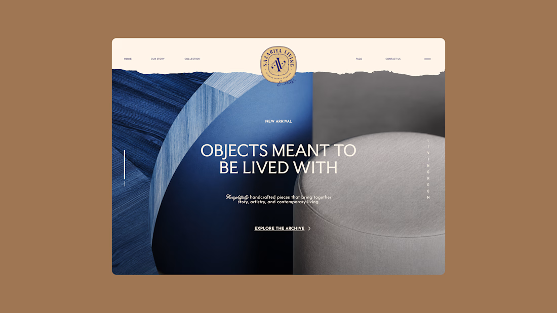
Nazariya Living is a premium carpet and home décor brand shaped by craftsmanship, culture and the stories objects carry into our homes.
This direction brought that idea to life through a seal-inspired logo, archival textures, unexpected colours and editorial typography, creating...

Which one's the best ?
10 voted
27%

27 voted
73%

37 votes
Closed


dark mode, no question