The network for creativity
Join 1.25M professional creatives like you
Connect with clients, get discovered, and run your business 100% commission-free
Creatives on Contra have earned over $150M and we are just getting started
Back to feedPost
Taste Test

Which one's the best ?
10 voted
27%

27 voted
73%

37 votes
Closed


Light mode

loved the dark mode

Dark is the Winner


dark mode, no question

Dark mode, no contest for me. Though I'm curious, does the choice change depending on what you're designing, or is it just personal preference across the board?

Light during the day and Dark during the evenings.
The network for creativity
Join 1.25M professional creatives like you
Connect with clients, get discovered, and run your business 100% commission-free
Creatives on Contra have earned over $150M and we are just getting started




Related posts

For freelancing which one will you choose, I will choose contra.
1 voted
4%

24 voted
96%

25 votes
Closed


Live action Recreation vs The Original Animation reference. I did my best to recreate the scene as best as i could.
3 voted
100%
0 voted
0%
3 votes
Closed

Voted for your live action version. The pose and the swirling light around the hands match the reference really closely.

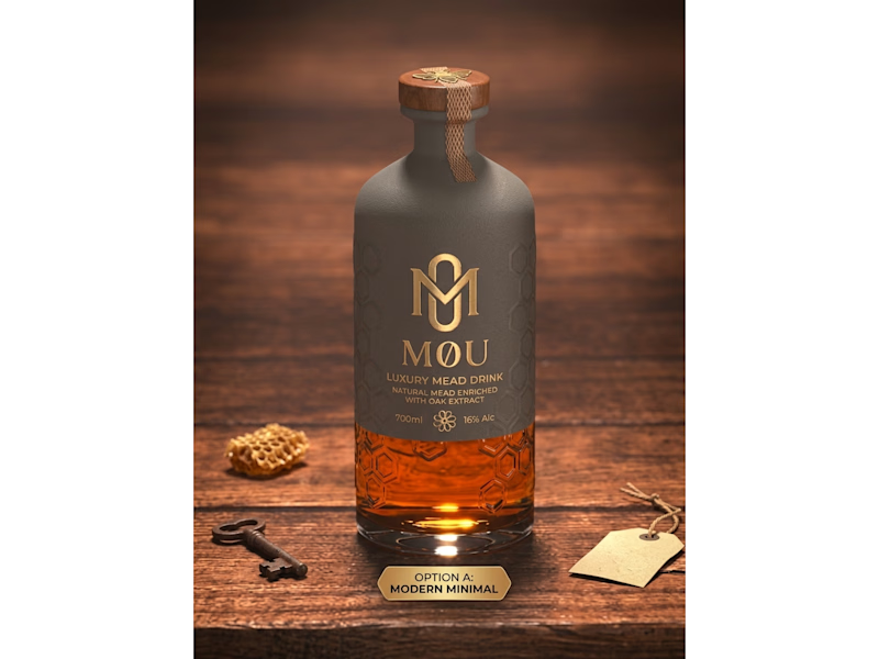
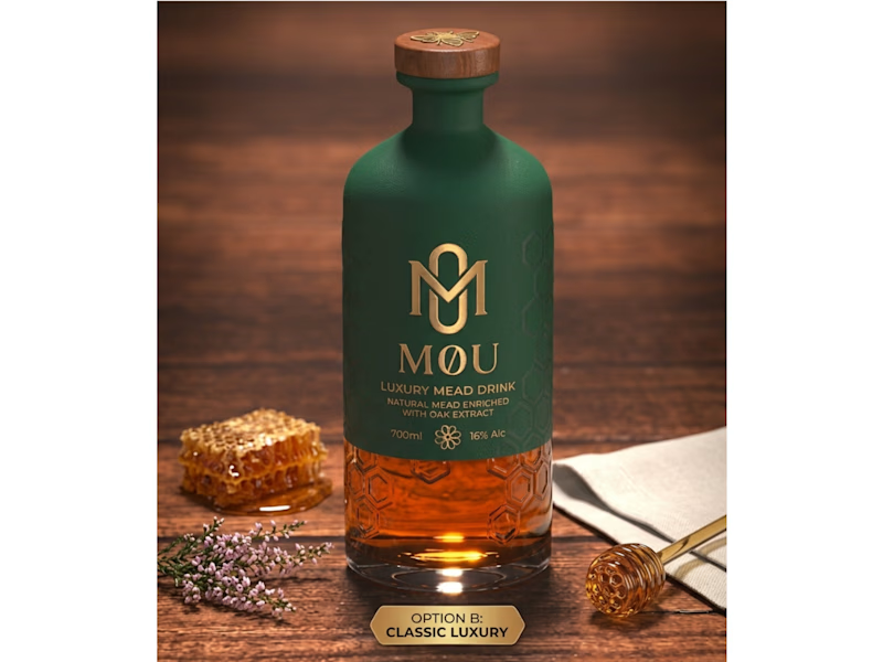
Craft Meets Heritage: Which M0U Packaging Wins?
I created two distinct packaging concepts for M0U, a luxury oak-enriched honey mead brand. Both designs keep the custom geometric gold monogram and embossed honeycomb glass intact while testing two different visual directions:
Option A (Modern Minimal): Features a matte slate-grey wrap and a textured neck seal for a contemporary, understated shelf presence.
Option B (Classic Luxury): Uses a deep forest-green finish paired with warm gold foil accents to highlight natural botanical heritage.
Which packaging direction grabs your attention first—A or B? Drop your vote below!
Looking to elevate your brand with custom logo systems and standout packaging design? Let’s connect and bring your vision to life.
0 voted
0%
4 voted
100%
4 votes
Closed
Went with Classic Luxury. The gold foil on that deep green feels right for a heritage mead.