The network for creativity
Join 1.25M professional creatives like you
Connect with clients, get discovered, and run your business 100% commission-free
Creatives on Contra have earned over $150M and we are just getting started
Back to feedPost

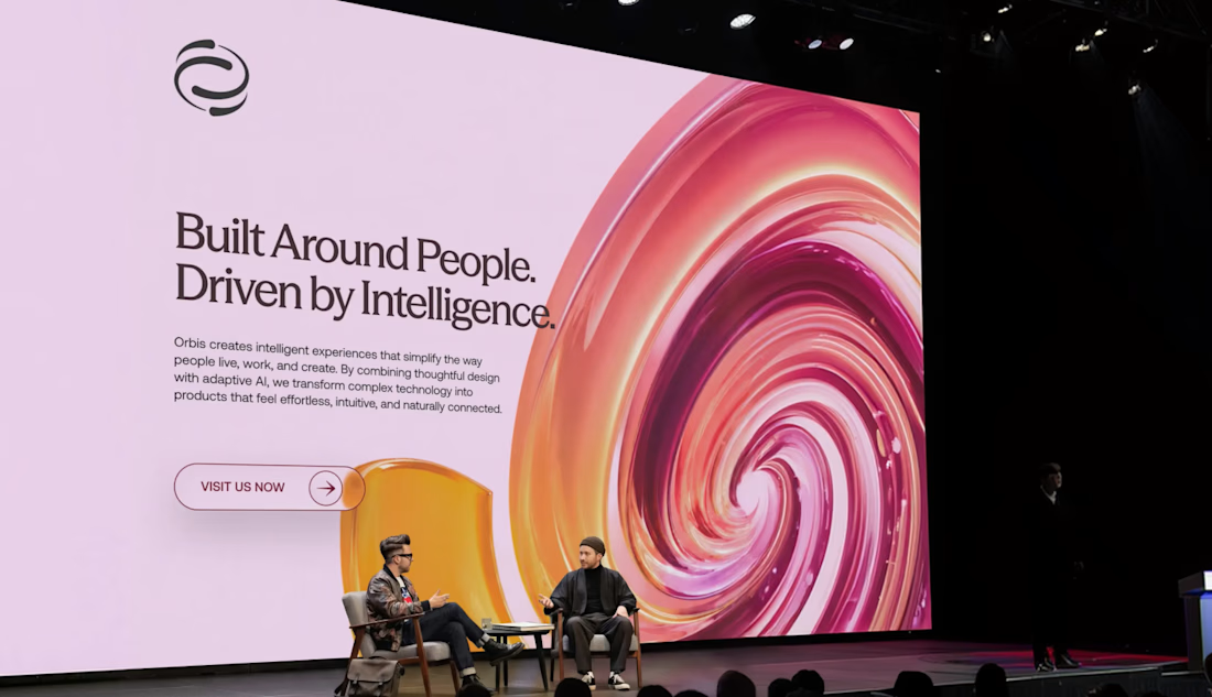


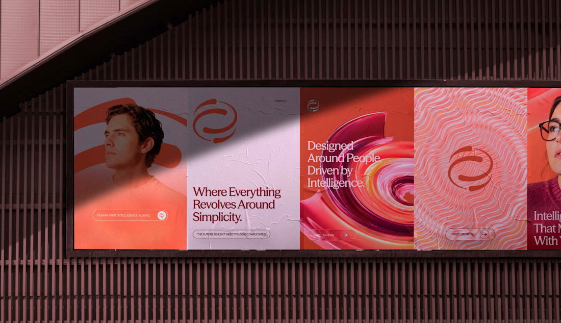

The red-on-dark system has a lot of energy, and the icon set feels especially cohesive. Nice work carrying one visual language from the mark into the broader layouts.

Thank you Ahmed

Thank you Alaa
The network for creativity
Join 1.25M professional creatives like you
Connect with clients, get discovered, and run your business 100% commission-free
Creatives on Contra have earned over $150M and we are just getting started

Challenges
View all


Related posts

Which cover for a new case study do you like more?
19 voted
40%

29 voted
60%

48 votes
Closed

Really inspiring work!

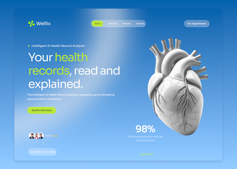
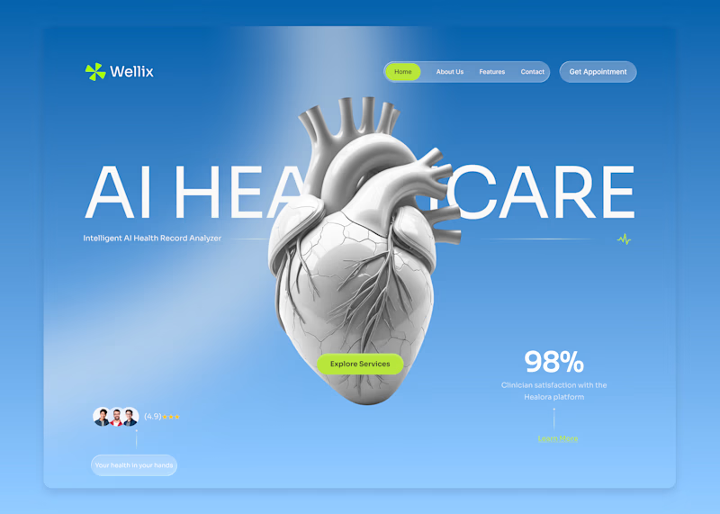
Wellix two homepage directions. Which one would you pick?
Wellix is an AI tool that reads health records and explains them in plain language lab results, scans, and charts turned into something a person can actually understand without a medical background.
Same brand, same palette, same illustration just two different ways of arranging the hero.
Which one would you go with, A or B? Drop a comment I'd like to hear which one lands better for you.
60 voted
61%
39 voted
39%
99 votes
Closed

Version. A does the job


Love the mark!