The network for creativity
Join 1.25M professional creatives like you
Connect with clients, get discovered, and run your business 100% commission-free
Creatives on Contra have earned over $150M and we are just getting started
Back to feedPost

Crafting the Visual Identity for Elichi Coffee | Case Study
For Elichi, the goal was to build a brand identity that captures the ritual of craft coffee. The visual direction balances modern simplicity with a warm, sensory feel—creating a clean yet inviting identity across every touchpoint.
Design Highlights:
Custom Typography: Paired clean, modern letterforms with subtle editorial accents to establish an elevated, boutique feel.
Packaging & Collateral: Used generous white space and structured layout grids so the physical packaging feels premium in hand.
Palette & Materials: Blended deep, roasted tones with soft, muted neutrals to reflect the warmth of the space and the richness of the brew.
I’d love to get your feedback on this direction:
How does the balance between modern typography and warm tones feel to you?
Does the packaging strike the right balance between minimal and welcoming?


Cool work 🙌


beautifully done, i love the presentation!


Creative
The network for creativity
Join 1.25M professional creatives like you
Connect with clients, get discovered, and run your business 100% commission-free
Creatives on Contra have earned over $150M and we are just getting started











Related posts


😍

What would happen if a modern skincare product had to communicate without the visual language we associate with beauty today?
Instead, I went back to Art Nouveau, where typography, illustration, architecture, and ornament were treated as one visual system.
The subject actually...




thanks for sharing!

A clean and modern food delivery app concept designed with a focus on simple navigation, clear layouts, and a smooth user experience.
Designed in Figma.
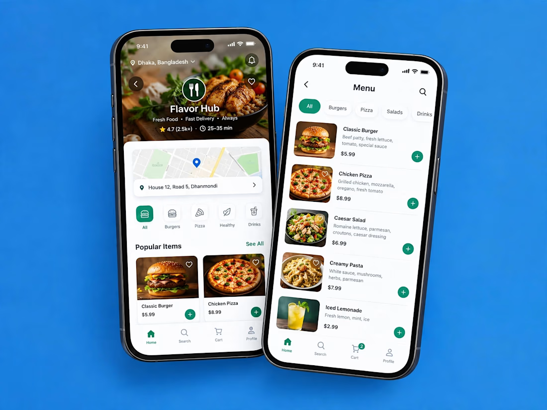

Love how clean and intuitive this feels, the navigation looks super smooth and the layout is really well balanced

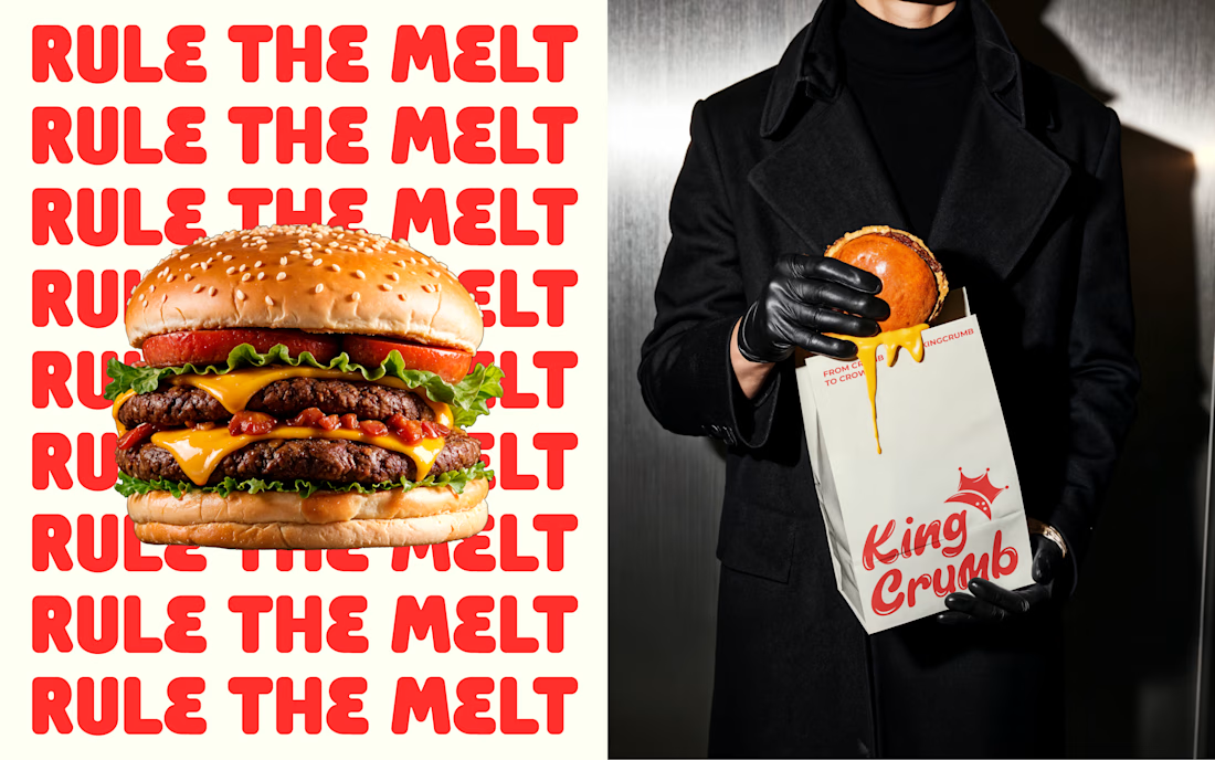
King Crumb — Bold Burger Branding That Makes an Impression.
A distinctive visual identity built around expressive typography, vibrant red tones, and eye-catching packaging.
From brand visuals to real-world applications, every detail brings King Crumb's personality to life.
What catches your eye first?


Looks great!!