The network for creativity
Join 1.25M professional creatives like you
Connect with clients, get discovered, and run your business 100% commission-free
Creatives on Contra have earned over $150M and we are just getting started
Back to feedPost

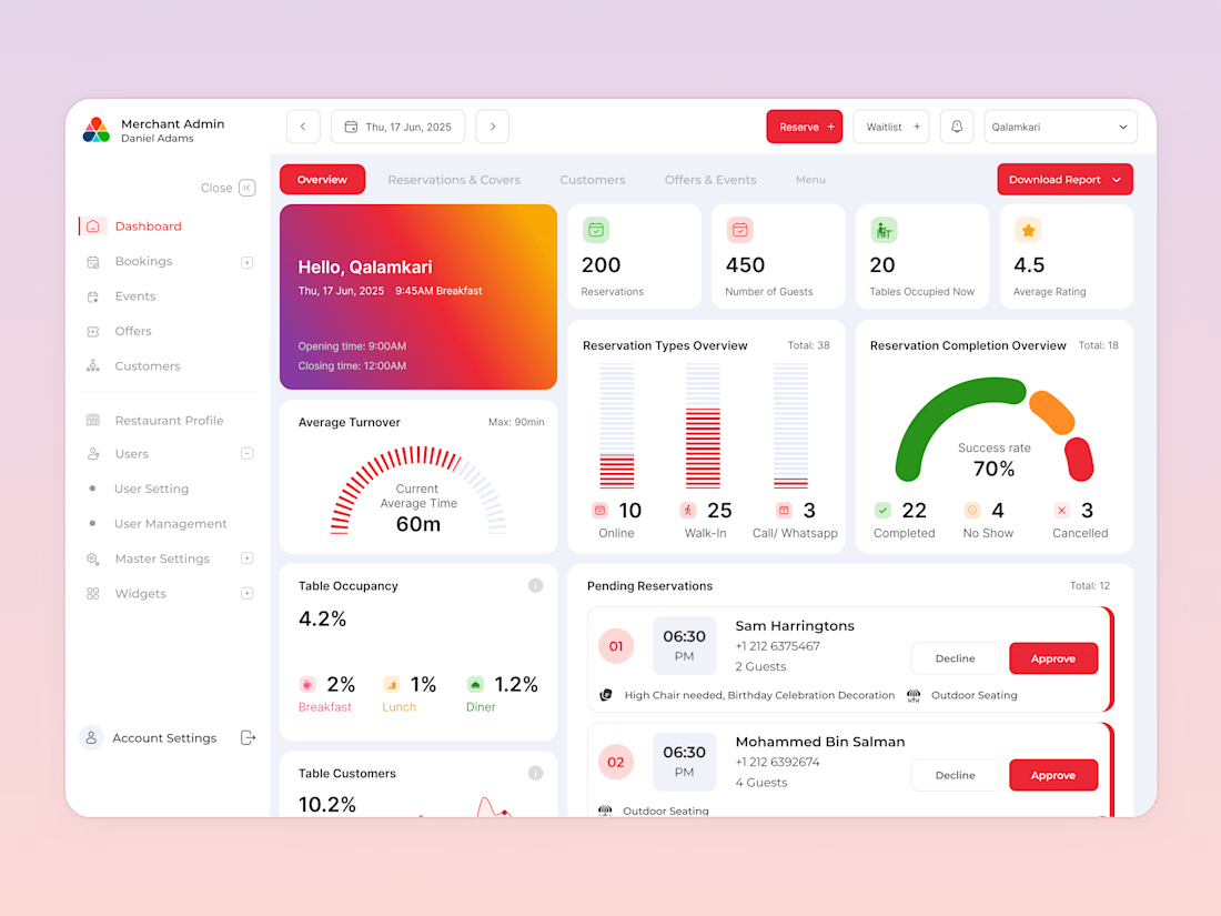
Most restaurant owners don't need more tools, they need one platform that actually helps them grow.
Amaken was designed to simplify restaurant operations, improve customer engagement, and give owners complete control over their business from a single SaaS platform.
Built for a client in Qatar, the platform streamlines loyalty programs, customer management, marketing campaigns, analytics, and day-to-day operations, helping restaurants focus on growth instead of complexity.
The results within the first month of launch:
🚀 50+ restaurants, cafés, and lounges onboarded
📈 20% higher growth performance compared to competing platforms
🔄 Seamless data migration made switching effortless, significantly increasing adoption among restaurant owners
When you remove friction and design around real business needs, adoption becomes a natural outcome.
You can also follow the "Completed work" link to the complete case study of work.
#SaaSDesign #ProductDesign #RestaurantTech #B2BDesign #DashboardDesign #UXDesign #GrowthDesign #CustomerExperience #EnterpriseDesign #DigitalTransformation


Good work
The network for creativity
Join 1.25M professional creatives like you
Connect with clients, get discovered, and run your business 100% commission-free
Creatives on Contra have earned over $150M and we are just getting started






Related posts

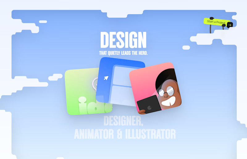
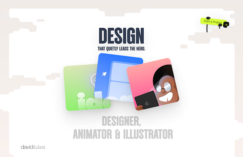
Should I go for left or right? Focusing on updating and finishing up my portfolio... and then I came across this crossroads. Another alternative is to make them switchable themes through a toggle, but I still need to decide which should be the default.
27 voted
75%
9 voted
25%
36 votes
Closed

Left is better because the text is readable, the overall blue background is not flashing to the eyes as compared to the right one.
For the top right button " Start a project ", you can add some animation so that it stands out and encourage users to click on it.

I'm offering 10 landing pages. $250 each. One-week turnaround. 🚀
I'm running a small experiment with SUR and opening 10 spots for people who need a simple, professionally designed landing page.
For founders, freelancers, creators and small businesses who have been putting their website off, need a place to launch something, or simply want a more professional online presence.
The offer includes:
• UX + UI design
• Responsive landing page
• Build and launch
• 1 week turnaround
Simple scope by design. If a project needs complex functionality, integrations, databases, e-commerce or custom development, we'll evaluate it separately.
Domain not included.
I'm curious to see what happens when you make it this simple to get a proper landing page out into the world.
10 spots. $250. First come, first served.
DM me or use the link in the comments to apply.


Amazing work


This is fire 🔥