The network for creativity
Join 1.25M professional creatives like you
Connect with clients, get discovered, and run your business 100% commission-free
Creatives on Contra have earned over $150M and we are just getting started
Back to feedPost
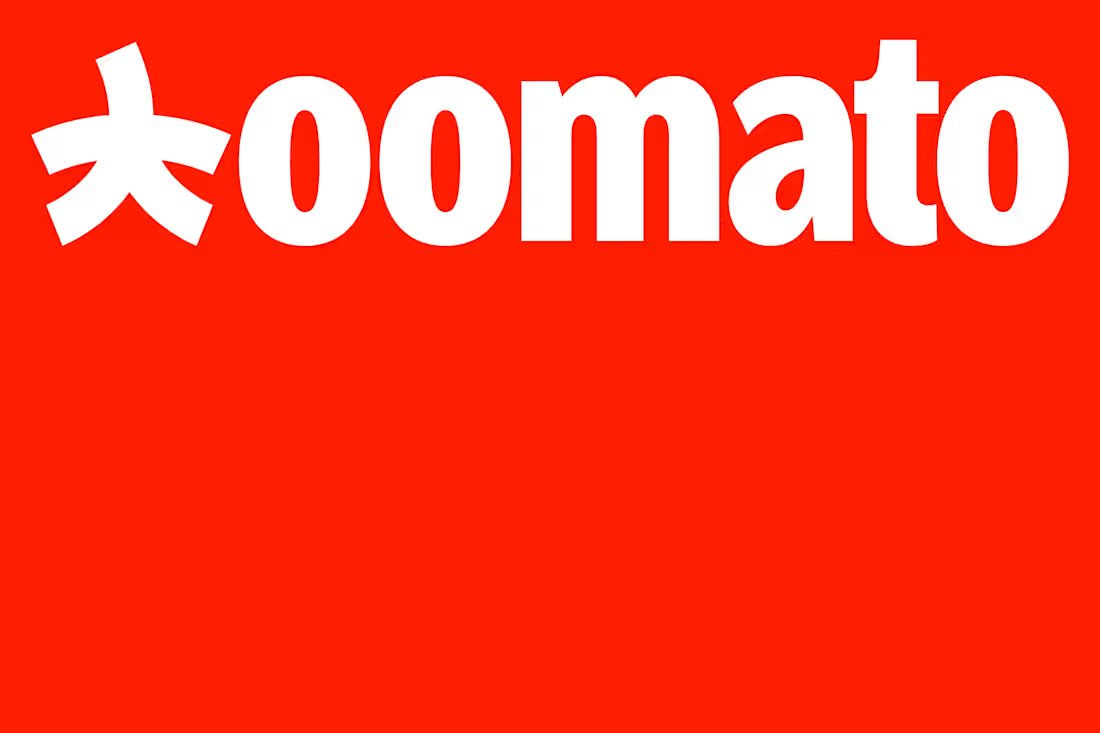
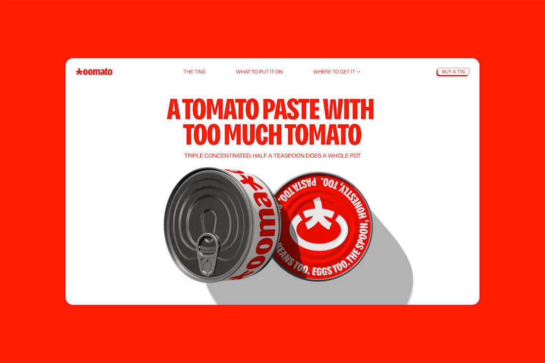
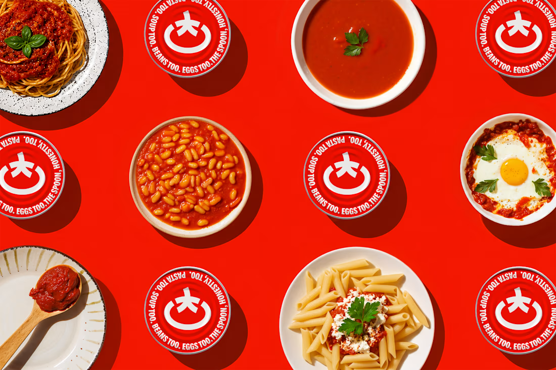
Tomato paste does important work quietly, building depth in sauces, soups, beans, and stews. Most brands in the category lean on red packaging and Italian heritage cues. Toomato's triple-concentrated paste stood apart: intense flavor from a small amount.
We positioned the brand as a small ingredient with an outsized presence. We named it Toomato, adding an extra "o" to "tomato" to make "too much" a compliment. "Too much tomato" set the attitude, "triple concentrated" grounded it in the product, and "use less" expressed the practical promise.
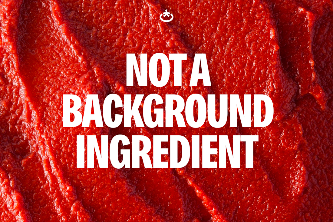
The identity made concentration visible. We reduced the tomato to a ring and stem, the palette to a single unapologetic red, and the language to short, emphatic statements. A bold, condensed typeface gave them impact on shelf and street. These choices gave a quietly powerful ingredient a presence to match.




skipping the red and italian cues is a bold move for tomato paste, curious how it reads on a real shelf

Thank you for the comment @Benjamin C , the idea was to combine tradition with a little boldness, I'm glad you liked.
The network for creativity
Join 1.25M professional creatives like you
Connect with clients, get discovered, and run your business 100% commission-free
Creatives on Contra have earned over $150M and we are just getting started
Related posts

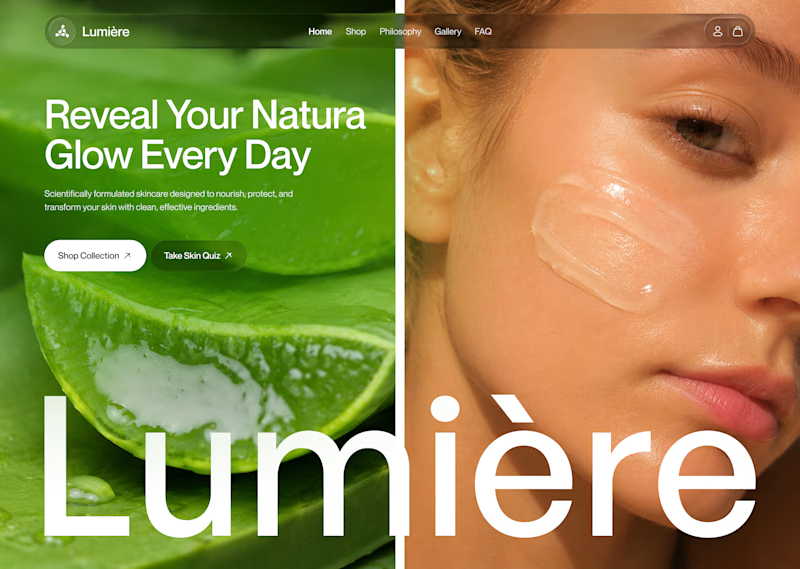
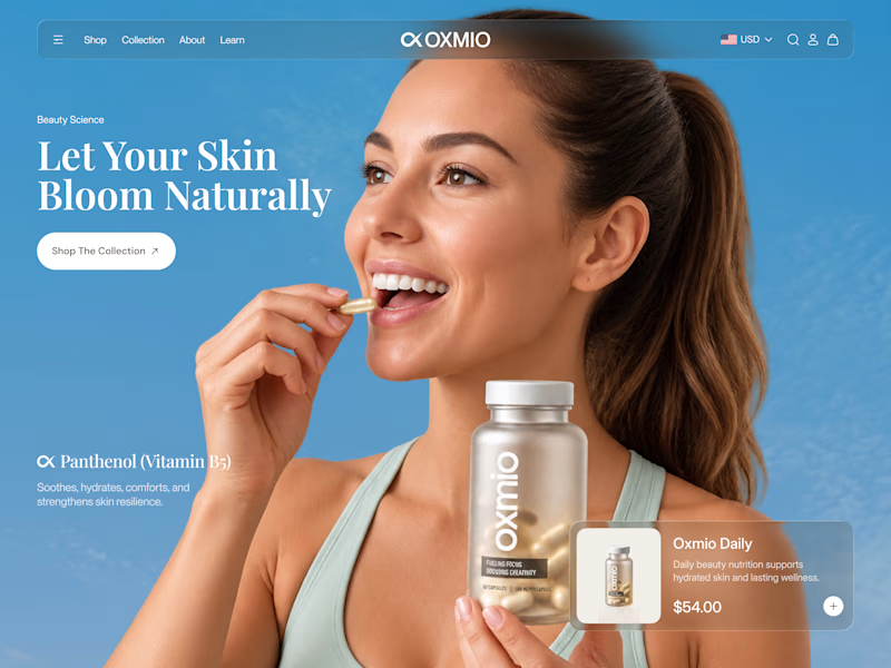
Your design has 3 seconds to earn attention. Which skincare brand wins?
A leads with confidence, energy, and aspiration. B builds trust through nature, freshness, and simplicity.
Great design doesn’t just look good. It makes people feel the brand before they read a word.
A or B? Which would make you stop scrolling?

30 voted
52%
28 voted
48%
58 votes
Closed


B without questions


Celvana brand identity & packaging for a red light therapy brand launching in the US.
The category is crowded with identical, unbranded panels. Celvana sells precision, so the brand had to look like medical equipment you can trust: clinical, exact and professional.
Brand identity case study
Packaging case study

This is high end branding

A cozy botanical shop that not only sells beautiful plants, but also takes care of yours while you’re away on a trip!
For the logo, I customized the typography to give it a soft, fluid effect inspired by growing branches and leaves.🌱
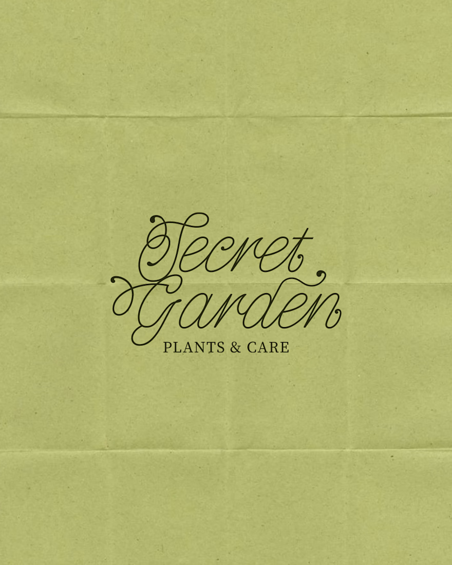

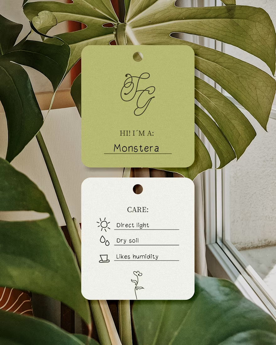

I like this calligraphy style.