The network for creativity
Join 1.25M professional creatives like you
Connect with clients, get discovered, and run your business 100% commission-free
Creatives on Contra have earned over $150M and we are just getting started
Back to feedPost
ketchup has looked the same for decades. POMORA was designed to make the category look again.
brand identity and packaging system for a contemporary ketchup brand, built on one conviction: a classic product with genuine quality deserves a visual language that shows it before the bottle is even opened.
bold red palette. organic tomato-inspired forms. packaging designed to stop someone on a shelf full of familiar bottles.
the tomato deserved better packaging. finally.


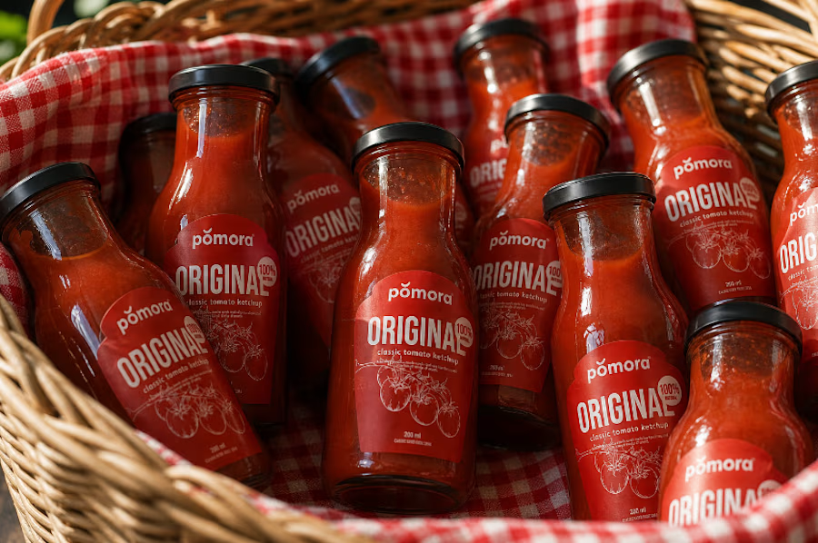
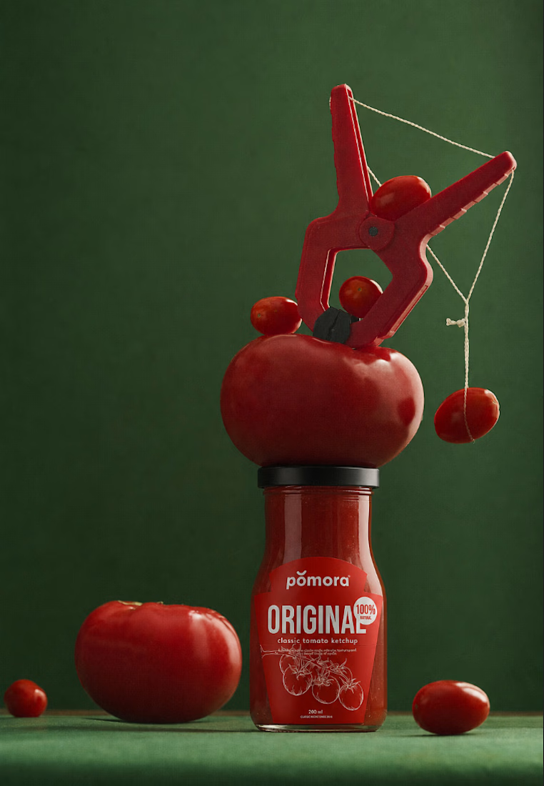
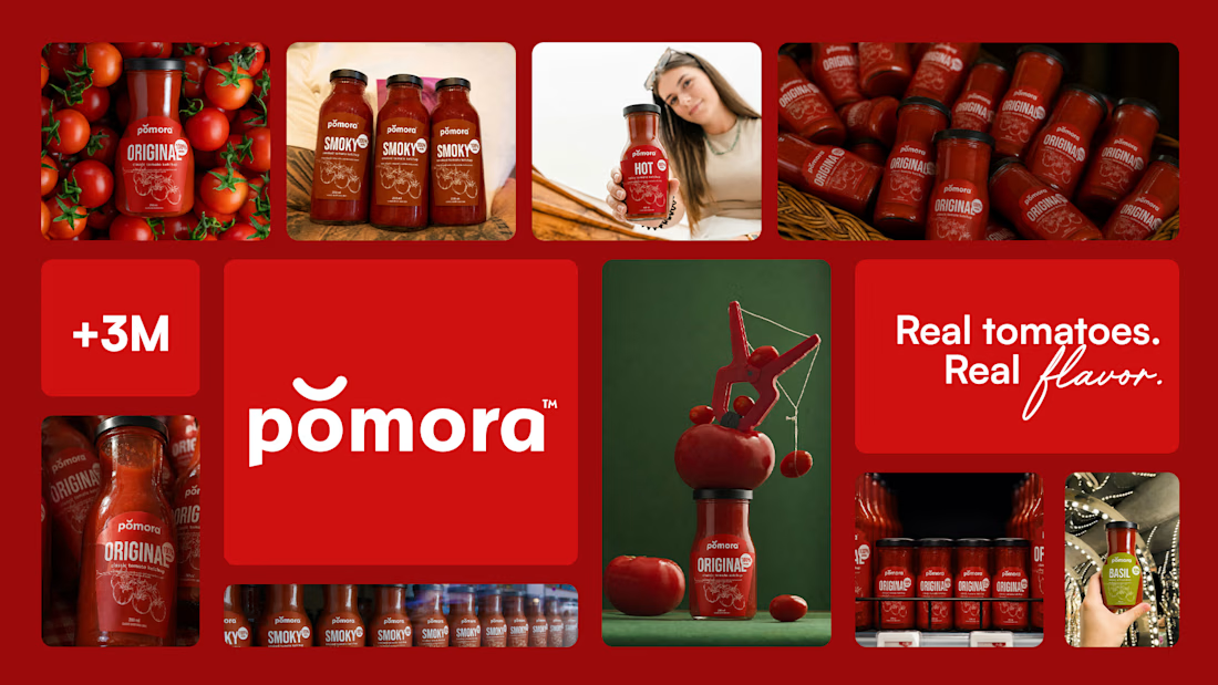

Loooove it! Great job Marta, very unique! 💯

Thanks!

The organic tomato-inspired forms against a shelf of straight-sided bottles is the real move — it doesn't just look "premium," it breaks the silhouette pattern shoppers scan past on autopilot. Standing out on-shelf is a shape problem before it's a color one.

This really does make ketchup feel like a category worth looking at again. The deep red and green palette gives POMORA huge shelf presence, and I love how the tomato imagery carries through both the packaging and campaign visuals. Really strong system, Marta.
In my opinion, that's what good branding is all about :) It's not an art to make a nice product, but one that actually works

Beautiful design all round.
Thank you!

So, sooo goooood!!!
Thank yoooou 🙌

Ketchup is a hard one because the product colour and the category colour are the same thing, so every red on the pack competes with what's already visible through the glass. On the shelf shot it's the green and the amount of label you left uncovered that separate it, more than...

This looks awesome! ✨✨


ketchup that doesn't look like ketchup, love it
You have to stand out, right? C:
The network for creativity
Join 1.25M professional creatives like you
Connect with clients, get discovered, and run your business 100% commission-free
Creatives on Contra have earned over $150M and we are just getting started
Trending
retrofuturism
Share your favorite designs from the past exploring the distant future. Or your own take on the aesthetic 🚀
halftone
Dots. Texture. Grain. Let's see your designs using the halftone technique.

Midjourney
Creatives are showing off what they're making with Midjourney.
colorgrade
Video editors sound off: How do you enhance the mood of your video in color grading?


Related posts



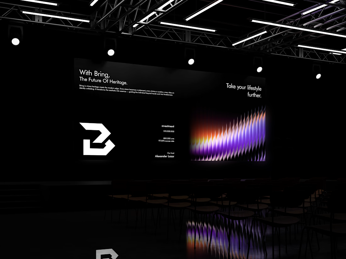



one last look at Vault® before i call it finished.
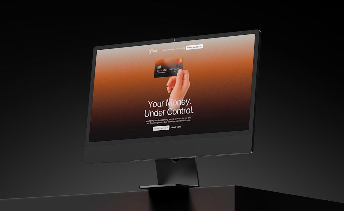
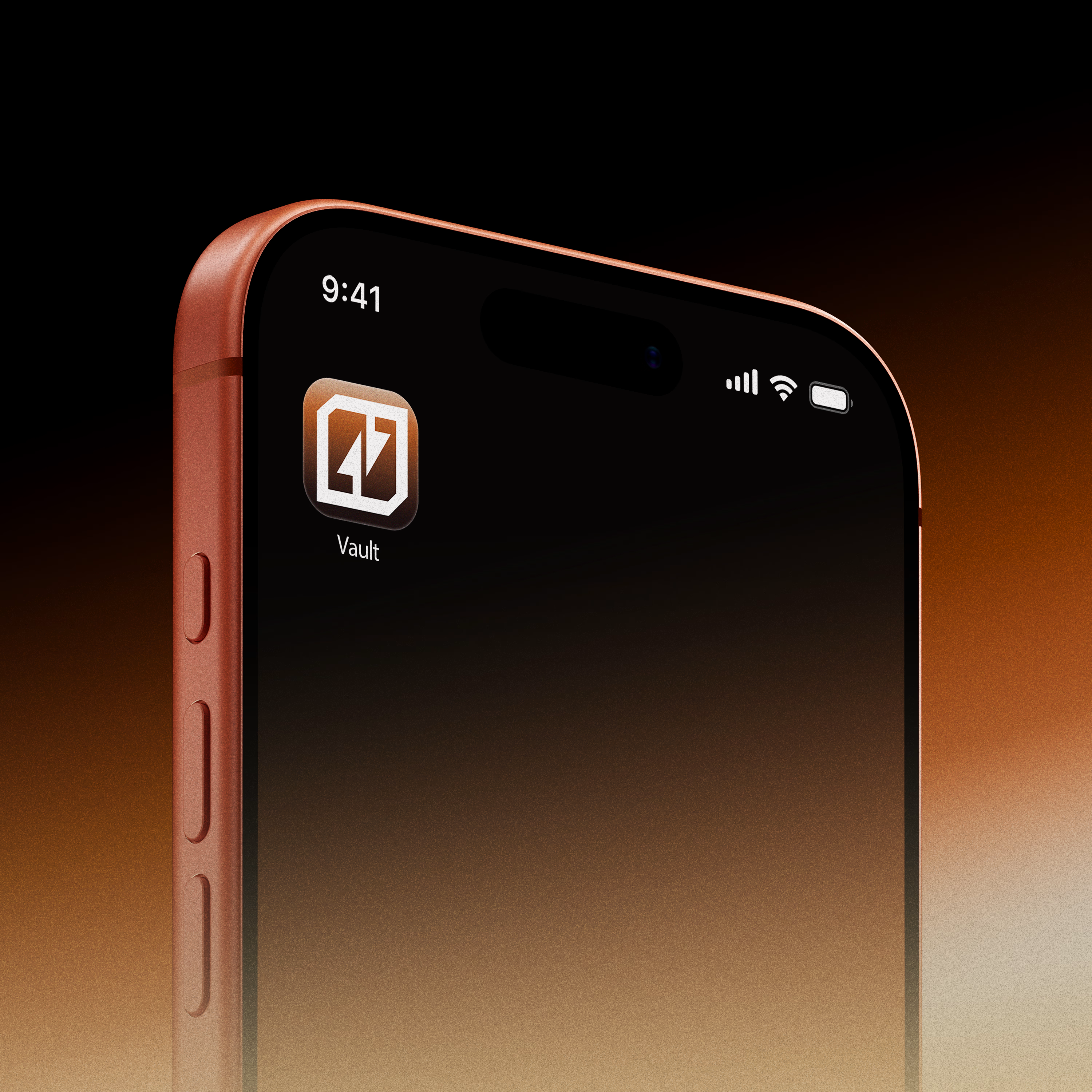
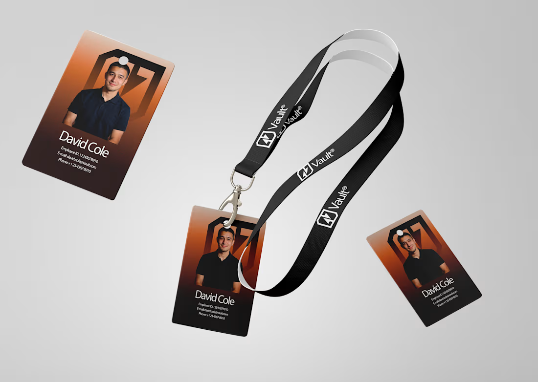
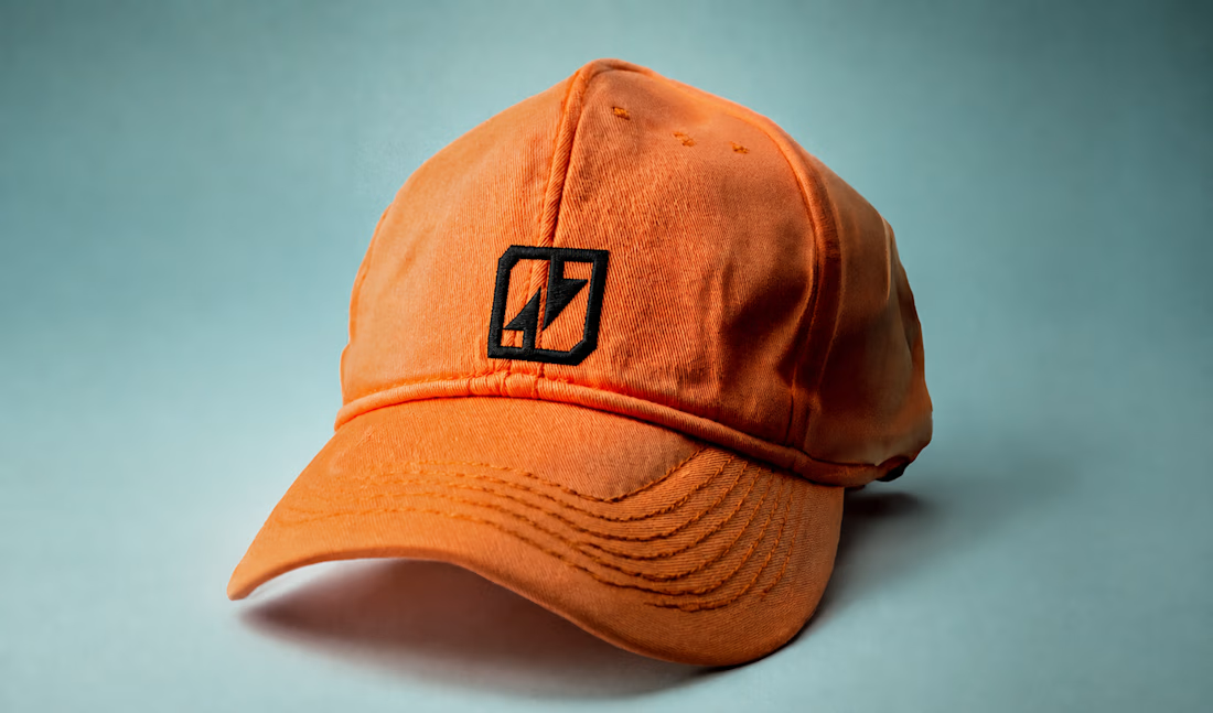
added a few more brand applications across the website, app, ID card, cap, and more.
really enjoyed seeing how the identity holds up across completely different touchpoints.
strategy → identity → digital → product
So gooooood
Vault® — Brand Strategy, Identity & Web.
This is definitely the last thing i’m posting about this project😂
The project started as a simple fintech branding exercise and slowly grew into a complete brand system — from strategy and identity to cards, digital products, social, and web.
Really happy with where this one landed.
Vault®: Your money. Under control.

excellent visual execution! the strength in the identity is indisputable.