The network for creativity
Join 1.25M professional creatives like you
Connect with clients, get discovered, and run your business 100% commission-free
Creatives on Contra have earned over $150M and we are just getting started
Back to feedPost

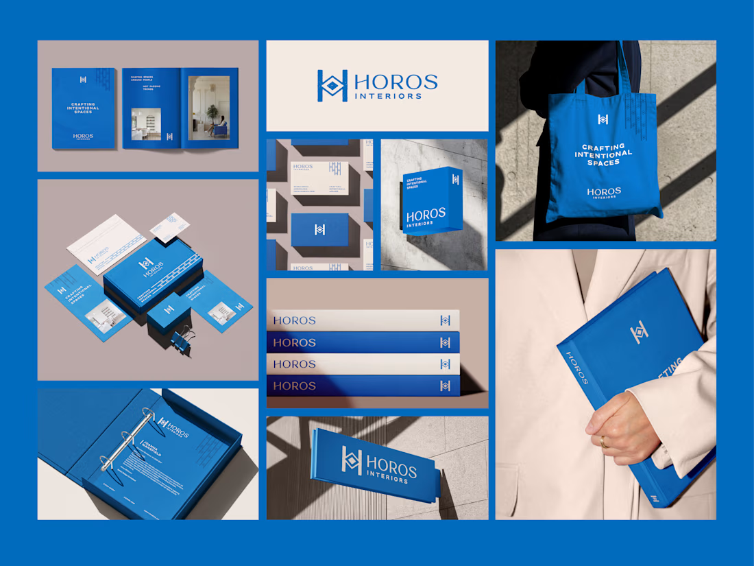
Brand identity for HOROS, an interior design studio
Inspired by the ancient Greek horos, a boundary stone used to define space with purpose and permanence, HOROS is an interior design studio focused on creating spaces that feel intentional, timeless, and thoughtfully designed.
For the identity, I wanted to translate this idea into a visual language built around structure, geometry, and craftsmanship.
The bold vertical forms of the H bring a sense of stability and architectural precision, while the central polygon takes inspiration from traditional Greek geometry, representing balance and harmony.
To soften the geometric structure, I introduced a handcrafted texture that adds a more human quality to the identity. It reflects the belief that every space is shaped by thoughtful decisions, craftsmanship, and attention to detail.
The colour palette takes inspiration from the landscapes of Greece, bringing together deep ocean blues and warm off-whites to create a feeling of calm, clarity, and timeless elegance. A visual identity that brings together structure and soul, geometry and craftsmanship.
HOROS, designing spaces with purpose and permanence.
interiordesignbrandingbrandidentityLogo DesignBrand DesignBrand StrategyAdobe IllustratorAdobe Photoshop


The network for creativity
Join 1.25M professional creatives like you
Connect with clients, get discovered, and run your business 100% commission-free
Creatives on Contra have earned over $150M and we are just getting started
Related posts

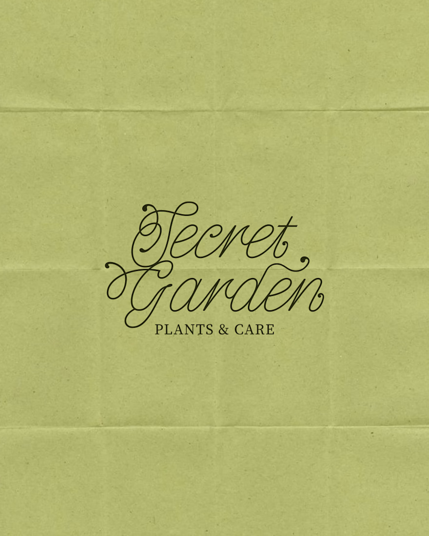
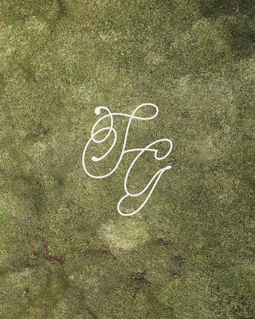
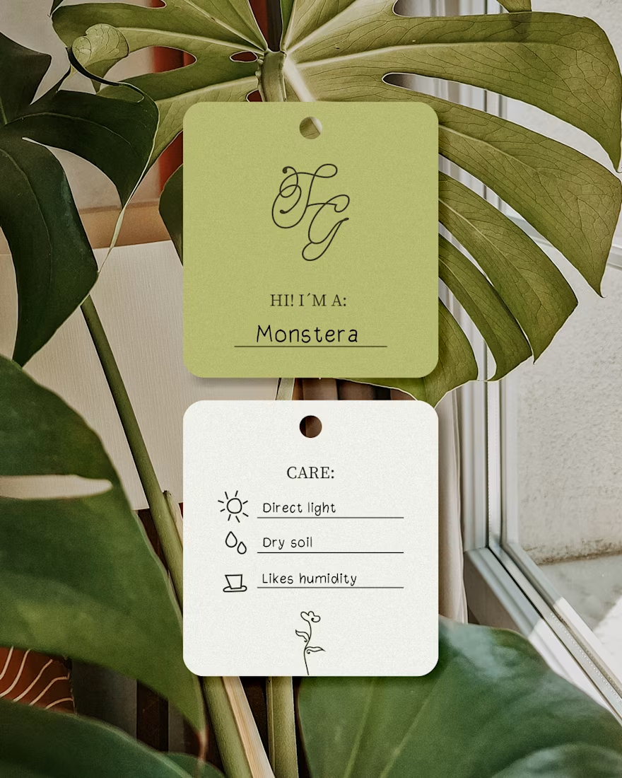
A cozy botanical shop that not only sells beautiful plants, but also takes care of yours while you’re away on a trip!
For the logo, I customized the typography to give it a soft, fluid effect inspired by growing branches and leaves.🌱

I like this calligraphy style.



Cool branding


Celvana brand identity & packaging for a red light therapy brand launching in the US.
The category is crowded with identical, unbranded panels. Celvana sells precision, so the brand had to look like medical equipment you can trust: clinical, exact and professional.
Brand identity case study
Packaging case study
This is high end branding