The network for creativity
Join 1.25M professional creatives like you
Connect with clients, get discovered, and run your business 100% commission-free
Creatives on Contra have earned over $150M and we are just getting started
Back to feedPost
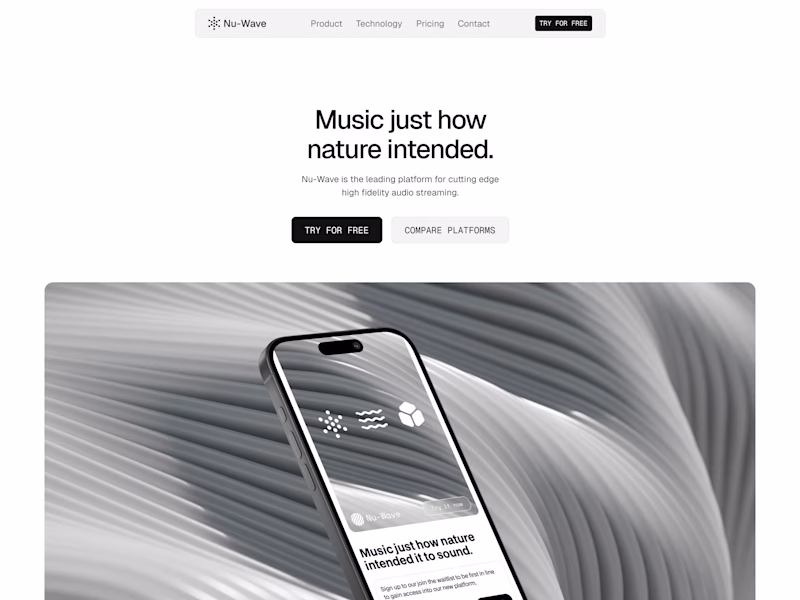
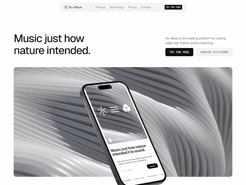
Taste Test
Iterating on a hero section layout for a high fidelity music streaming landing page. Going for super minimal and refined aesthetic. Which version do you prefer?
51 voted
31%
113 voted
69%
164 votes
Closed
Nice work
Thanks!
Version 2 feels cleaner and more premium to me, the spacing just breathes better
Thanks for the input!
Version one leaves a lot a white space, maybe too much for my kind of hero section. Version 2 is well balanced.
Overall, great, clean design.
Thanks! I'm feeling version 2 as well, it uses the space better if that makes sense
Great design idea
Thanks!
Both Design looks premium and awesome. But I like 2nd version
Thanks Sajibur!
Version 1 feels more intentional from a conversion standpoint. The visual hierarchy is tighter, headline -> CTA -> image, which guides the eye without friction. For a landing page where the goal is quick action (sign-ups, trials), this structure reduces cognitive load and gets...
Wow great insight! Thanks Zeeshan
Version 2: looking well balanced and group hierarchy
Thanks!
V2 looks much cleaner and well structured
Thank you Saif!
Both looks nice and clean, But Version 1 looks like the same like any other ordinary website hero section and Version 2 grabs attention
I agree!
Version 2 looks clean!
Thanks Angel!
Version 1 for me, cos it looks more cohesive and easier to read. And, the image serves as a good focal point without being too distracting.
The only change I'd suggest is making the "Music Just how nature intended." a tad bit bigger.
Like add another word of two to the heading you mean?
Nah, I meant you should make the entire heading bigger
Ahh yeah. I agree for version 1 it would definitely benefit from a bigger heading, better hierarchy that way
Great work
Thanks!
impressive design
Thanks Sohan!
Version 2 is new?
What do you mean?
Professional work
Appreciate it Fazlur 🙏
Version 2 is well ⚖️ balance and also look premium
Thanks Franklin!
Version 2 looks more premium
2nd looks more attractive
Thanks!
Interested how aligning to the left changes the entire page dynamics. I'm going to borrow this idea lol 💗
Yeah one change can change the whole feel of a design! Haha please do and experiment with it further
Version 2 looks good! The headline is clear and looks solid overall!
Thanks man!
Both looks great
Thanks!
Clean work—both directions feel very intentional and premium.
Personally, I lean toward Version 2. The composition feels more balanced, and the added breathing space on the right improves visual hierarchy. It also guides the eye more naturally from headline → CTA → product, which...
No not necessarily. Just iterating on the layout to see which one feels more on brand for this project!
Version 2 feels stronger.
The composition creates better focus and the product stands out more naturally.
Version 1 looks clean, but it feels slightly static in comparison.
I agree! Thanks Mian
You're welcome!
The network for creativity
Join 1.25M professional creatives like you
Connect with clients, get discovered, and run your business 100% commission-free
Creatives on Contra have earned over $150M and we are just getting started
Related posts
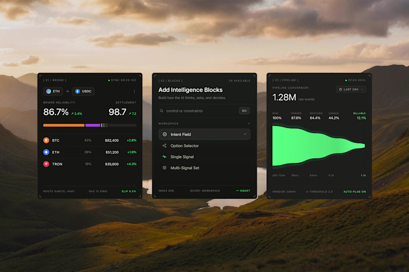
Interface cards for a recent product design project, what would be the best direction? Dark Mode or Light Mode? ⚡️
69 voted
68%
32 voted
32%
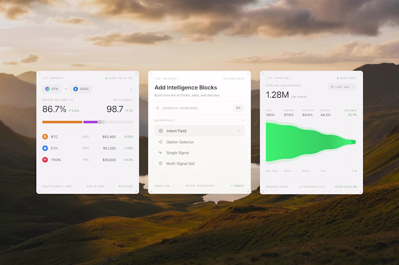
101 votes
Closed
Both look great, but i will go for the dark mode
I designed a website and 3d animations for Ngen.
This is mesmerizin 🔥
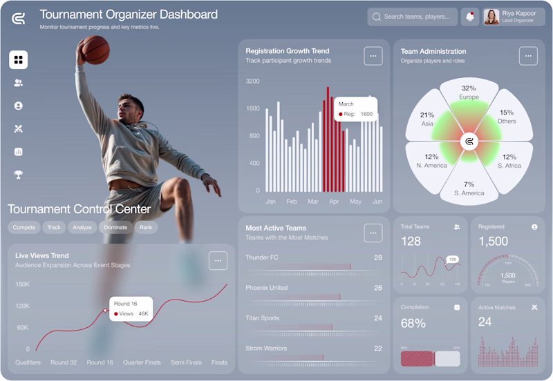
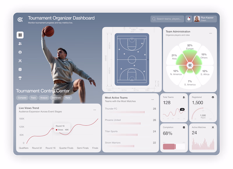
Small visual changes can completely change how a product feels.
Imagine you're the client.
You paid for this dashboard.
Which version would you approve?
🅰️ A
🅱️ B
I'm curious what catches your eye first.
#uidesign #dashboard #saas #figma #productdesign #webdesign #uxdesign #sports #designfeedback #contra
14 voted
58%
10 voted
42%
24 votes
Closed
I prefer A. The hero section grabs my attention immediately.
Challenges
View allTrending
Claude
Claude has entered the design space. How are you using Claude Design?
Contra University
Learn from expert creatives how to earn more using next-gen AI tools.
fifaworldcup2026
The World Cup is here and the whole world's watching. How are you designing for the world stage?
creativeaiflow
Creative AI workflows are evolving. What tools do you use, and what are their strengths and weaknesses?
freelancerlife
Freelancer life is wins, pivots, and everything in between. What’s yours right now?