The network for creativity
Join 1.25M professional creatives like you
Connect with clients, get discovered, and run your business 100% commission-free
Creatives on Contra have earned over $150M and we are just getting started
Back to feedPost
Taste Test
Iterating on a hero section layout for a high fidelity music streaming landing page. Going for super minimal and refined aesthetic. Which version do you prefer?

51 voted
31%
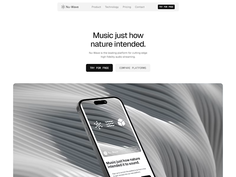
113 voted
69%
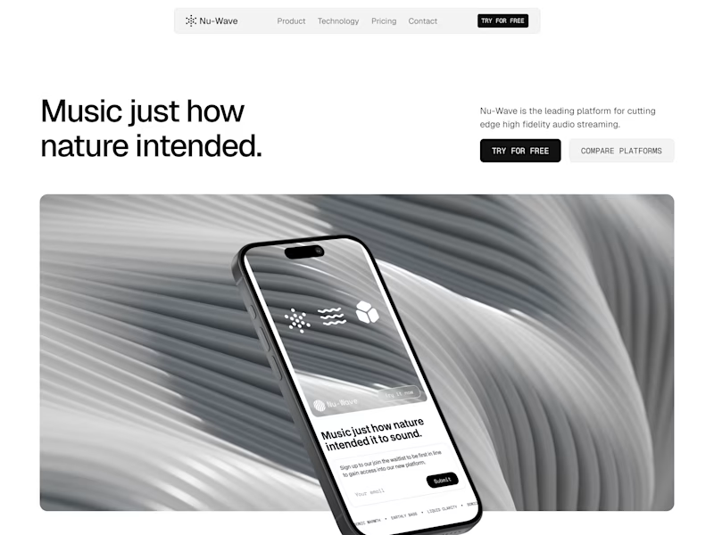
164 votes
Closed

Version 2 feels cleaner and more premium to me, the spacing just breathes better

Thanks for the input!


Version one leaves a lot a white space, maybe too much for my kind of hero section. Version 2 is well balanced.
Overall, great, clean design.
Thanks! I'm feeling version 2 as well, it uses the space better if that makes sense

Great design idea
Thanks!

Both Design looks premium and awesome. But I like 2nd version
Thanks Sajibur!

Version 1 feels more intentional from a conversion standpoint. The visual hierarchy is tighter, headline -> CTA -> image, which guides the eye without friction. For a landing page where the goal is quick action (sign-ups, trials), this structure reduces cognitive load and gets...
Wow great insight! Thanks Zeeshan

Version 2: looking well balanced and group hierarchy
Thanks!

V2 looks much cleaner and well structured
Thank you Saif!

Both looks nice and clean, But Version 1 looks like the same like any other ordinary website hero section and Version 2 grabs attention
I agree!

Version 2 looks clean!
Thanks Angel!

Version 1 for me, cos it looks more cohesive and easier to read. And, the image serves as a good focal point without being too distracting.
The only change I'd suggest is making the "Music Just how nature intended." a tad bit bigger.
Like add another word of two to the heading you mean?
Nah, I meant you should make the entire heading bigger
Ahh yeah. I agree for version 1 it would definitely benefit from a bigger heading, better hierarchy that way

Great work
Thanks!

impressive design
Thanks Sohan!

Version 2 is new?
What do you mean?

Professional work
Appreciate it Fazlur 🙏

Version 2 is well ⚖️ balance and also look premium
Thanks Franklin!

Version 2 looks more premium

2nd looks more attractive
Thanks!

Interested how aligning to the left changes the entire page dynamics. I'm going to borrow this idea lol 💗
Yeah one change can change the whole feel of a design! Haha please do and experiment with it further

Version 2 looks good! The headline is clear and looks solid overall!
Thanks man!

Both looks great
Thanks!

Clean work—both directions feel very intentional and premium.
Personally, I lean toward Version 2. The composition feels more balanced, and the added breathing space on the right improves visual hierarchy. It also guides the eye more naturally from headline → CTA → product, which...
No not necessarily. Just iterating on the layout to see which one feels more on brand for this project!

Version 2 feels stronger.
The composition creates better focus and the product stands out more naturally.
Version 1 looks clean, but it feels slightly static in comparison.
I agree! Thanks Mian
You're welcome!
The network for creativity
Join 1.25M professional creatives like you
Connect with clients, get discovered, and run your business 100% commission-free
Creatives on Contra have earned over $150M and we are just getting started











Related posts

Same content, different experience. A few thoughtful design choices can completely change how a presentation feels, flows, and communicates. Which version would you choose?

11 voted
31%
24 voted
69%
35 votes
Closed

Verde Vista 1 is more modern and futuristic specially with blue colors and robotic hand❤️
Great job Rasid🎉🎉🔥🔥

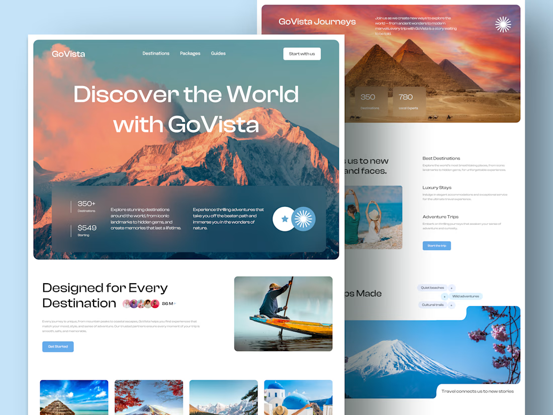
GoVista Journeys - A travel landing page designed to make people dream of their next destination.
A travel company based in Leicester, UK, needed a visually engaging landing page to showcase its destinations and travel experiences while its larger website was being prepared.
The goal was simple: make a strong first impression through beautiful travel imagery, a clean layout, and a design that makes people want to explore more.
Because in travel, the journey can begin long before the booking. ✈️
What catches your attention first on a travel website: the images, the destinations, or the overall design? 👇

I like this very much, very good concept

The team is cooking
Motion design for the logo we are making for Nation e-commerce


Wou