The network for creativity
Join 1.25M professional creatives like you
Connect with clients, get discovered, and run your business 100% commission-free
Creatives on Contra have earned over $150M and we are just getting started
Back to feedPost
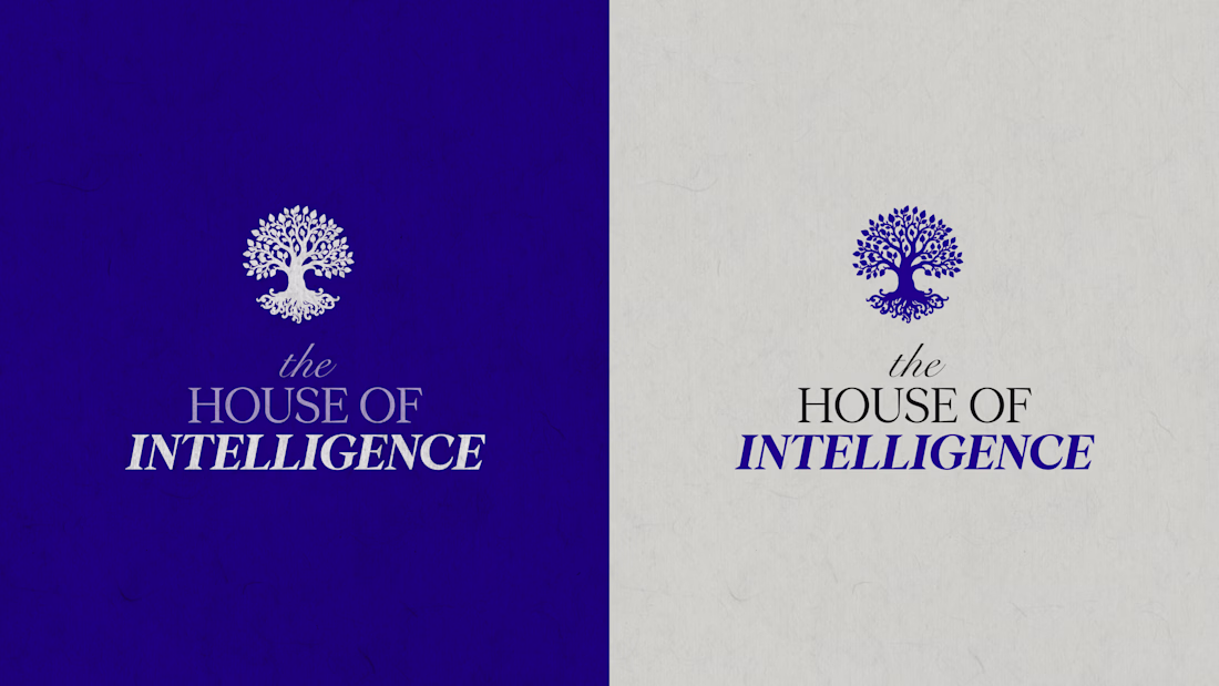
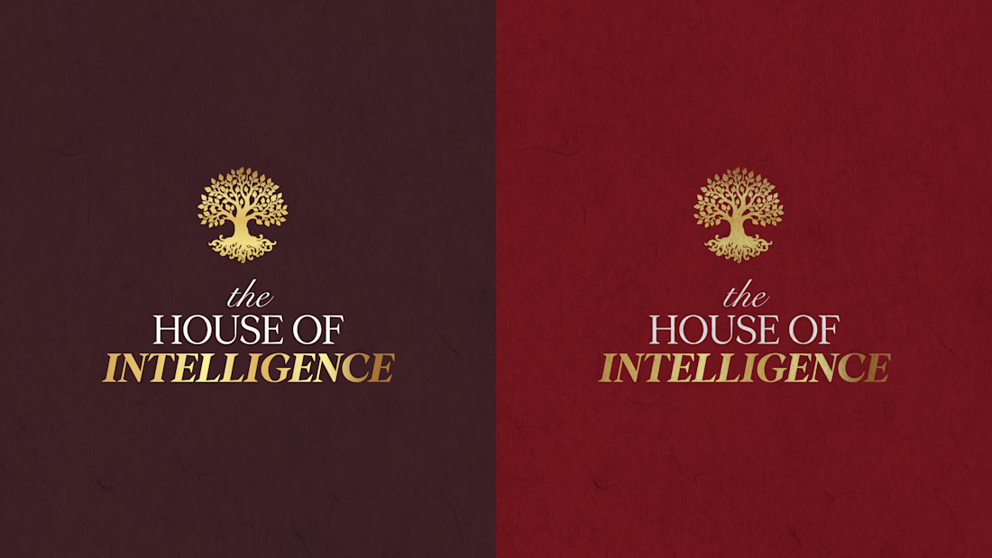
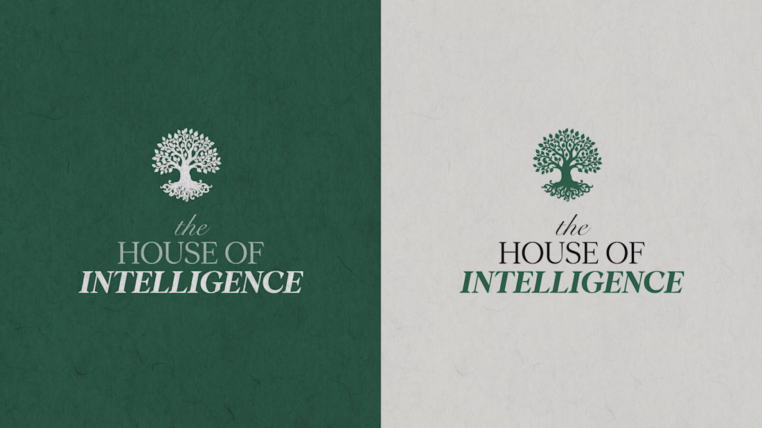
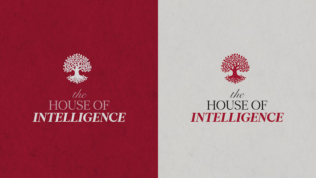
Taste Test
Light or Dark?
86 voted
45%
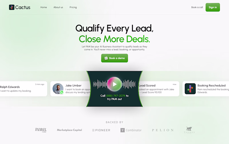
105 voted
55%
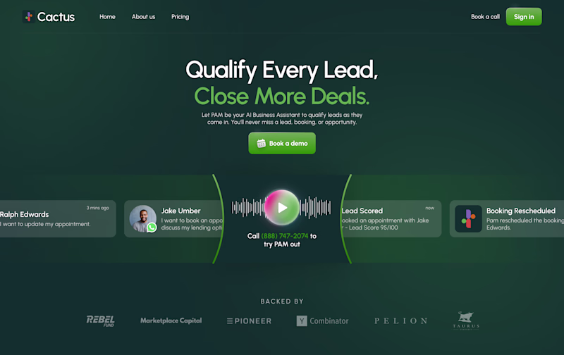
191 votes
Closed
Dark feels more premium here — the contrast helps anchor attention on the headline & CTA. Curious if you noticed any perceived hierarchy differences between the two?
I totally feel you, originally I only designed the light mode but felt something was missing so designed the dark mode as well and immediately fell in love haha
Haha same experience here 😄
Sometimes dark mode reveals the hierarchy and spacing in a way light mode can’t.
Very hard to pick but light
Yeah light is cleaner I'd say
I'd say the light UI feels better. It goes well with what you are expressing and light feels more refreshing and builds trust in viewers.
Both are great btw.
Thanks for your feedback
Thanks Ali
Light seems appealing to me
Thanks Nouman
Indeed it is hard to pick, your work looks lovely.
So kind of you, Hugo
Dark look more clean and clear🚀
Yes, same thoughts
Dark
Yup
Dark for me, the neon green on black makes the Cactus brand pop and feels more modern for a sales tool.
Same thoughts, thanks for your feedback :)
This was a tough pick, but light looks really good, it feels subtle
Thanks Wuraola
I prefer dark this is so good
Thanks
Dark mode just hits different 😎 but that light version is clean too — both are honestly well done!
Thanks Rayan
Light
Dark for me. Feels more clean and especially with the colors and contrasts
Same thoughts
both are really great but i will go with the dark one. It has a more futuristic tone to it
Thanks
The light version ✨️
Thanks
I prefer the light mode, well done
Thanks
I like the light one
Dark, perfect
Thanks Burak
The both looks really clean but the dark mode does it better
Thanks
I am a dark-mode girlie so dark
Great work
It's a win win situation 🤔
haha, you're right
Light looks great, works best I'll say
thanks
Light mode for me
To be honest, I love dark theme any day but for this light goes better
Love the grid consistency here very clean execution.
The network for creativity
Join 1.25M professional creatives like you
Connect with clients, get discovered, and run your business 100% commission-free
Creatives on Contra have earned over $150M and we are just getting started
Related posts
Team Light or Team Dark? ☀️🌙
I created two versions of the same experience, and now I need your vote.
Watch both videos and comment:
☀️ LIGHT
🌙 DARK
No long explanations — just choose the one you would actually use.
Let the theme battle begin. 👇
Also, if you have a project involving Next.js, Framer, custom software, AI solutions, automations, or web applications, feel free to reach out:
📩 panicvaskrsije@gmail.com
🌐 panicdigital.com/contact
31 votes
Ends in 14h
Voted Light! Both versions look incredibly clean, but what really stands out is the handling of the accent typography in the light UI—specifically how the vibrant blue numbers and highlights contrast perfectly against the deep navy background without losing readability or...
need your eyes on this one :)
two hero options for a private tutoring platform we're working on at effekt.design
White or Blue?
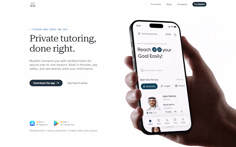
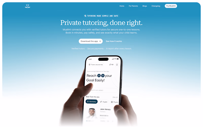
66 votes
Ends in 1d
I will pick blue 🙌
Trending
Claude
Claude has entered the design space. How are you using Claude Design?
Contra University
Learn from expert creatives how to earn more using next-gen AI tools.
fifaworldcup2026
The World Cup is here and the whole world's watching. How are you designing for the world stage?
creativeaiflow
Creative AI workflows are evolving. What tools do you use, and what are their strengths and weaknesses?
freelancerlife
Freelancer life is wins, pivots, and everything in between. What’s yours right now?