The network for creativity
Join 1.25M professional creatives like you
Connect with clients, get discovered, and run your business 100% commission-free
Creatives on Contra have earned over $150M and we are just getting started
Back to feedPost
Taste Test
Brand new project is cooking up stay tune for further updates
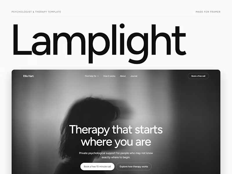
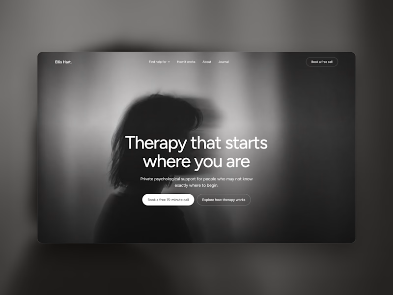
which one is looks better ? light mode (paper texture) or dark mode

2 voted
33%
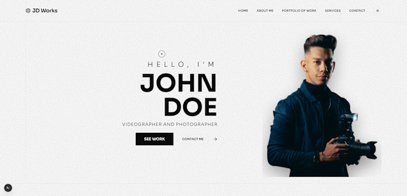
4 voted
67%
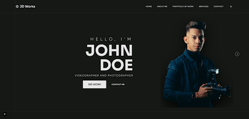
6 votes
Closed

Dark mode

Thanks for voting 👍

Dark mode, but design need more balance.
Thanks for voting & feedback! I'll work on balancing it more. 🙌


Dark one seems better
Thanks for voting & feedback!
The network for creativity
Join 1.25M professional creatives like you
Connect with clients, get discovered, and run your business 100% commission-free
Creatives on Contra have earned over $150M and we are just getting started





Related posts

The client really liked Barcelona typical floor tiles, so I presented these logo options. Which one you liked the most?
4 voted
13%
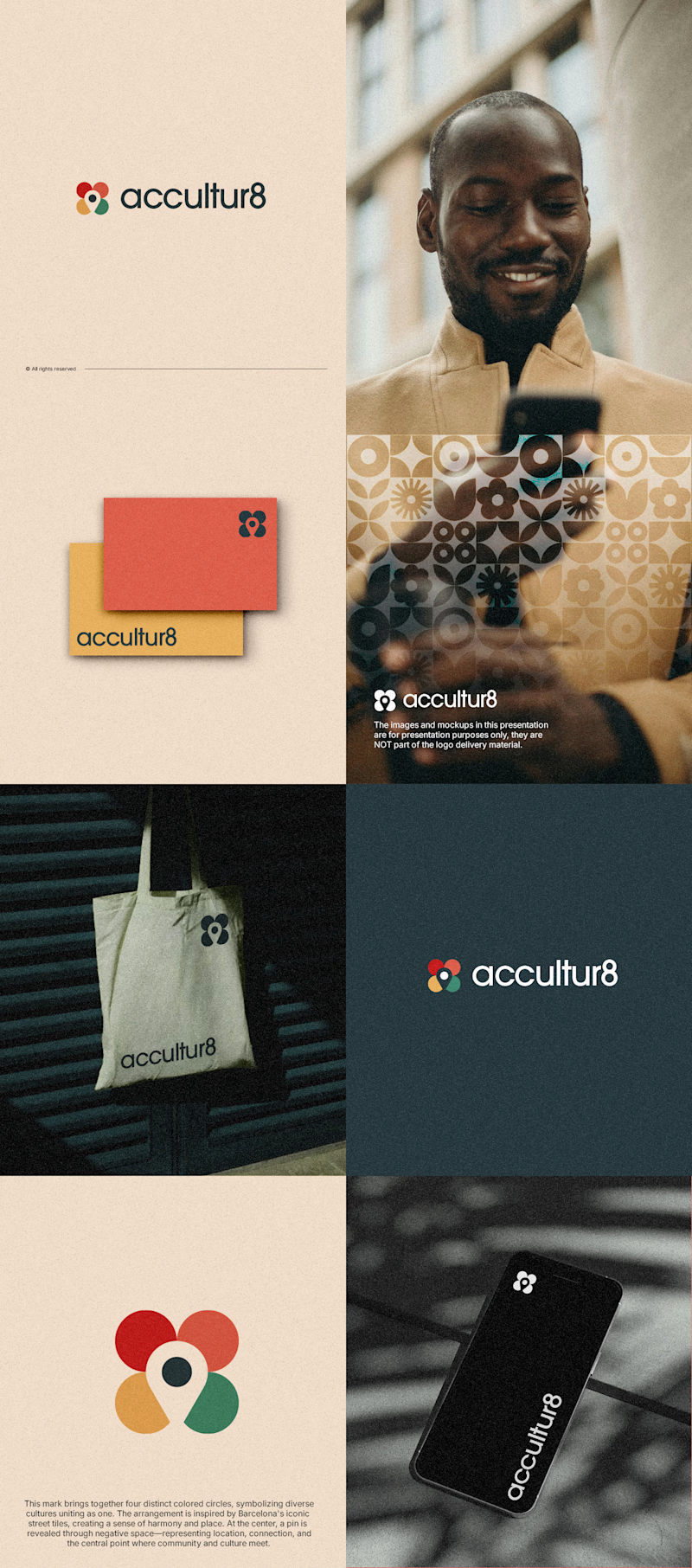
26 voted
87%
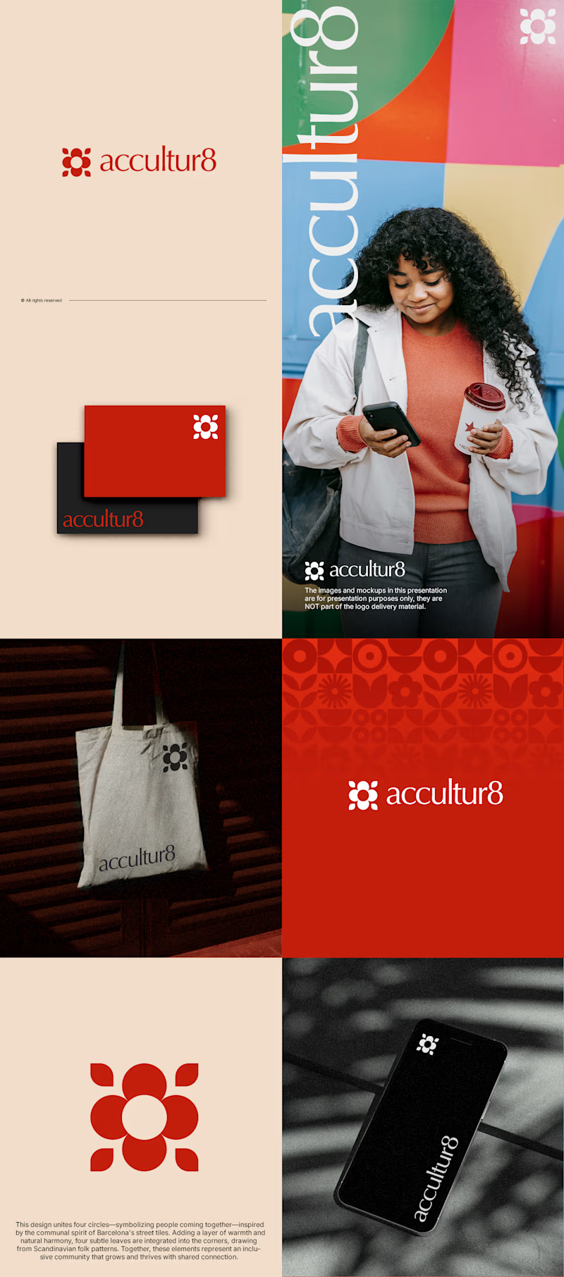
30 votes
Closed
Love option 2, which one do you like most ?


Which one grabs your attention and should be the main visual for a framer template thumbnail?

7 voted
50%
7 voted
50%
14 votes
Closed

Both works are great; it's hard to choose


Collage