The network for creativity
Join 1.25M professional creatives like you
Connect with clients, get discovered, and run your business 100% commission-free
Creatives on Contra have earned over $150M and we are just getting started
Back to feedPost
Taste Test
Do you like more dark green mode or white mode?
I like both, but I prefer dark green mode. The client wanted specifically dark green mode, so I chose that.
This project corresponds to a glassmorphism redesign I made for a minimalistic website: read more here.

25 voted
76%
8 voted
24%
33 votes
Closed

Use brighter text colors, stronger contrast, and a slightly darker overlay to improve readability.

Dark green mode

Brilliant Work

thanks a lot for all the comments and support :)

Love the look of the dark green mode

thanks! 😊

Upgoating the dark green mode
thanks a lot!

You never fail to impress me!
thanks a lot :)


Hi,
From my perspective, the best approach here is whichever one delivers the highest legibility. Even without the client's suggestion, I would have arrived at the same choice, legibility and WCAG accessibility compliance need to be the priority.

Dark green mode, no questions asked.
The network for creativity
Join 1.25M professional creatives like you
Connect with clients, get discovered, and run your business 100% commission-free
Creatives on Contra have earned over $150M and we are just getting started

Challenges
View all


Related posts


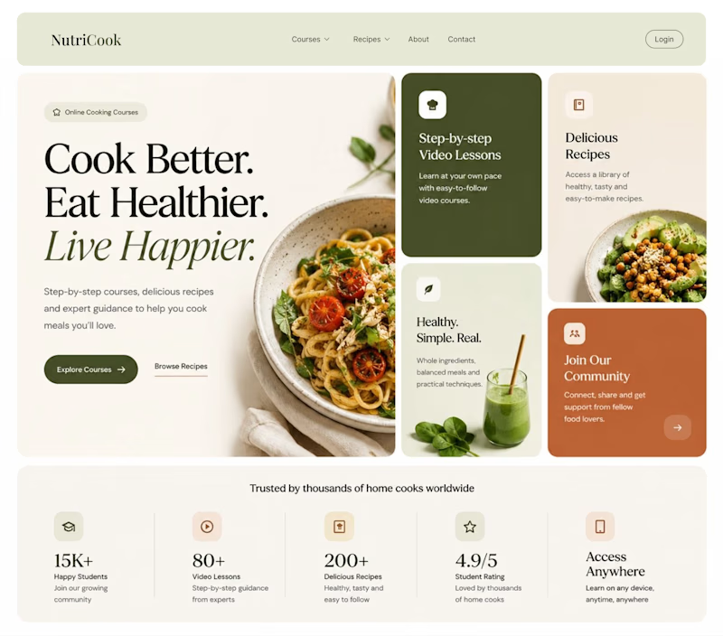
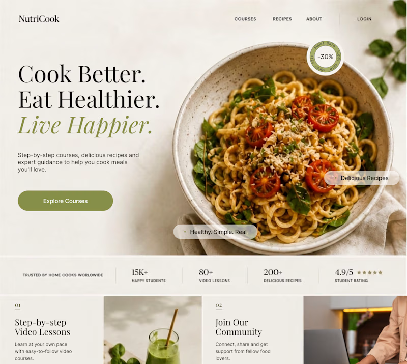
Same content. Two completely different vibes.
What happens when you keep the course content the same, but change the structure, typography, and color palette?
Two hero sections. One course. Two different visual experiences.
Which one would you choose? 1 or 2?
29 voted
41%
42 voted
59%
71 votes
Closed

Option 1 works well , the heirarchy and card layout on the hero is very smart

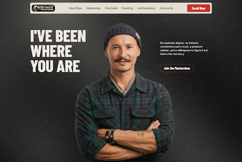
Which layout is better?
.
.
Curious which one wins? Follow along for more tests like this x.com/rightnextstep

20 voted
67%
10 voted
33%

30 votes
Closed
Hero 1 shows the hero text very well but you might need to work on the Hero CTA for "join the masterclass", I will probable miss it as a key action if I was a regular user

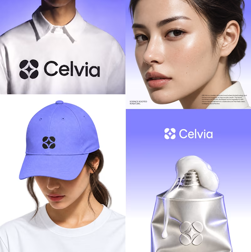
Which color direction feels stronger for CELVIA, a modern skincare brand blending biotechnology with nature - Bio Lime or Soft Violet?
8 voted
42%
11 voted
58%
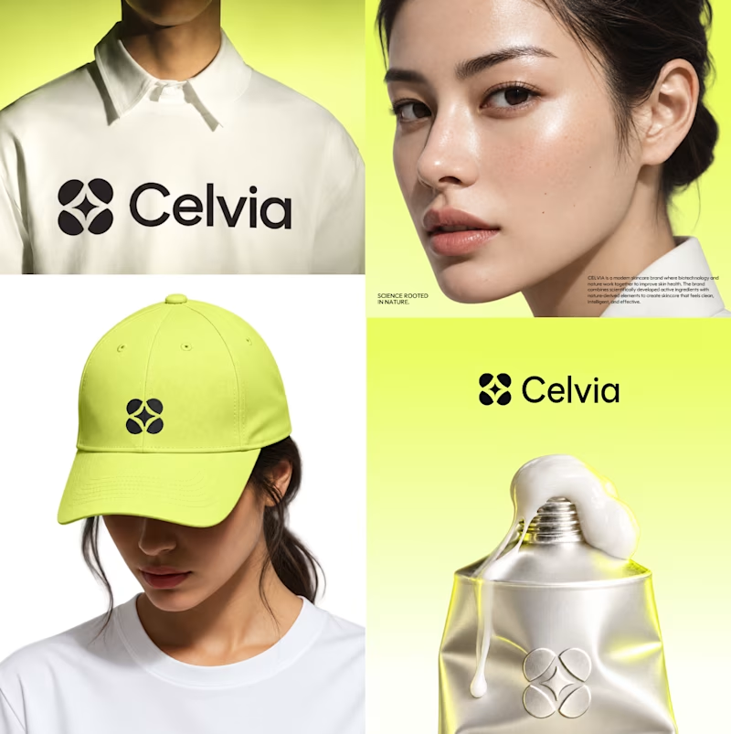
19 votes
Closed

Bio lime 🤩