The network for creativity
Join 1.25M professional creatives like you
Connect with clients, get discovered, and run your business 100% commission-free
Creatives on Contra have earned over $150M and we are just getting started
Back to feedPost
Taste Test
Healthcare should feel less clinical and more human.
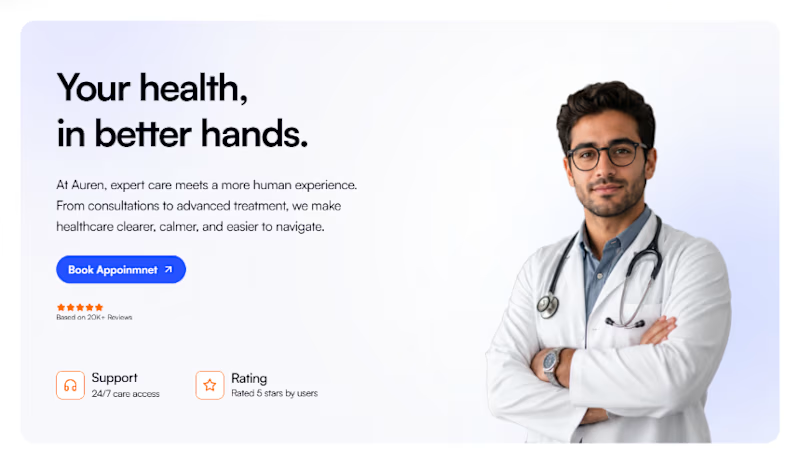
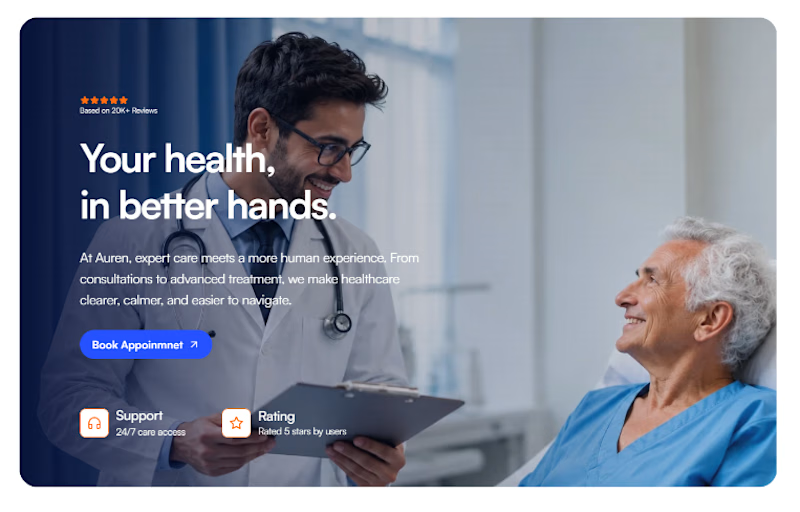
Introducing Auren® a contemporary healthcare brand built around clarity, calm, and patient-first care.
For the website, I wanted the experience to feel trustworthy without feeling sterile. Warm photography, confident typography, soft colors.
What do you think of the direction? 👀

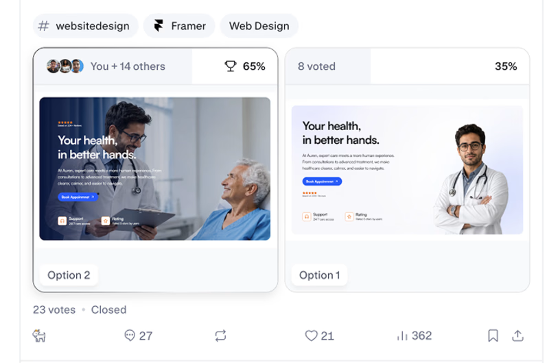
8 voted
35%
15 voted
65%
23 votes
Closed

option2 looks better


Yes same for me!


Option 2 seems better
Yes I agree

Really like the direction. Curious how you balanced making it feel warm while still keeping that sense of clinical credibility? also imo 2nd option looks more good
The topic of healthcare is already sensitive and confusing for most of the patients and family.
Why confuse them more with a overwhelming design?
I just kept it simple, clean and warm , here copy plays an important role too.


Nice design !
Thanks

Went with the confident doctor portrait, it reads more reassuring to me than the caretaker scene. Warm photography and soft colors are doing a lot of the trust-building work here without tipping into sterile.

Option 2 looks amazing
Thanks, i feel it's more clean and warm

If this is for doctors portfolio option 1 is nice,
if is for hospital appointment booking option 2

Option 2 looks more humanized, which is very important in the healthcare industry.
I agree Farhan

It shows the better hand
I agree with this

Love it my option is 1
What do you love about it?
It's more minimal and the gradient is so cool
Thanks

yeah because human connect with it easily when it is human focused
I agree Arman, human connection is utmost priority in healthcare.

I guess it's option 1 ( doctor with patient) which shows the care experience.
Is that a typo from your end?
The network for creativity
Join 1.25M professional creatives like you
Connect with clients, get discovered, and run your business 100% commission-free
Creatives on Contra have earned over $150M and we are just getting started

Challenges
View all


Related posts

Two case studies, two totally opposite registers.
One is carved in stone and says nothing.
One drips off a spoon and won't shut up about which field it came from.
Which one do you want first?
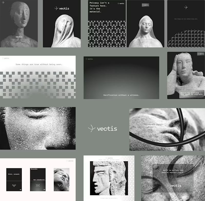
vectis — zero-knowledge privacy, dithered like a forgotten statue
HIVE INDEX — raw honey with a paper trail. No two lots taste the same, and we don't correct for that.
45 voted
51%
43 voted
49%
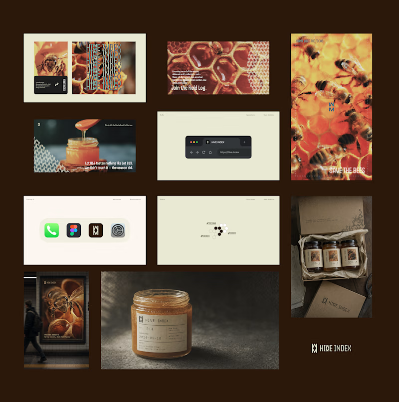
88 votes
Closed

Vectis


A look at the identity we designed for Vetti, a dog health monitoring brand.
There’s a lot of data behind a product like this but the person using it just wants to know their dog is okay.
That’s the balance in the design with a connected dot system that feels precise and warm colors and photography that keep it close to what people care about.
Also, an excellent excuse to spend far too long choosing dog photos.


Custom liquid interaction built in Framer.
Turning a static hero into a responsive visual surface through cursor-driven distortion.


How do you adapt the cursor-driven effect for touch screens?