The network for creativity
Join 1.25M professional creatives like you
Connect with clients, get discovered, and run your business 100% commission-free
Creatives on Contra have earned over $150M and we are just getting started
Back to feedPost
What if the whisky-making process became the artwork?
Full Barile identity, campaign and film:
https://contra.com/p/bMNAvgWk-barile-brand-identity-and-launch-campaign
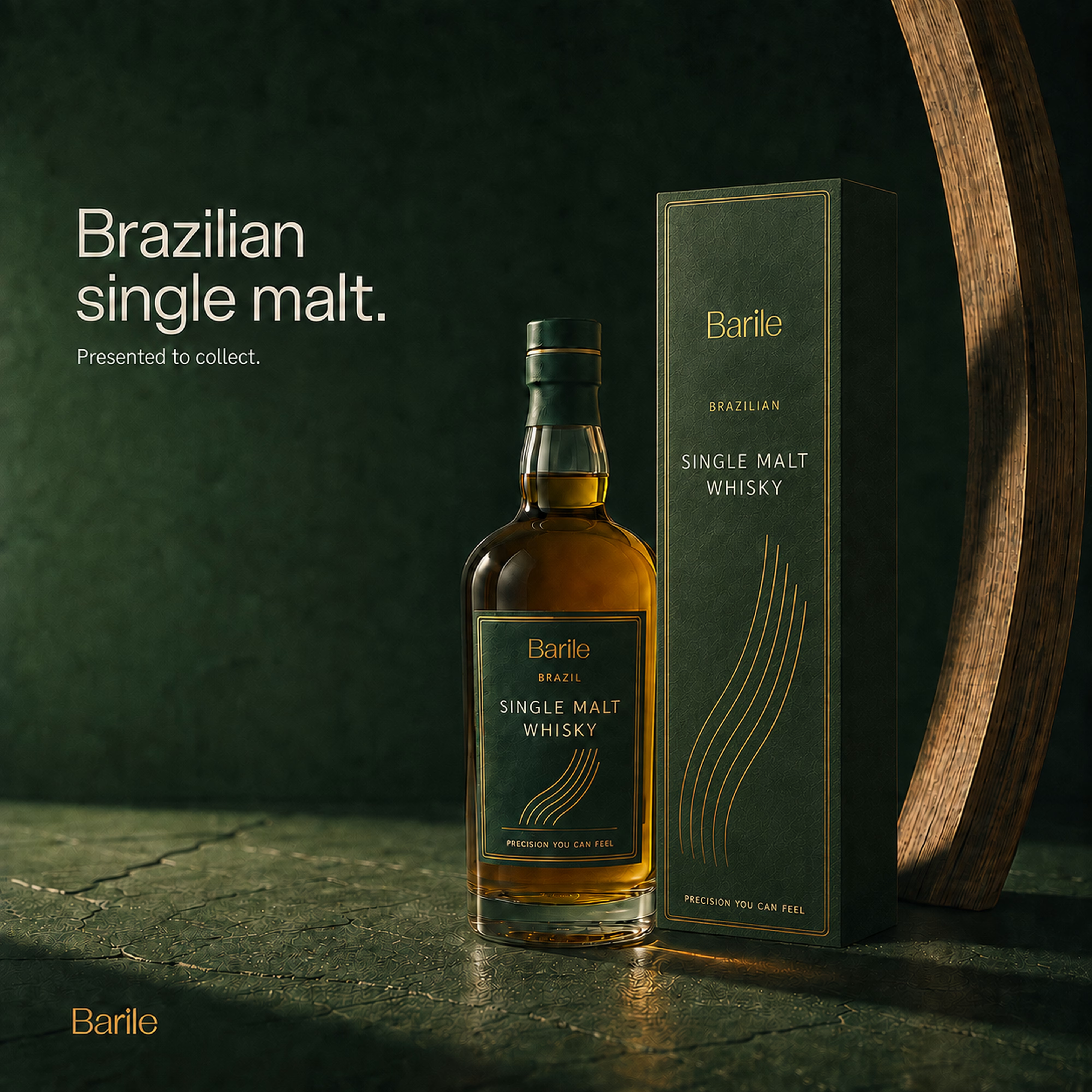
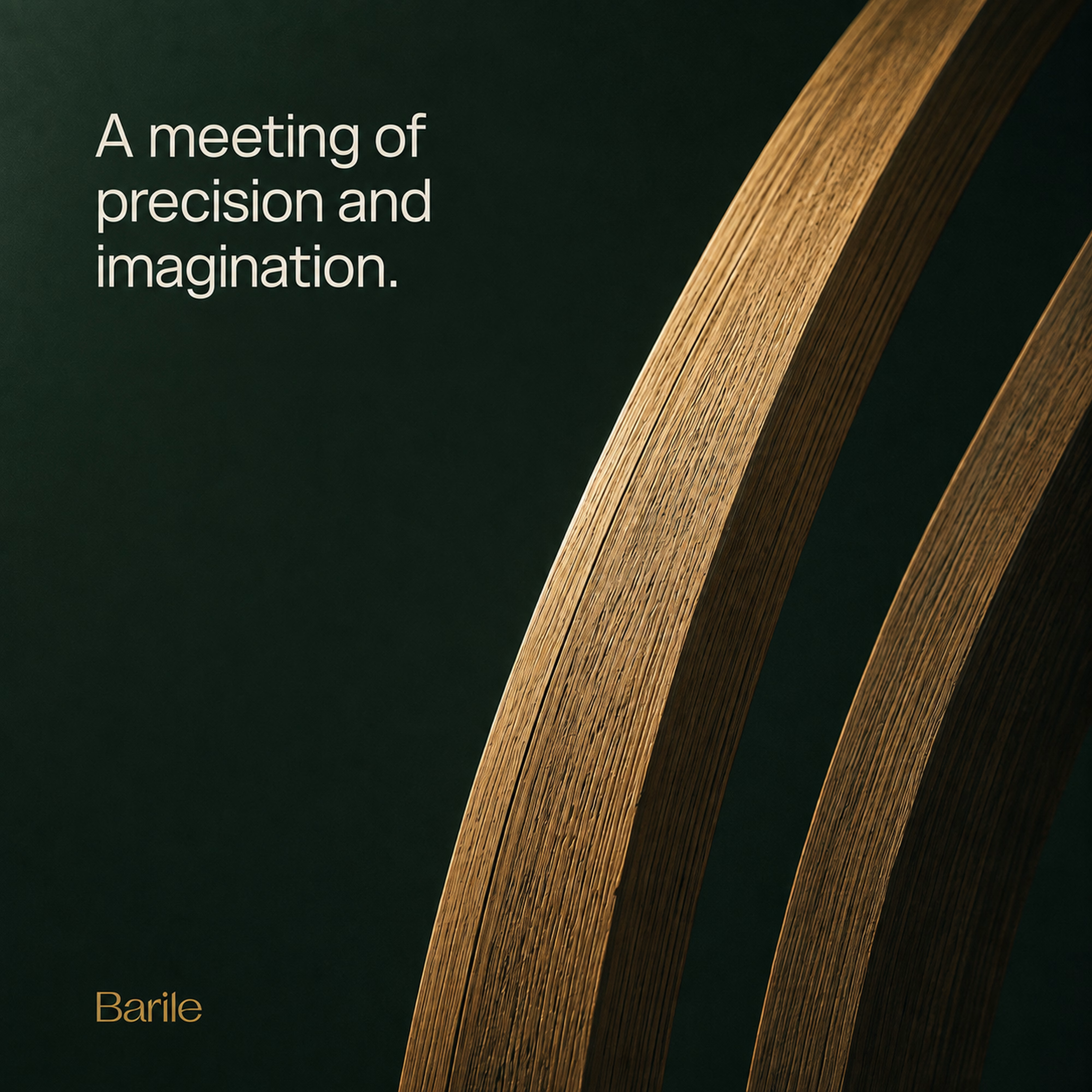
Barrel staves become monumental sculptures. Their curves carry through the collector’s packaging and a 15-second film. Explore four moments from the project here, then discover the complete visual identity and campaign in the case study.
Self-initiated concept for a fictional Brazilian single malt. Creative direction, brand identity and AI-assisted visual development by Mauricio Pontual.
#BrandIdentity #ArtDirection #PackagingDesign #BrandCampaign #AIVideo


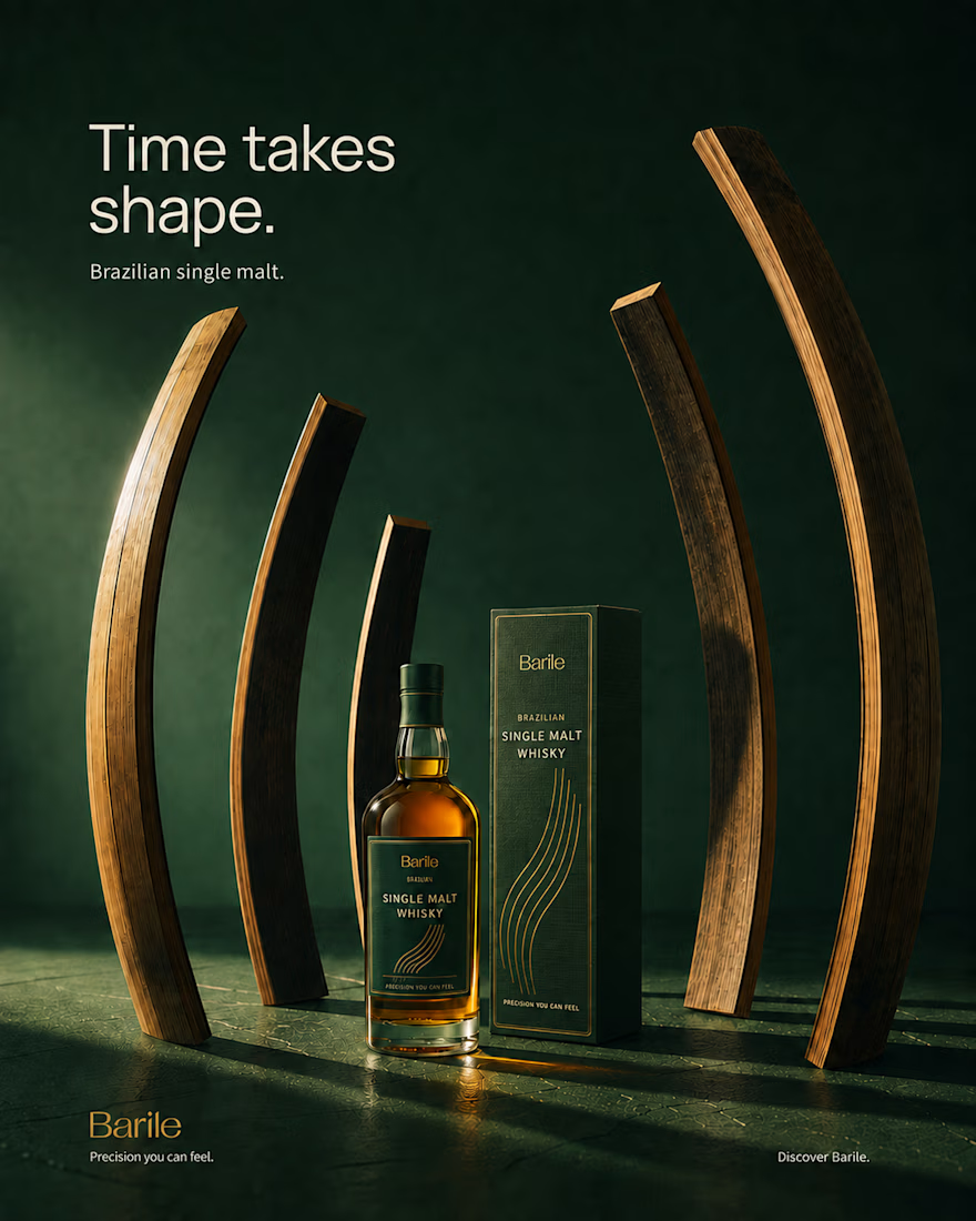

Turning barrel staves into monumental sculpture is a great answer to the usual whisky brand cliche of just shooting moody bottle photography. Since this was self-initiated, what made you pick whisky specifically as the category to explore that concept in?

Thanks! Whisky felt like the one category where the material argument isn’t decorative, it’s the actual origin story. The stave only exists because whisky ages in oak, so building the brand around it let the craft do the talking instead of another backlit bottle shot. Coopering...

Making the stave the hero gets past the problem most fictional whisky brands never solve, which is looking like every Scottish shelf-mate. The part I'd want to see is the label itself, because that's where the curve has to share space with ABV, volume and the legal line - did...
Great question! Nothing competes with the stave on the front, that’s the whole point. ABV, volume and the legal line all live happily on the back label, on the opposite side of the bottle, in a clean text panel. The front is kept free for just the stave curve and the wordmark,...

Impressive
Thank you so much, Sandaruwani!

Thank you so much! Really glad you liked that combination.

Thank you so much!

The way the barrel curves carry all the way through to the packaging is such a tight through line. Since this was self-initiated, did the sculptural direction come first and the 15 second film get built around it, or were they developed side by side?
Thanks, Diego! Sculptural direction came first. The barrel curves set the language for everything, including the packaging. The 15 second film came after, built to put that form in motion.

Absolutely love this approach Mauricio! Making the barrel material the main hero creates such a rich narrative for a single malt. Everything about the branding looks ultra premium.
Thank you so much, Timothy! Really appreciate that.
That's a clean way to justify the whole structure to a client, sculpture first, film built to serve it rather than the other way around. Did anyone push back on leading with sculpture over typical bottle photography, or was that actually the pitch that won the project?

The color palette is beautiful. I love a deep green.
So glad you liked it, Stefa.
The network for creativity
Join 1.25M professional creatives like you
Connect with clients, get discovered, and run your business 100% commission-free
Creatives on Contra have earned over $150M and we are just getting started











Related posts

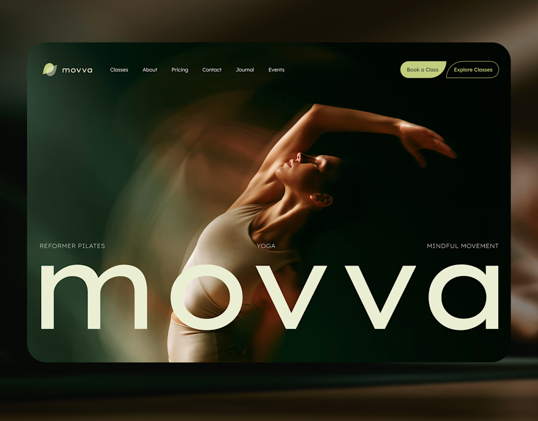
MOVVA is now featured on Contra 🤍
I’m especially happy about this because working on this template was a creative outlet for me.
I wanted to build something useful for a business: a website that covers what a studio needs when it opens, from an easy-to-use schedule to clearly structured class information, with a solid foundation for SEO.
At the same time, I wanted it to feel beautiful. To bring a sense of movement, lightness, and the joy of taking a class into the design. To capture that friendly atmosphere that makes you want to walk into a studio and give it a try.
Thank you, Contra team!


Huge congrats on getting featured! 🤍 MOVVA looks stunning - love the mindful movement vibe and that hero image. Super useful concept for studios. Well deserved feature!

Brand Expressions -- Olivir


Thats so crazy!!!!!! Seeing this I feel we humans are still far better than AI

A little peek at the brand work we did for Elio Mortgage.
A warm, approachable identity full of warm vibrant colors paired with soft sun rising inspired gradients, inner glows and custom illustrations & more. Loved this direction!
Full case study coming soon, from process to final identity.
Plenty of logo explorations to share too!


That color palette takes the whole identity to a different level!! I loove it.