The network for creativity
Join 1.25M professional creatives like you
Connect with clients, get discovered, and run your business 100% commission-free
Creatives on Contra have earned over $150M and we are just getting started
Back to feedPost


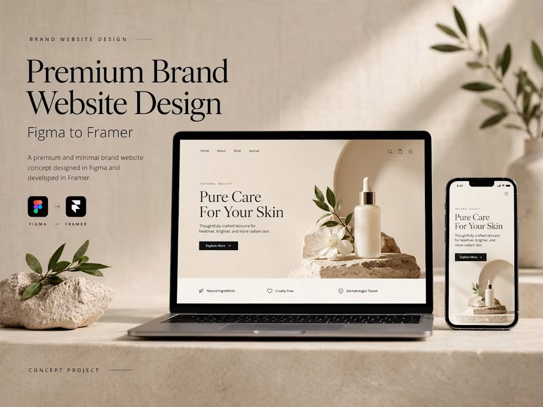
So clean Naim! ✨ Premium Brand Website Design - Figma to Framer execution is on point. That skincare "Pure Care For Your Skin" concept looks luxurious, love the beige minimal aesthetic and the stone + leaf art direction. Super polished mockup presentation too!

The Pure Care For Your Skin presentation is genuinely lovely. That warm beige tone with the stone and leaf styling makes the whole thing feel like a spa before you even read a word. How close did the Framer build stay to the original Figma, or did you make a lot of layout calls in the browser?
The network for creativity
Join 1.25M professional creatives like you
Connect with clients, get discovered, and run your business 100% commission-free
Creatives on Contra have earned over $150M and we are just getting started










Related posts


Fresh case study 🚀🚀🚀
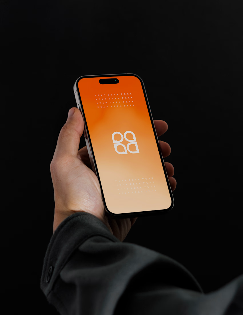
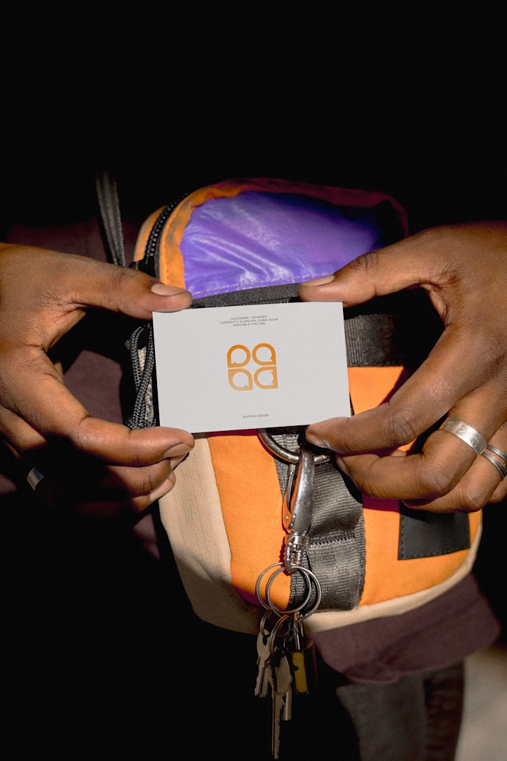
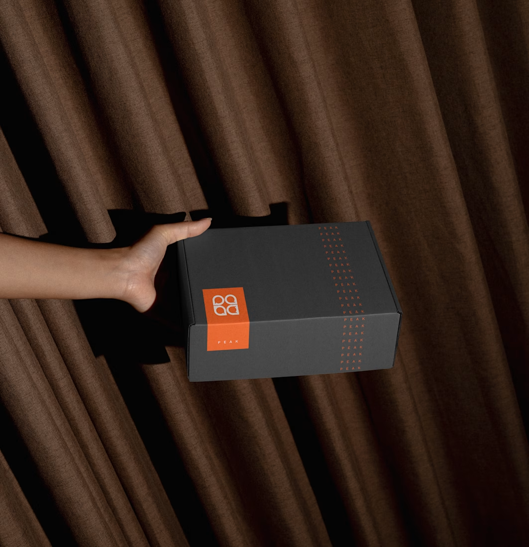
Brand identity for Peak, an all-in-one website builder for WordPress that I design and build. A four-letter mark, a warm paper-and-ember palette and one system that runs from the favicon to the packaging.

A four-letter mark that has to hold from favicon to packaging is a tough constraint. Did you draw one letterform first and build the other three from it, or design them together as a set from the start?


new work is live. quite proud of this one!

I like this

Beautyy


