The network for creativity
Join 1.25M professional creatives like you
Connect with clients, get discovered, and run your business 100% commission-free
Creatives on Contra have earned over $150M and we are just getting started
Back to feedPost

Inspiration design of the day 🔥

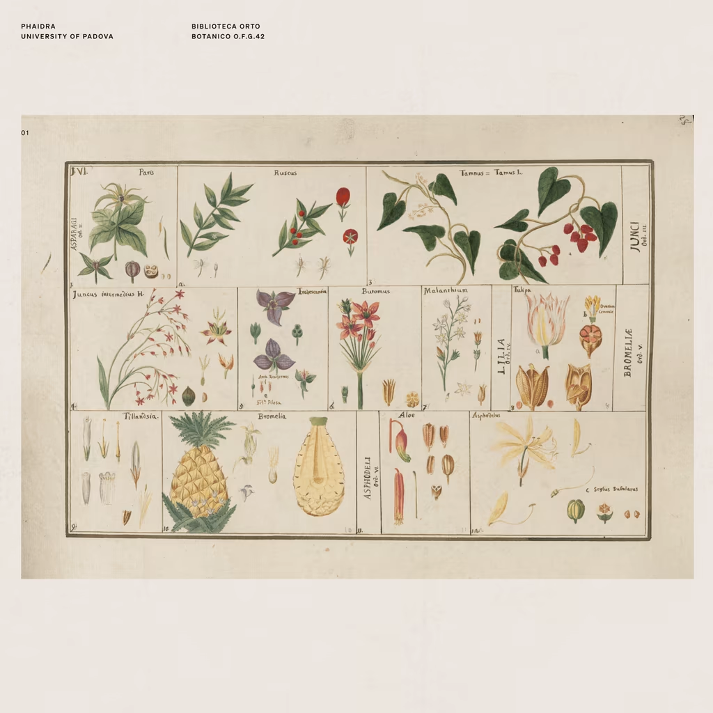
There's a shop in Barcelona that sells vintage prints from artists long gone.
On one of my visits, I found myself completely drawn to the way they used to illustrate flowers, fruits, objects, animals. A real exercise in consistent observation, one that's been lost in a generation...


great work

Vintage


The network for creativity
Join 1.25M professional creatives like you
Connect with clients, get discovered, and run your business 100% commission-free
Creatives on Contra have earned over $150M and we are just getting started







Related posts


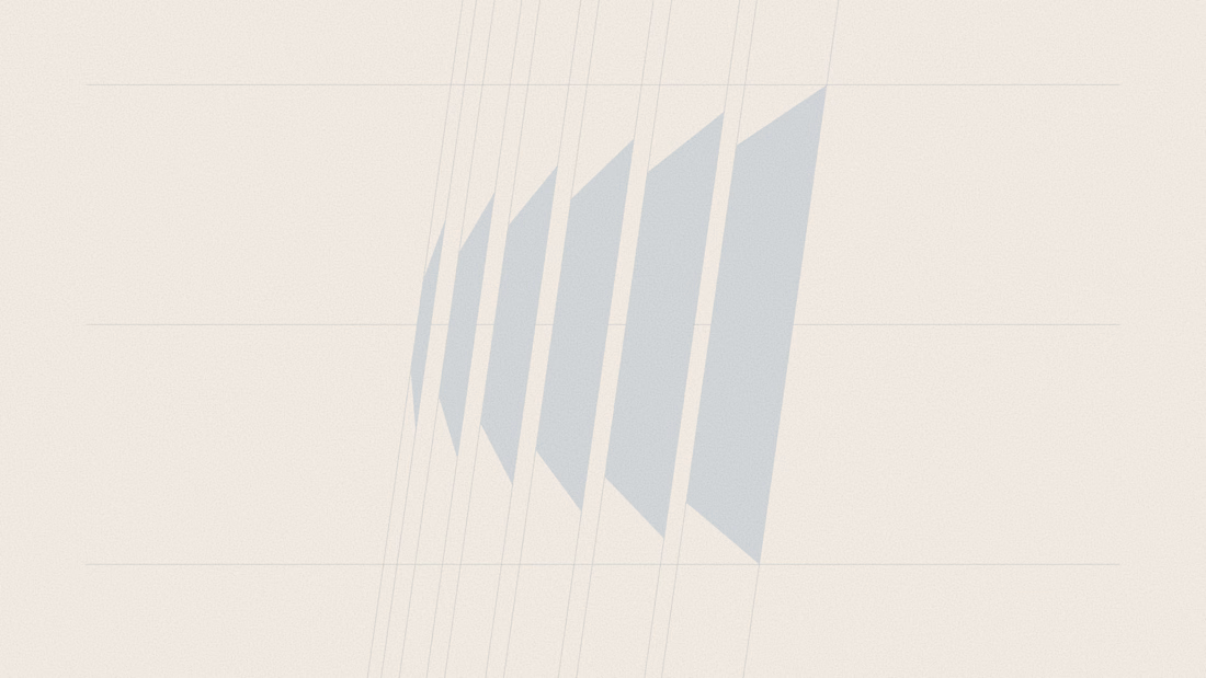
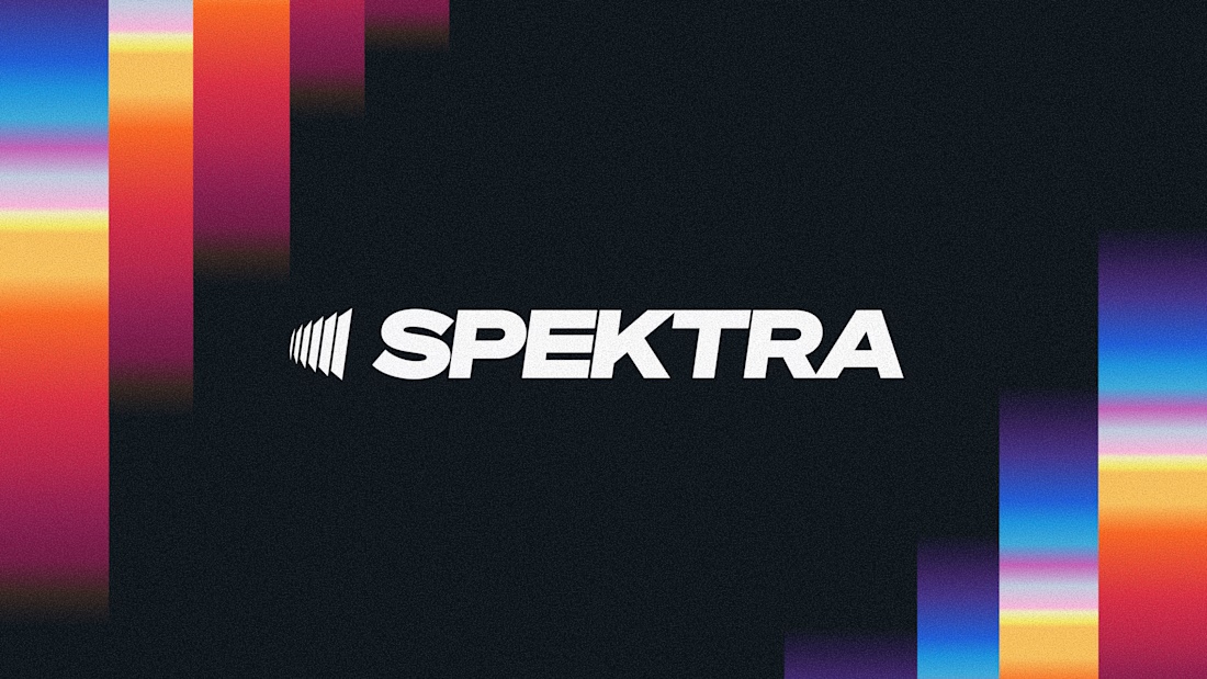
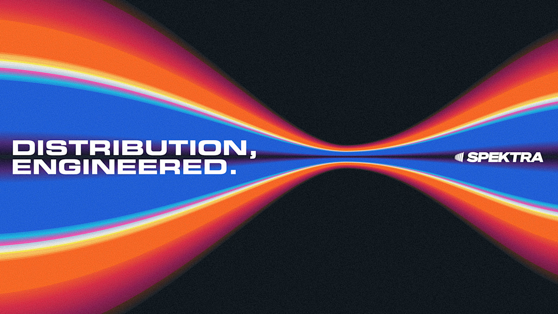
A closer look at the Spektra logo I designed.
The mark fans out from a narrow point, while the wordmark leans forward. together, they give it a sense of movement without needing much detail.
There’s a lot of color in the wider identity, so the logo holds its own in plain white. Simple geometry with enough weight to stand up to everything around it.


This is fire, Daniel
The logo conveys the story


Four logo concepts, one direction: calmness, warmth, mental health and professionalism.
Which one feels most aligned with the brief to you?

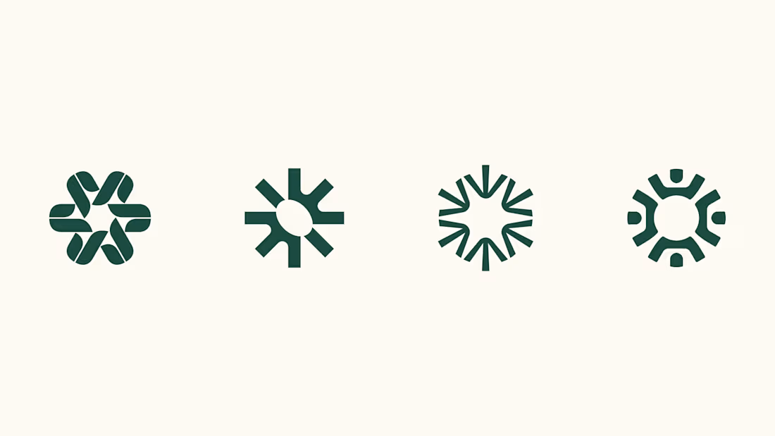

I think 3 or 4 work best. I really like the first one, but it moves away from the "calmness" concept

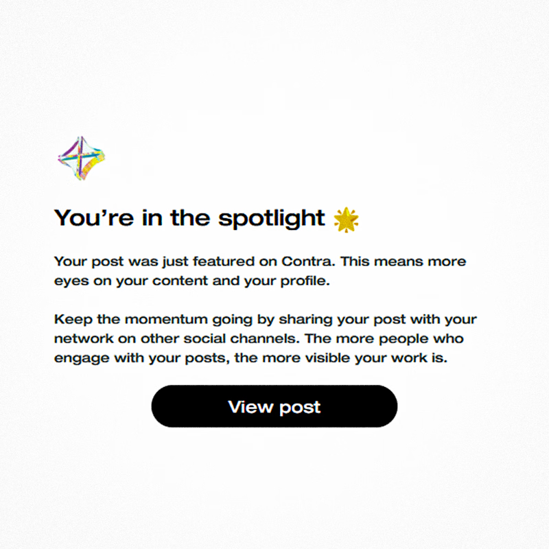
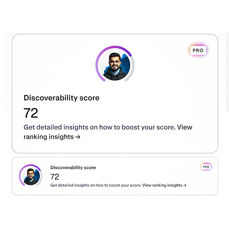
2 Achievements 🏆 On Same Day ... !!!
⚡I'm in the spotlight. My Post was Featured on Contra
⚡I Just Got 72 Discovery Score
Which one do you think more worth celebratingggg....!!! ✨💡🌟

16 voted
89%
2 voted
11%
18 votes
Closed

72 Discovery Score is no small thing either 👀
Both deserve the celebration fr!