The network for creativity
Join 1.25M professional creatives like you
Connect with clients, get discovered, and run your business 100% commission-free
Creatives on Contra have earned over $150M and we are just getting started
Back to feedPost


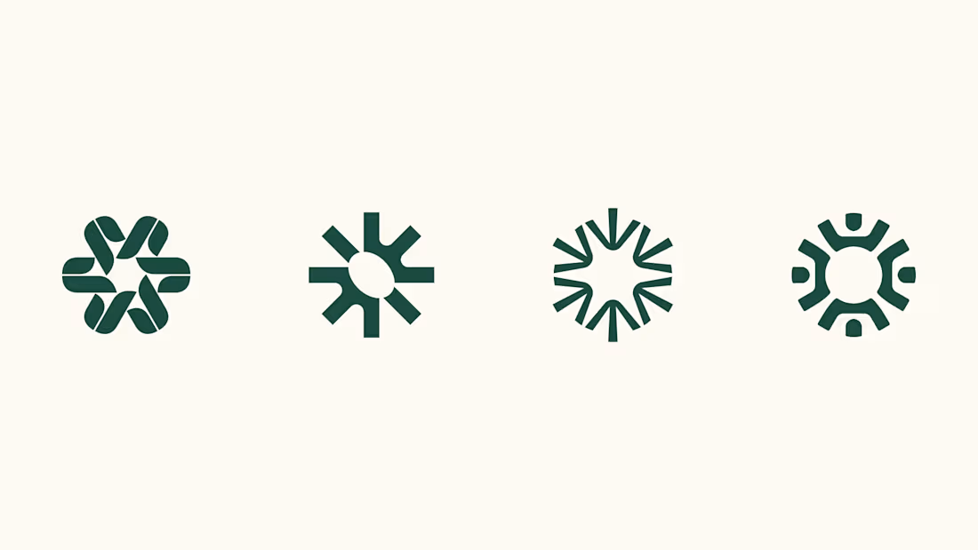
Four logo concepts, one direction: calmness, warmth, mental health and professionalism.
Which one feels most aligned with the brief to you?



Wow 😍

I think 3 or 4 work best. I really like the first one, but it moves away from the "calmness" concept

The four marks keep a strong shared rhythm while each shifts the balance of warmth and structure. I’m especially into how the open negative space lets the calmer direction breathe.

The first one for me: rounded terminals and overlapping petals are where the warmth actually comes from, and it's the only one that doesn't read as a burst. Two and three point outward with sharp tips, which lands closer to alert or energy than calm, and three will fill in and...

Awesome!

The first logo feels the most aligned with the brief to me. Simple, warm, and memorable.

I love 2nd version most.

Number 3 gets calmness right, it has room to breathe where the others feel a little clenched. The first is gorgeous but reads more tech startup than mental health, it is doing jumping jacks when the brief asked for a deep breath.

I like the third to last and the last one, that one got some African vibes to it

i love the 2nd & 3rd–– the 2nd almost looks like an eye-shape in the middle, which makes me think of paying attention to mental health & awareness of wellness in general.

Love the consistency and creativity in these geometric logo explorations!

Very impressive.

So nice! Love the logomark and the colors! 🧡
S


Nice work🔥👏👏


All of them are good but the second one feels a little but unique because of the oval shape. what is your stand here?

Awesome!

Awesome
I prefer number 4

The concept are cool, nice work

Wonderful 3 for me

The first one feels most aligned to me. The interlocking shapes suggest support and community, while the rounded overlap adds warmth without losing structure. I’d be curious how it holds at very small sizes? if it becomes too detailed, the fourth feels like the strongest simplified alternative.

Wow... there's something I appreciate about each one. I think #1 and #4 are the most unique. #1 feels like it could be used in a lot of different contexts, so I would lean toward that.

4 the last one, for me it has like 4 people seating together or standing, shows all character you are looking for, togetherness it has calmness, warmth as they are showing mutal emotions with i suppose their hands.

Honestly, they all look great, but I'm definitely leaning toward the first one. The interlocking shape just feels really calm and cohesive.

One of the best designs I’ve seen today. Really solid work 👏 Balancing warmth and clinical professionalism across all four concepts shows so much versatility.

Minimal yet powerful concept.
The network for creativity
Join 1.25M professional creatives like you
Connect with clients, get discovered, and run your business 100% commission-free
Creatives on Contra have earned over $150M and we are just getting started





Related posts


The thing I keep relearning: a design is never finished because someone ran out of ideas. It's finished because someone decided to stop. Knowing when to stop is the hardest part.
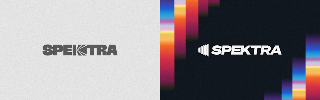


Damn.... Crazy colors 👏😍

Brand identity work for WesoftAI



Next intelligence. A brand you can feel.
Ice blue, deep black and refracted glass bring texture, depth and a sense of touch to an invisible technology. An identity designed to be recognised. And felt.
Brand identity and visual direction for Niwos, a platform that brings AI agents together as a digital workforce.
Five modules. One W. A simple idea at the heart of the identity: working as one.
I’ve really enjoyed working on this project with Muhammed. His trust in my design judgement and openness to new ideas gave me the creative freedom to explore fully.
Here’s hoping this is just the first chapter of an exciting journey with him and his team.


👍 nicely done