The network for creativity
Join 1.25M professional creatives like you
Connect with clients, get discovered, and run your business 100% commission-free
Creatives on Contra have earned over $150M and we are just getting started
Back to feedPost
Taste Test
Exploring letters “oo” and Infinity concept for a logo
Which one do you like?
2 voted
14%

12 voted
86%
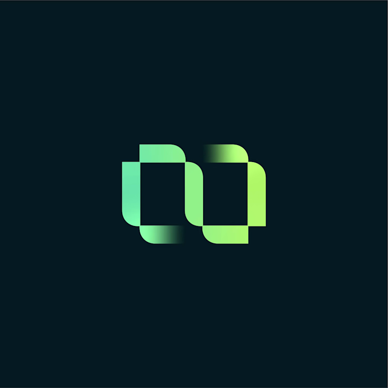
14 votes
Closed
nice
Thanks!
Love this!
Thanks!
Gradient for this one! 👍
Thanks Akin!
nice one
Thanks Ajayi!
The gradient infinity is perhaps giving more character depth to the letter "OO" and I think the gradient infinity concept is more accurate for infinity sign.
Thanks for detailed feedback! I really appreciate it.
You're welcome!
The network for creativity
Join 1.25M professional creatives like you
Connect with clients, get discovered, and run your business 100% commission-free
Creatives on Contra have earned over $150M and we are just getting started
Related posts
This looks clean and well thought out. How long did it take you to bring everything together?
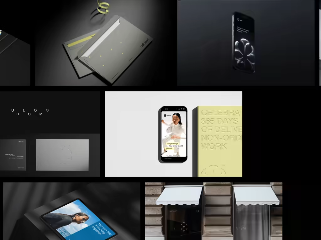
What if a brand's entire visual language was built around the act of repair? Tessler & Co., a fictional tools workshop identity rooted in craft, longevity, and the dignity of skilled hands.
Clean work
top class work 🔝
Trending
Claude
Claude has entered the design space. How are you using Claude Design?
Contra University
Learn from expert creatives how to earn more using next-gen AI tools.
creativeaiflow
Creative AI workflows are evolving. What tools do you use, and what are their strengths and weaknesses?
portfolioreview
The best portfolios tell a story, not just show a grid. Share yours for feedback.
freelancerlife
Freelancer life is wins, pivots, and everything in between. What’s yours right now?
