The network for creativity
Join 1.25M professional creatives like you
Connect with clients, get discovered, and run your business 100% commission-free
Creatives on Contra have earned over $150M and we are just getting started
Back to feedPost

I built AIDesignSys to turn a short description of your company and brand into a complete design system that’s ready for AI.
Now I’m wondering… do startups actually need a design system this early, or is it overkill? What do you think? 👀


The network for creativity
Join 1.25M professional creatives like you
Connect with clients, get discovered, and run your business 100% commission-free
Creatives on Contra have earned over $150M and we are just getting started

Challenges
View all


Related posts


Engaging website for a New York–based architecture and construction studio, balancing bold typography, immersive imagery and a minimal editorial layout.


A look at the identity we designed for Vetti, a dog health monitoring brand.
There’s a lot of data behind a product like this but the person using it just wants to know their dog is okay.
That’s the balance in the design with a connected dot system that feels precise and warm colors and photography that keep it close to what people care about.
Also, an excellent excuse to spend far too long choosing dog photos.


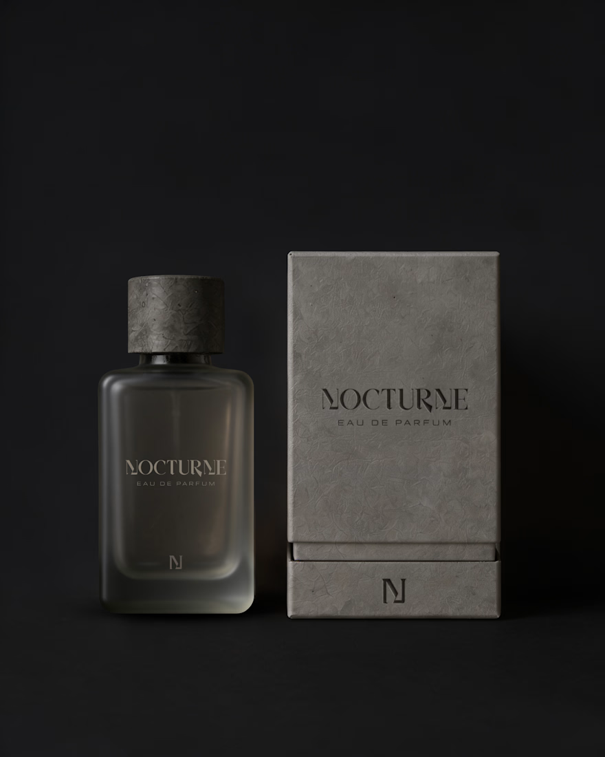
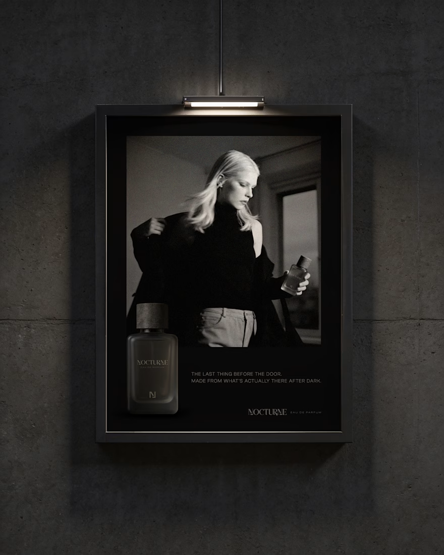
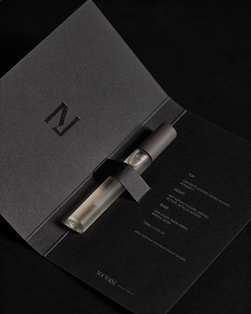
Nocturne is a self-initiated fragrance house I built from the ground up, treated with the same process I'd bring to any client: strategy first, then design.
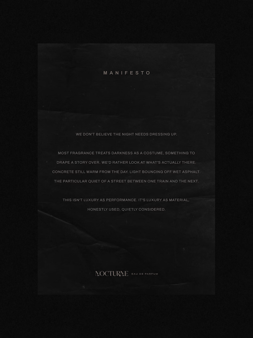
The brief was familiar: a fragrance inspired by the city after dark. Most fragrance branding solves that with common approaches such as moonlight, mystery, or gold foil details. I wanted to solve it with something more specific: what does after dark actually look like in an urban environment? Concrete, streetlight, wet pavement, the quiet stretch between one train and the next.
That question shaped everything downstream. An archetype chosen deliberately against category convention, Creator and Explorer rather than the more expected Lover or Magician. A material-first approach to the bottle and packaging. Sandblasted glass, a textured concrete-like cap, no gold, no ornament. And a running checklist I held every decision against throughout the project.
The case study covers the strategy behind Nocturne, not just the finished system: positioning, personality, the reasoning behind each material and typography choice, and how those decisions translated into the bottle, packaging, and campaign work.
I'd love to hear what you think, especially if you enjoy seeing the thinking behind a visual identity as much as the final result.



Good Work!


