The network for creativity
Join 1.25M professional creatives like you
Connect with clients, get discovered, and run your business 100% commission-free
Creatives on Contra have earned over $150M and we are just getting started
Back to feedPost

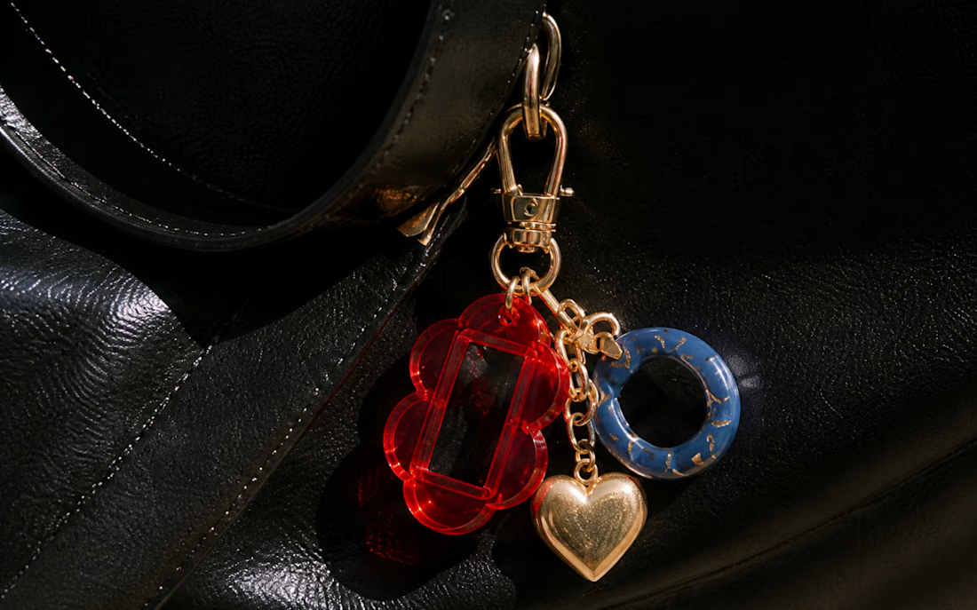
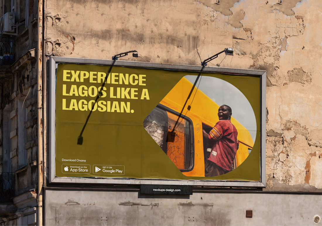
A couple of screens from a project i'm currently working on. I really enjoyed working on the design system, specifically the colours and the use of shapes throughout the system. ✨


Love this!

Beautiful work

Nice work!

Cool!!!!!!!!!

Great visuals!

Fun! The shapes are a great piece of design here. You are really utilizing them well with images
The network for creativity
Join 1.25M professional creatives like you
Connect with clients, get discovered, and run your business 100% commission-free
Creatives on Contra have earned over $150M and we are just getting started





Related posts

Some more experimental futuristic typography story design for Bar LOQA.


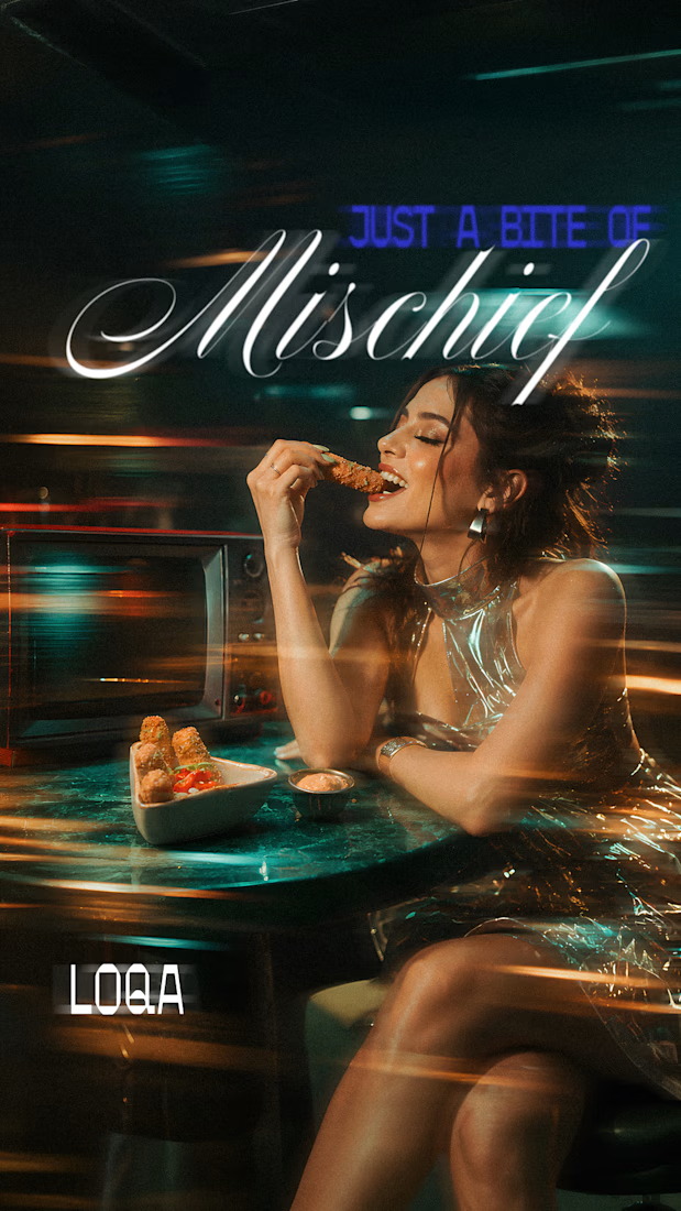
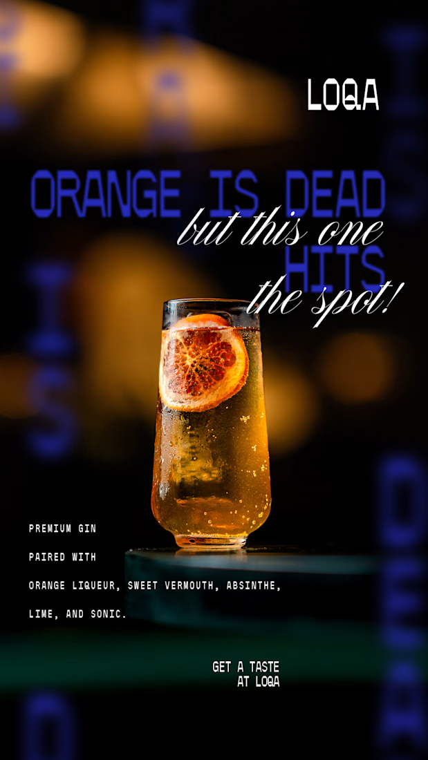
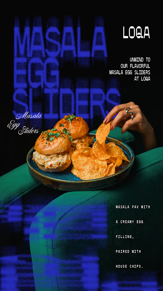
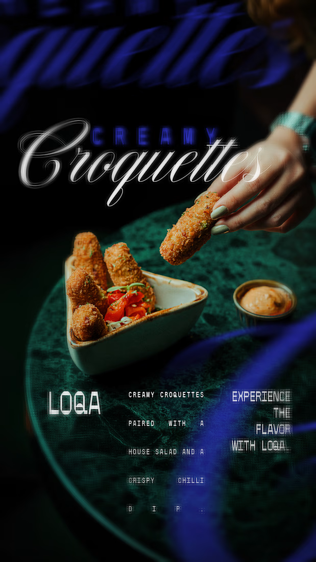

The script lettering over the cocktail sits in the glow without fighting the photo, while the sliders frame gets a much lighter touch. Do you place the type first and crop the image around it, or the other way round?

Created this masterpiece ❤️
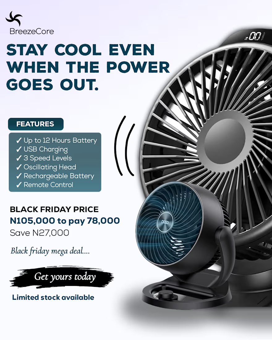
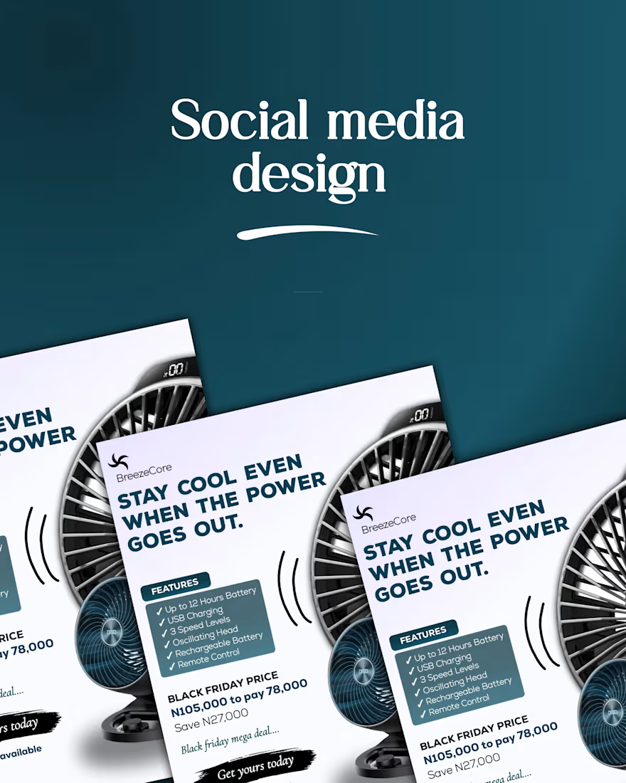
The goal was to create a design that communicates and solve the clients problem.

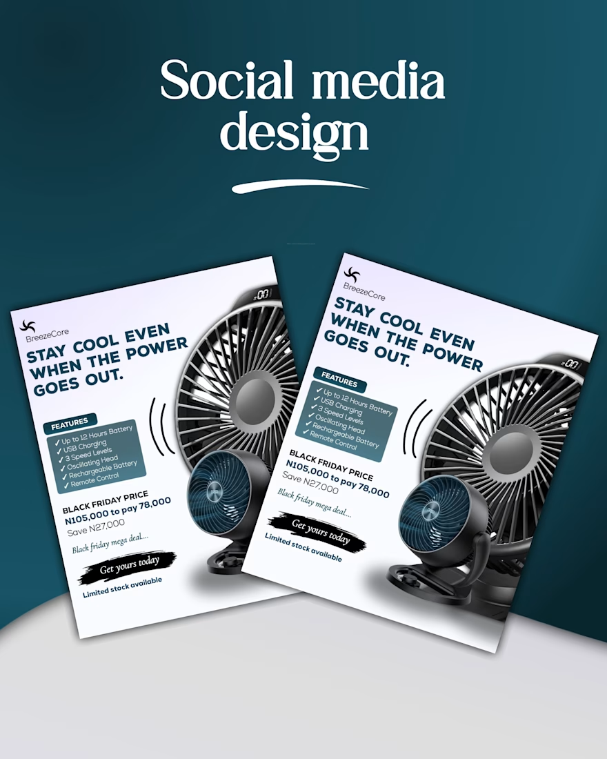

For the first one, I design in Figma, animate using Figma Motion, and then edit everything in DaVinci Resolve
The other is simply Claude 🥲


The Figma-to-DaVinci workflow keeps the motion clean and efficient.