The network for creativity
Join 1.25M professional creatives like you
Connect with clients, get discovered, and run your business 100% commission-free
Creatives on Contra have earned over $150M and we are just getting started
Back to feedPost
Taste Test


Which one would you put on the cover? Same river, same falling leaves, two different temperatures. One runs green: a tonneau case in forest tones with a gold tourbillon at six, emerald clouds banked over a valley, wet black rock and mist rising off the water. The other runs violet: a softer cushion case in polished purple, lilac cloud towers catching the last of the light, the same stream running cooler beneath it. One feels like midday in the canopy. The other feels like the hour after sunset. Which fall would you wear? 👇 #brandconcept #watchdesign #artdirection
3 voted
100%
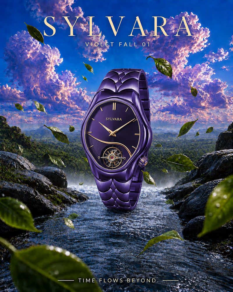
0 voted
0%
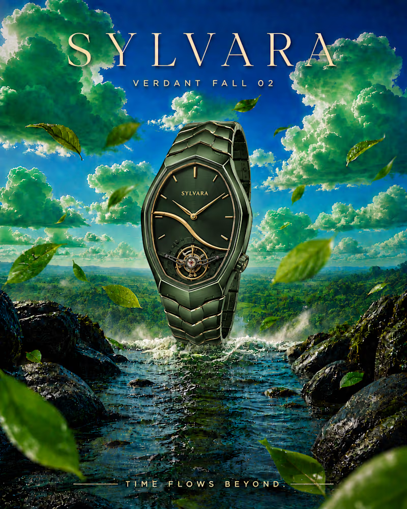
3 votes
Closed

i prefer violet concept, the main reason is overall more balance/natural, eye will easy to look at your watch in the this cover.


Verdant Fall for me. The green case with the clouds looks so cool.

Great work

cool
The network for creativity
Join 1.25M professional creatives like you
Connect with clients, get discovered, and run your business 100% commission-free
Creatives on Contra have earned over $150M and we are just getting started
Trending
retrofuturism
Share your favorite designs from the past exploring the distant future. Or your own take on the aesthetic 🚀
halftone
Dots. Texture. Grain. Let's see your designs using the halftone technique.

Midjourney
Creatives are showing off what they're making with Midjourney.
colorgrade
Video editors sound off: How do you enhance the mood of your video in color grading?





Related posts

here's the million dollar question:
light mode or dark mode, choose one👇

7 voted
39%
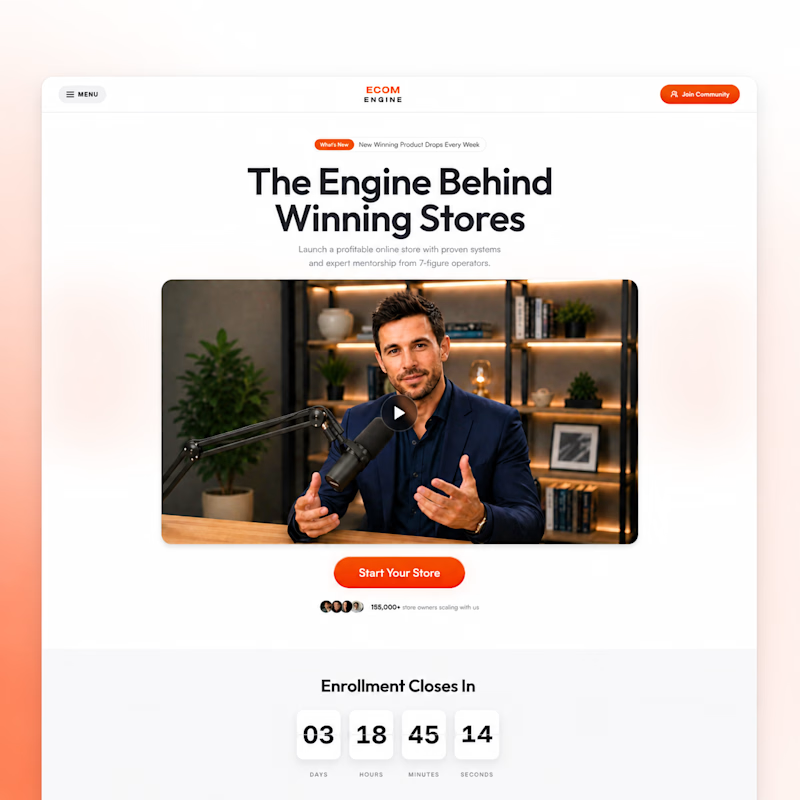
11 voted
61%
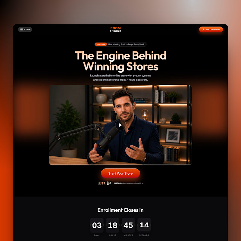
18 votes
Closed

Dark is adding more personality.

Sometimes the idea looks perfect in the frame, then you hit the timeline and everything changes.
Here is the animation next to the storyboard frame.
Did I nail it or did I go a little too far? 👇
28 voted
88%
4 voted
12%
32 votes
Closed
the animation matches the storyboard pretty close. i like it
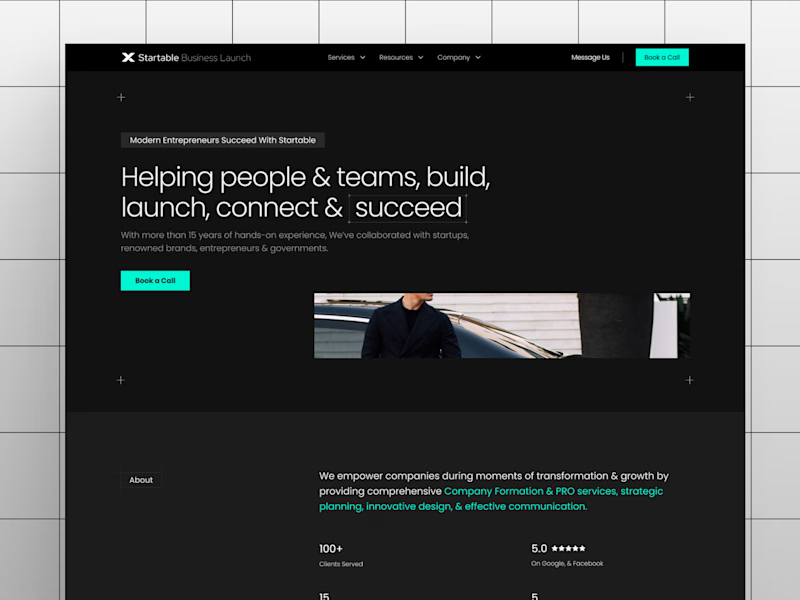
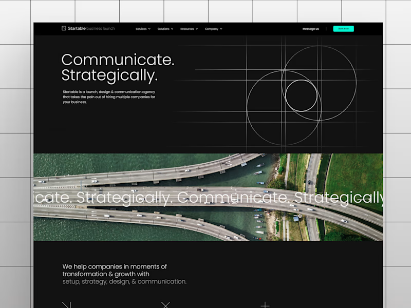
Which of these hero sections look visually more balanced and premium to you?
16 voted
53%
14 voted
47%
30 votes
Closed


Option A feels beautifully balanced with its proportion and layout hierarchy, giving the layout an ultra-clean, elevated, and premium feel