The network for creativity
Join 1.25M professional creatives like you
Connect with clients, get discovered, and run your business 100% commission-free
Creatives on Contra have earned over $150M and we are just getting started
Back to feedPost
Taste Test

here's the million dollar question:
light mode or dark mode, choose one👇

7 voted
39%
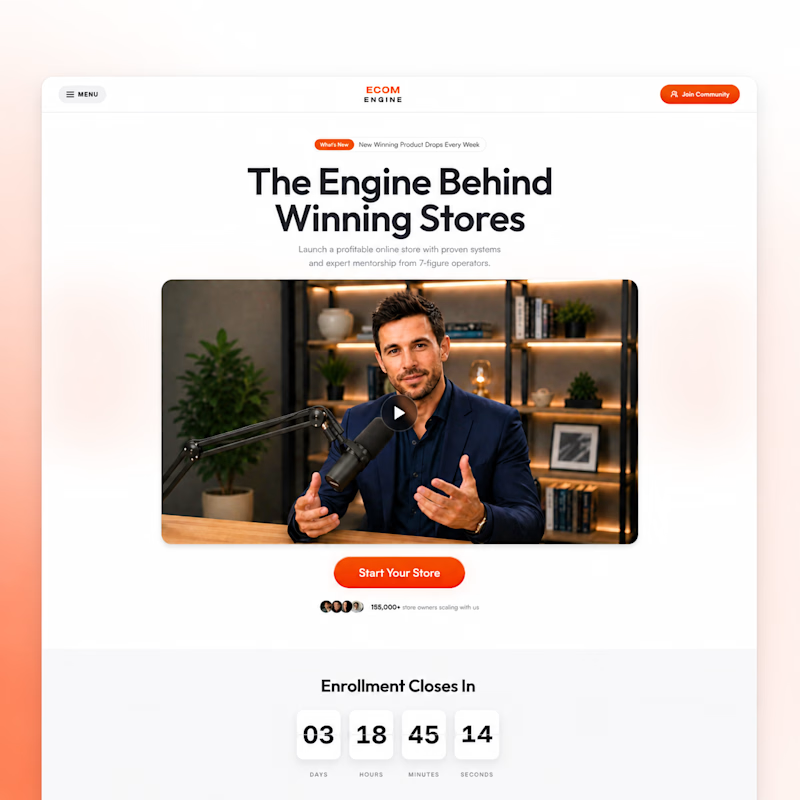
11 voted
61%
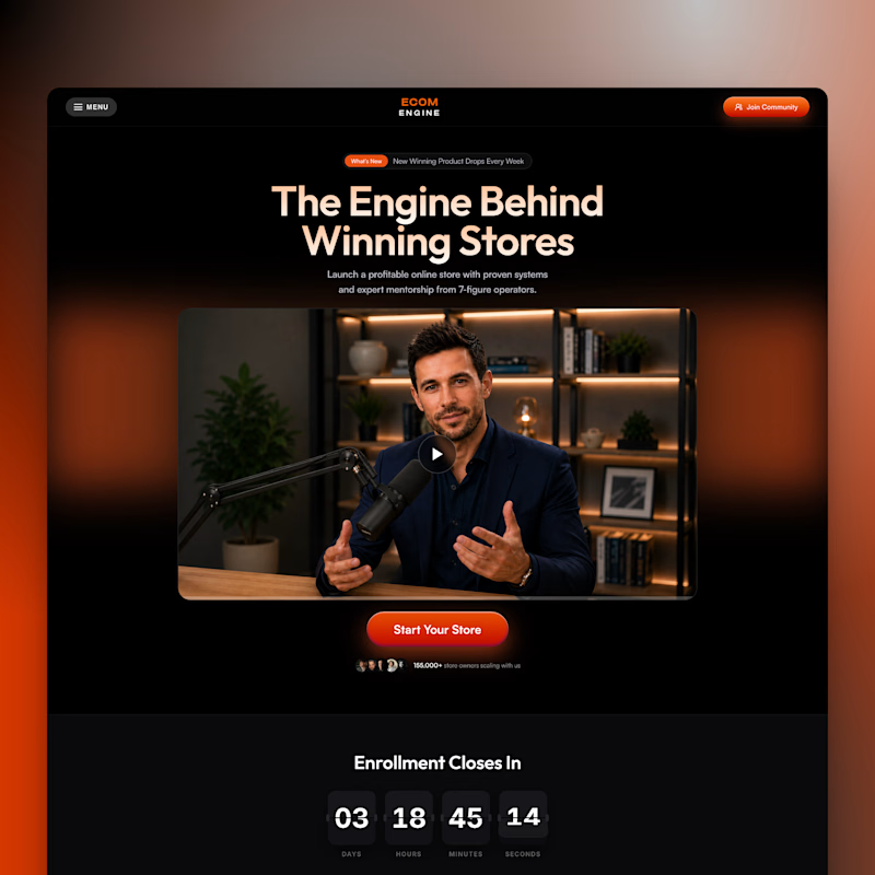
18 votes
Closed


Dark mode for the atmosphere, light mode for readability but dark mode wins for overall vibe every single time
Nice choice. What field are you in btw?

Love the light version more
Weldone, Syed.
Thank you! Glad you liked it 🙌

Dark is adding more personality.
So true. It feels more intentional
I also posted an A/B test. Would love to know which one you'd pick 🙌
Sure will check it out

Dark mode wins for me🔥
Thanks! Nice choice

Definitely dark mode, it has a premium look to it

Light version looks more professional...
Yup it does. Nice choice


dark for me syed. the orange button shows up better on it
Right. That's why I shipped the template with dark mode only
The network for creativity
Join 1.25M professional creatives like you
Connect with clients, get discovered, and run your business 100% commission-free
Creatives on Contra have earned over $150M and we are just getting started

Challenges
View all


Related posts

My previous poll showed unexpected results (I am very grateful to everyone who took the time to vote and comment 🤍).
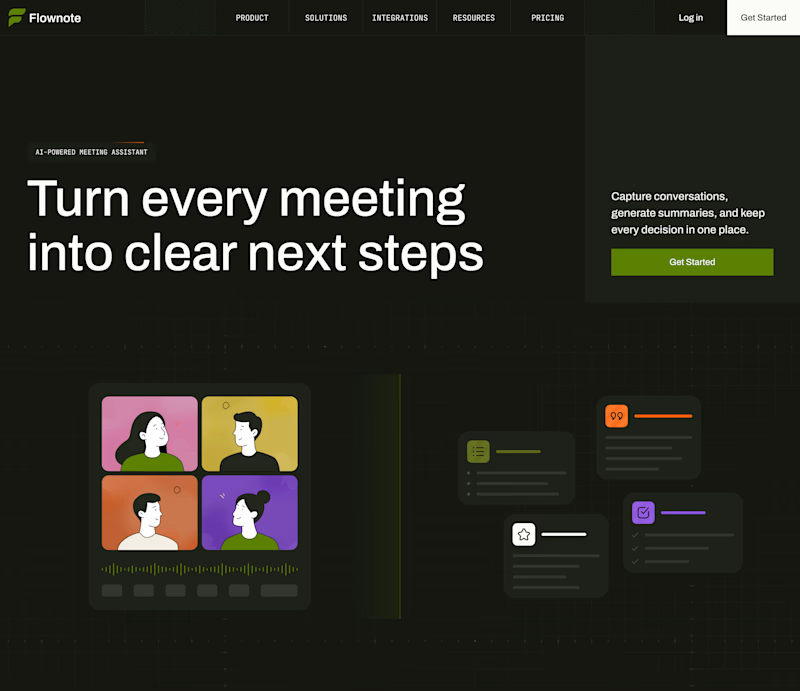
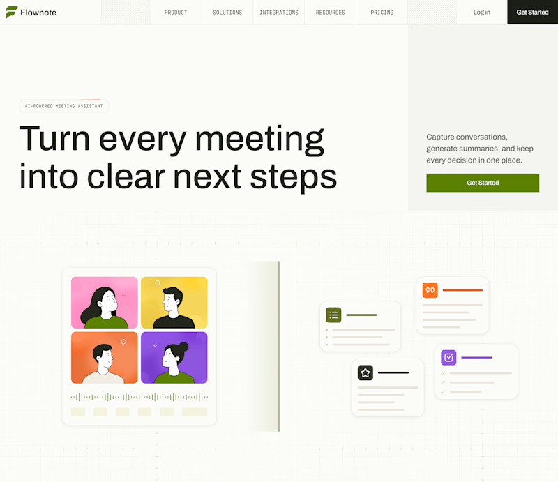
Now I am curious about your opinion on the color mode for this hero section. I definitely like a light theme. What about you?
By the way, I made a nice animation for this design. You can see it on my profile

28 voted
54%
24 voted
46%
52 votes
Closed

To be honest the dark mode looks really good

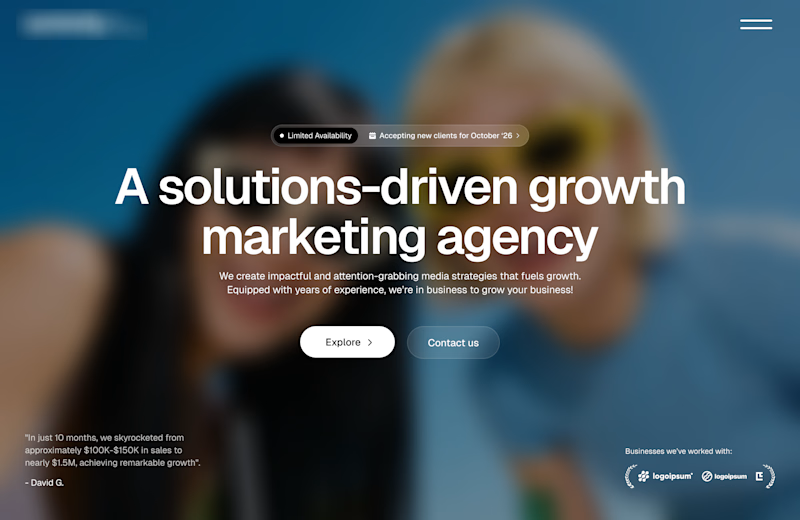
Working on a redesign for a marketing agency and I’m currently exploring layout options.
Assuming the background image is approved, which layout do you think will work best?
A or B?
11 voted
73%
4 voted
27%

15 votes
Closed

Option A works well

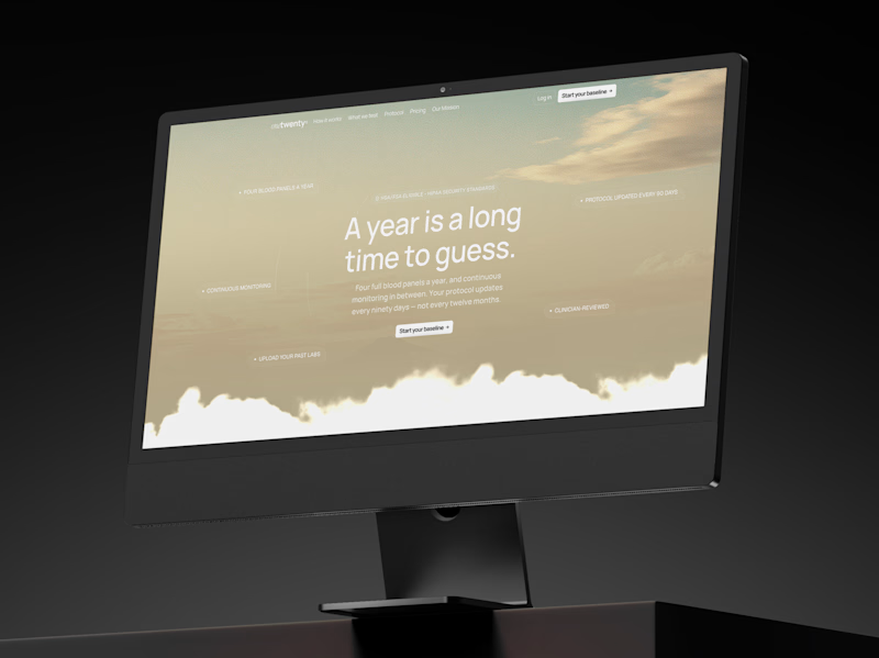
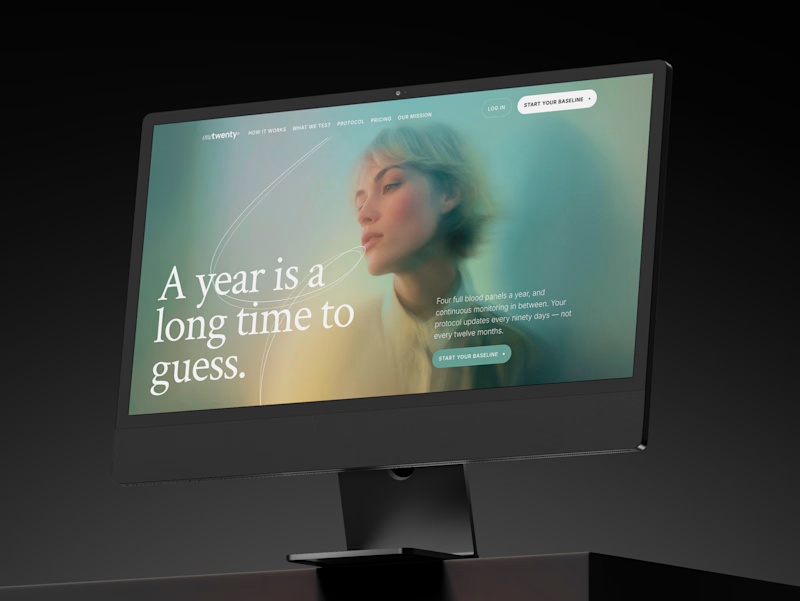
a longevity health membership asked me for the first ten seconds of their site. two opinionated directions, not four safe ones.
A · the instrument: https://onetwenty-direction-a.framer.website/
opens with how it works, shown through real product interface. the clearest version of what the category already does.
risk: one more health dashboard.
B · the publication: https://onetwenty-direction-b.framer.website/
opens with the reader's doubt, then explains. a big serif headline, one photo, a section that plays the idea out as you scroll.
risk: drifting into wellness.
the copy is nearly identical in both, on purpose. so the question isn't which one looks better:
which one would make you trust a health company with your blood and your data?
vote, and tell me why below.
10 voted
17%
49 voted
83%
59 votes
Closed

B look similar to this https://templatoria.com/templates/clearpath
templatoria.com
ClearPath — Framer Template for Therapists and Coaches
ClearPath is a warm Framer template for therapists, coaches, and personal growth professionals. Built for services, client stories, journals, and booking-focused websites.